Data view
This component is available since version 15.0.0.
Introduction
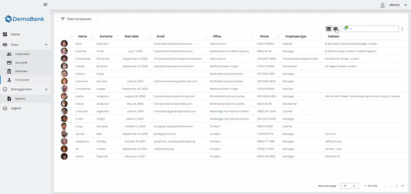
The o-data-view component is used to display the same dataset using two different visualizations:
- Table view, based on
o-table - Grid view, based on
o-grid
The component provides a single entry point for data binding and common UI configuration (title, toolbar controls, quick filter, pagination, etc.), while allowing you to define custom templates for both the table columns and the grid items.
Data binding
The o-data-view component supports data binding and you can command the component to display data either from local or remote data storage.
The data array can be provided in two ways:
- Provide an array of objects to the
static-dataattribute. - Configure the component to query the data from a service using
serviceandentityattributes.
Passing function calls directly to
static-data(e.g.[static-data]="getData()") is a bad practice that causes continuous re-evaluation and leads to malfunctioning behavior in components such as o-list, o-table, o-grid and o-tree. Always pass a static reference instead (e.g.[static-data]="data").
Configuration objects
The o-data-view component provides two configuration inputs to group view-specific options:
table-config: table-specific configuration (selection, grouping, export, scrolling, edit/detail behavior, etc.). See all of its properties heregrid-config: grid-specific configuration (layout, footer, orderable, quick filter columns, etc.). See all of its properties here
This allows you to keep the main component declaration clean and move advanced settings into configuration objects.
Global table configuration (Injection token)
Besides configuring the table behavior through table-config, some default table options can be defined globally by providing the O_TABLE_GLOBAL_CONFIG injection token.
The final value for a given option is resolved using the following precedence order:
table-configinput value (highest priority)O_TABLE_GLOBAL_CONFIGinjection token value- Component default value (lowest priority)
This is especially useful when you want to enforce consistent table behavior across the application (e.g. default row height, default edition mode), while still allowing each
o-data-view/o-tableinstance to override those defaults throughtable-config.
Example
import { NgModule } from '@angular/core';
import { O_TABLE_GLOBAL_CONFIG, OTableGlobalConfig } from 'ontimize-web-ngx';

const TABLE_GLOBAL_CONFIG: OTableGlobalConfig = {
  autoAdjust: true,
  autoAlignTitles: false,
  filterColumnActiveByDefault: false,
  editionMode: 'dblclick',
  detailMode: 'click',
  rowHeight: 'medium'
};

@NgModule({
  providers: [
    { provide: O_TABLE_GLOBAL_CONFIG, useValue: TABLE_GLOBAL_CONFIG }
  ]
})
export class AppModule {}
For a full description of the token and its supported properties, see the official OTableComponent documentation.
Templates
The o-data-view component uses content projection to allow you to customize what is rendered in each view.
For that reason, ng-template definitions are required in the following cases:
- Grid view: you must provide a grid item template, otherwise the grid has no content to render.
- Table view: you can optionally provide a table columns template to define columns and attach table extensions (filters, aggregates, context menu, paginator, etc.).
Table columns template
To configure the table (columns and extensions), define an ng-template with the oDataViewTableColumns directive and place any table-related definitions inside it.
This is the recommended approach to:
- define
o-table-columnelements - add table extensions such as:
o-table-columns-filtero-table-column-aggregateo-table-context-menuo-table-paginator- and any other table configuration components
Grid item template
To render items in grid mode, define an ng-template with the oDataViewGridItem directive.
Each rendered item receives the current record as template context using let-item, allowing you to build card-based layouts or any custom UI.
In grid mode, the oDataViewGridItem template is required to display content. In table mode, the oDataViewTableColumns template is recommended when you need to define columns or attach table extensions (filters, aggregates, context menus, paginator, etc.).
Basic example
<o-data-view service="packs" entity="packs" keys="id" columns="id;name;location;price;duration;score" [table-config]="tableCfg" [grid-config]="gridCfg" refresh-button="no" show-buttons-text="no" title="Data View Example">

  <ng-template oDataViewTableColumns>
      <!-- filter by columns -->
      <o-table-columns-filter columns="name;location;price;duration;score"></o-table-columns-filter>

      <o-table-columns-grouping columns="score"></o-table-columns-grouping>
      <o-table-column attr="name" title-align="start" editable="yes" width="400px"></o-table-column>
      <o-table-column attr="location" title-align="start" editable="yes" width="500px"></o-table-column>
      <o-table-column attr="price" type="currency" thousand-separator="." decimal-separator="," currency-symbol="€" currency-symbol-position="right"
        title-align="end"></o-table-column>
      <o-table-column attr="score" title-align="end" filterable="yes" sortable="yes">
        <o-table-cell-renderer-real></o-table-cell-renderer-real>
      </o-table-column>
      <!-- Aggregate columns -->
      <o-table-column-aggregate attr="score" aggregate="avg" title="Avg Price"></o-table-column-aggregate>

      <!-- Table context menu -->
      <o-table-context-menu [context-menu]="contextMenu" insert="no" edit="no" view-detail="no"></o-table-context-menu>

      <!-- Table paginator -->
      <o-table-paginator page-size-options="5;10;15"></o-table-paginator>
    </ng-template>

    <o-context-menu #contextMenu>
      <o-context-menu-item icon="grade" label="Item 1" (execute)="onExecute('Item 1', $event)"></o-context-menu-item>
      <o-context-menu-item icon="grade" label="Item 2" enabled="no"></o-context-menu-item>
    </o-context-menu>

    <ng-template oDataViewGridItem let-item>
      <mat-card class="grid-card">
        <mat-card-header>
          <mat-card-title></mat-card-title>
          <mat-card-subtitle></mat-card-subtitle>
        </mat-card-header>
        <mat-card-content>
          <div fxLayout="column" fxLayoutAlign="center">Cost: </div>
        </mat-card-content>
      </mat-card>
    </ng-template>

</o-data-view>
tableCfg = { visibleColumns: 'name;location;price;duration;score', editButtonInRow: 'yes', selectAllCheckbox: 'yes', deleteButton: 'no', showReportOnDemandOption: 'no', exportButton: 'no', rowHeight: 'small' };

gridCfg = { cols: 4, gutterSize: '2px', gridItemHeight: '175px', quickFilterColumns: 'name;price', showPageSize: "yes", insertButtonFloatable: 'no' };
View modes
The o-data-view component can render data in two modes:
- table: optimized for dense data inspection and column-based operations (sorting, grouping, selection, etc.)
- grid: optimized for browsing, card layouts and visually rich items
You can define which view is shown by default using the default-view attribute.
Toggle between views
The o-data-view component can show a toggle to switch between table and grid modes.
The toggle behavior can be configured with:
toggle-on-toolbar: places the toggle inside the toolbar.toggle-floatable: renders the toggle as a floating control (useful to keep it accessible while scrolling).toggle-button: indicates whether or not to show the toggle button.
toggle-buttonis enabled by default (yes). This is the default wayo-data-viewprovides view switching between table and grid modes.
Custom view switching (without toggle)
In addition to the built-in toggle, the o-data-view component exposes a public method to switch the active view programmatically.
This is useful when you want to provide your own UI (buttons, menus, tabs, etc.) to change between table and grid modes.
Public method: changeView
Use the changeView method passing a valid ODataViewMode value:
tablegrid
Example: custom buttons
<!-- Custom controls -->
<div class="data-view-actions">
  <button mat-stroked-button type="button" (click)="dv.changeView('table')">
    Table
  </button>
  <button mat-stroked-button type="button" (click)="dv.changeView('grid')">
    Grid
  </button>
</div>

<o-data-view #dv service="packs" entity="packs" keys="id" columns="id;name;location;price" title="Packs" toggle-button="no">

  <ng-template oDataViewTableColumns>
      <!--Custom o-table template-->
  </ng-template>

  <ng-template oDataViewGridItem let-item>
    <!--Custom o-grid template-->
  </ng-template>

</o-data-view>
In this example:
- The default toggle is disabled using
toggle-button="no". - A template reference variable (
#dv) is used to access the component instance. - Two custom buttons call
changeView('table')andchangeView('grid').
changeViewonly acceptstableorgrid. Any other value will be ignored or may cause unexpected behavior depending on the implementation.
Demo
You can see this and more examples of this component in the OntimizeWeb playground.