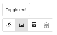
The o-button-toggle component is an on/off toggle with the appearance of a button. They can be standalone or grouped with the mat-button-toggle-group component.
<o-button-toggle attr= "singleToggle" label= "Toggle me!" layout-padding ></o-button-toggle>
<o-button-toggle-group attr= "toggleGroup" layout= "row" multiple= "no" value= "car" layout-padding >
<o-button-toggle attr= "toggle1" value= "bike" icon= "directions_bike" ></o-button-toggle>
<o-button-toggle attr= "toggle2" value= "car" icon= "directions_car" ></o-button-toggle>
<o-button-toggle attr= "toggle3" value= "train" icon= "directions_railway" ></o-button-toggle>
<o-button-toggle attr= "toggle4" value= "boat" icon= "directions_boat" ></o-button-toggle>
</o-button-toggle-group>
You can see this live example in the OntimizeWeb playground .
Directive: o-button-toggle
Name Since Description Default
attr
string
Field identifier. Registry property if component is inside a form.
checked
boolean
Indicates whether the button toggle is checked or not
no
enabled
no | false | yes | true
Indicates whether or not the field is enabled
yes
icon
string
Name of google icon (see Google material design icons )
icon-position
before | after
Icon position
before
label
string
Field label
attr input
name
string
The name for the button toggle, this attribute is used when the toggle button is inside a button toggle group
value
any
The value for the button toggle, this attribute is used when the toggle button is inside a button toggle group
* required inputs.
Name Since Description onChange
Event triggered when the status of the button toggle changes
Directive: o-button-toggle-group
Name Since Description Default
attr
string
Field identifier. Registry property if component is inside a form.
enabled
no | false | yes | true
Indicates whether or not the button toggle group is enabled
yes
layout
row | column
Indicates the disposition of the toggle buttons inside the group
row
multiple
no | false | yes | true
Whether multiple button toggles can be selected
no
name
string
The name tha identifies the button toggle group and its toggle buttons
value
any
The default value of the button toggle group
* required inputs.
Name Since Description onChange
Event triggered when the value of the toggle button group changes
getValue Return the value of the component Returns any
setValue Sets the value of the component Parameters val: any | any[]
