Combo
The o-combo component is used in forms for getting or displaying an option between multiple input submitted by the user.
The combo component is automatically registered on its parent o-form, which provides the value for the combo programatically. Its value can be also set manually via the data parameter. This and other attributes are explained on the API section of this page.
This component is different than most of other inputs, an array of data must be provided to the component in order to interact with it. This data is used to display the options on the drop down and each element of the data array must be an object with at least one key/value pair.
The data array can be provided in two ways:
- Provide an array of objects to the
static-dataattribute (see the example below). - Configure the component to query the data from a service. Using
serviceandentityattributes.
Passing function calls directly to
static-data(e.g.[static-data]="getData()") is a bad practice that causes continuous re-evaluation and leads to malfunctioning behavior in components such as o-list, o-table, o-grid and o-tree. Always pass a static reference instead (e.g.[static-data]="data").
Basic example
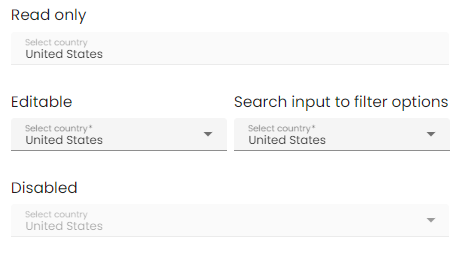
<o-form editable-detail="no" show-header="no">
    <o-combo attr="country" label="Country" data="Spain" [static-data]="staticData" value-column="name" columns="id;name" visible-columns="name" read-only="no" required="yes"></o-combo>
    <o-combo attr="country" label="Country" data="Spain" [static-data]="staticData" value-column="name" columns="id;name" visible-columns="name" enabled="no"></o-combo>
</o-form>
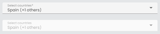
Multiple selection
The o-combo doesn’t allow multiple selection by default, you can configure the multiple selection by setting the value yes to the multiple attribute. This will allow the user to select multiple values at once.

<o-form editable-detail="no" show-header="no">
  <o-combo #combo attr="combo-multiple" label="Country" [static-data]="dataArray" [data]="valueMultiple" value-column="key" columns="key;value" visible-columns="value" required="yes" read-only="false" layout-padding multiple="yes"></o-combo>

  <o-combo #combo attr="combo-multiple-disabled" enabled="no" label="Country" [static-data]="dataArray" [data]="valueMultiple" value-column="key" columns="key;value" visible-columns="value" required="yes" read-only="false" layout-padding multiple="yes"></o-combo>
</o-form>
Customize the trigger label
You can customize the combo label configuring the multiple-trigger-label attribute as in the example below.
  <o-form editable-detail="no" show-header="no">
    <o-combo #combo attr="combo-multiple2" label="Country" [static-data]="dataArray"
     [data]="valueMultiple" value-column="key" columns="key;value" visible-columns="value"
     required="yes" read-only="false" layout-padding multiple="yes" multiple-trigger-label="yes"></o-combo>

    <o-combo #combo attr="combo-multiple-disabled" enabled="no" label="Country" [static-data]="dataArray"
     [data]="valueMultiple" value-column="key" columns="key;value" visible-columns="value"
     required="yes" read-only="false" layout-padding multiple="yes" multiple-trigger-label="yes"></o-combo>
  </o-form>
If you want to override the default trigger label, add the entry INPUT.COMBO.MESSAGE_TRIGGER in your bundle with the desired text.
'INPUT.COMBO.MESSAGE_TRIGGER':' (+{0} others)'
Validation
The o-combo shows automatically an error message when the required attribute is set to “yes” and there is no value selected.
You can see this and more examples of this component in the OntimizeWeb playground.
Renderers
OntimizeWeb offers you a set of prebuilt combo renderers to include in your o-combo component. This combo renderers are the following data types: boolean, real, currency, date, integer and percentage.
You may need to configure additional parametres depending on the combo renderer configured. Check the examples in the following sections and the attributes for each combo renderer in the API section of this page.
Predefined renderers
Boolean combo renderer
Display a custom value by configuring render-false-value and render-true-value attributes depending on the false-value-type and true-value-type attributes. Check the configuration of this attributes in the API section of this page.
<o-combo attr="combo-editable-search" [static-data]="dataArray" [data]="valueSimple"
  value-column="key" columns="key;value" visible-columns="value" required="yes" read-only="no" null-selection="no" searchable="yes" fxFlex>
  <o-combo-renderer-boolean boolean-type="boolean" render-true-value="Yes" render-false-value="No"></o-combo-renderer-boolean>
</o-combo>
You can check a working example of this renderer here.
Currency combo renderer
Configure the currency symbol with the currency-symbol attribute. Check this and other attributes in the API section of this page.
<o-combo attr="combo-editable-search" [static-data]="dataArray" [data]="valueSimple"
  value-column="key" columns="key;value" visible-columns="value" required="yes" read-only="no" null-selection="no" searchable="yes" fxFlex>
  <o-combo-renderer-currency></o-combo-renderer-currency>
</o-combo>
You can check a working example of this renderer here.
Date combo renderer
You may want to set the displaying date format by configuring the format attribute. Check this and other attributes in the API section of this page.
<o-combo attr="combo-editable-search" [static-data]="dataArray" [data]="valueSimple"
  value-column="key" columns="key;value" visible-columns="value" required="yes" read-only="no" null-selection="no" searchable="yes" fxFlex>
  <o-combo-renderer-date></o-combo-renderer-date>
</o-combo>
You can check a working example of this renderer here.
Integer combo renderer
<o-combo attr="combo-editable-search" [static-data]="dataArray" [data]="valueSimple"
  value-column="key" columns="key;value" visible-columns="value" required="yes" read-only="no" null-selection="no" searchable="yes" fxFlex>
  <o-combo-renderer-integer></o-combo-renderer-integer>
</o-combo>
You can check a working example of this renderer here.
Real combo renderer
<o-combo attr="combo-editable-search" [static-data]="dataArray" [data]="valueSimple"
  value-column="key" columns="key;value" visible-columns="value" required="yes" read-only="no" null-selection="no" searchable="yes" fxFlex>
  <o-combo-renderer-real></o-combo-renderer-real>
</o-combo>
You can check a working example of this renderer here.
Percentage combo renderer
<o-combo attr="combo-editable-search" [static-data]="dataArray" [data]="valueSimple"
  value-column="key" columns="key;value" visible-columns="value" required="yes" read-only="no" null-selection="no" searchable="yes" fxFlex>
  <o-combo-renderer-percentage value-base="100"></o-combo-renderer-percentage>
</o-combo>
You can check a working example of this renderer here.
Icon combo renderer
<o-combo attr="combo-editable-search"
  value-column="EMPLOYEE_TYPE_ID" columns="EMPLOYEE_TYPE_ID;EMPLOYEE_TYPE_VALUE;EMPLOYEE_TYPE_ICON" visible-columns="EMPLOYEE_TYPE_VALUE" required="yes" read-only="no" null-selection="no" searchable="yes" fxFlex>
  <o-combo-renderer-icon icon-position="right" icon-column="EMPLOYEE_TYPE_ICON"></o-combo-renderer-percentage>
</o-combo>
This renderer uses Material Icons to display each icon, you can see the complete set of icons here.
You can check a working example of this renderer here.
Custom renderers
A custom renderer allows you to display the data of a combo formatted as you desire. For this, you need to create a new component that extends the custom combo renderer class and place it into your o-combo component.
The requisites for a custom combo renderer component are the following:
-
The component must extend the
OComboCustomRendererclass. -
Your renderer template must reference the template container. For this, wrap the content of your component HTML with the
ng-templatetag and define a template variable. Then create an attribute to your component referencing the template container defined previously, add this line to your component:@ViewChild('templateref', { read: TemplateRef }) public templateref: TemplateRef<any>. This will give your component a reference to acces the template container. -
If you want to customize the internal values of the combo, you must overwrite the
getComboDatamethod.
You have an example of a custom renderer below. It displays a formatted date (the value is a timestamp) as the combo data.
import { Component, Injector, TemplateRef ViewChild } from '@angular/core';
import * as moment from 'moment';
import { OComboCustomRenderer } from 'ontimize-web-ngx';

@Component({
  selector: 'custom-render',
  templateUrl: './custom-render.component.html'
})

export class CustomRendererComponent extends OComboCustomRenderer {

  @ViewChild('templateref', { read: TemplateRef }) public templateref: TemplateRef<any>;

  constructor(protected injector: Injector) {
    super(injector);
  }

 getComboData(value: any) {
    let theDate = moment.unix(value.value).format("DD/MM/YYYY");
    return theDate;
  }

}
  <ng-template #templateref let-value="value">
    {{ getComboData(value) }}
  </ng-template>
The let keyword declares a template input variable that you reference within the template.
Finally, add the created component to your module for including it in your combo.
You can check a working example of this renderer here.
Locker
OntimizeWeb offers the oLocker directive to the o-combo that should to lock the component when you configure the component to query the data from a service
<o-combo attr="EMPLOYEETYPEID LOAD" oLocker read-only="no" service="employees" entity="employeeType" columns="EMPLOYEETYPEID;EMPLOYEETYPENAME"
  value-column="EMPLOYEETYPEID" keys="EMPLOYEETYPEID" visible-columns="EMPLOYEETYPENAME" width="33%">
</o-combo>

<o-combo attr="EMPLOYEETYPEID DISABLE" oLocker oLockerMode="disable" read-only="no" service="employees" entity="employeeType" columns="EMPLOYEETYPEID;EMPLOYEETYPENAME"
  value-column="EMPLOYEETYPEID" keys="EMPLOYEETYPEID" visible-columns="EMPLOYEETYPENAME" width="33%">
</o-combo>

Note you can configure the mode of the locker, there are two modes to block, disable and load mode. The mode by default is load. You can configure delay service start with oLockerDelay attribute, by default this value is the 250ms.
Filtering
You can check how to construct dependant combos here. You will need the attribute parent-keys to achieve this.
Support JDBC UUID
Ontimize web now supports the JDBC UUID sql type. To indicate that a combo column is of type UUID, all you have to do is to set sql-type="UUID" in the o-combo component as indicated in the following example.
    <o-form #form ...>
       <o-combo attr="REFID" service="..." entity="..." sql-type="UUID" value-column="REFID"
        columns="REFID;DESCRIPTION" visible-columns="DESCRIPTION">
      </o-combo>
      ...
    </o-form>