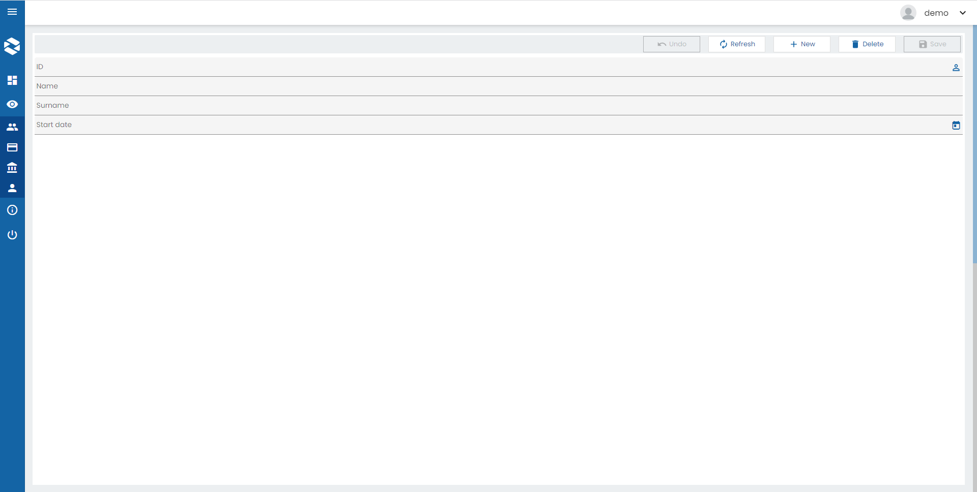
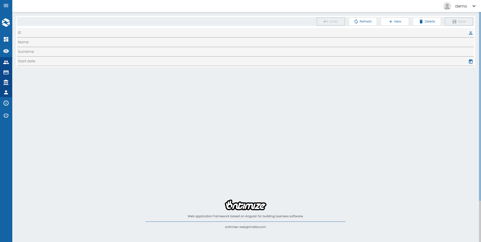
Form
Forms are the backbone of management applications. They are used in applications to request information from the user or display data. OntimizeWeb allows you to add a form and insert form fields into it very easily.
The o-form component allows to display data from the server and also to insert, update and delete records in the database. This can be easily achieved by setting some attributes such as service and entity. Check these and other attributes in the API section of this page.
Modes
The o-form component has different modes depending on the operation that is going to be performed. The form modes may suffer little modifications depending on the form configuration, this is explained in the form lifecycle section. The common description of the different form modes is as follows:
-
Read only mode: The read only mode is used for displaying data. In this mode the form components are not modifiable and the form toolbar shows the buttons to perform CRUD operations (Create, Read, Update and Delete).
-
Update mode: The form component adopts the update mode when the data is going to be modified. In this mode the form components are modifiable and the form toolbar shows the buttons to accept or reject the changes.
-
Insert mode This is the mode used by the form to perform creation operations. In this mode, all the components of the form are empty and modifiable. The form toolbar shows buttons to accept or reject the operation.
There are use cases when it is necessary to perform any action right before or after the form changes from one mode to another. You can achieve this thanks to the events that the o-form emits before and after changing its mode. This events are the following: beforeInsertMode, beforeUpdateMode, beforeInitialMode, onInsertMode, onUpdateMode and onInitialMode.
For example, you can listen to the onInsertMode of the o-form component in your HTML:
<o-form (onInsertMode)="performAction()">
And perform an action each time the event is emited:
  performAction() {
    alert("The form has changed to insert mode!")
  }
However, in case you want to change the mode at the time the screen loads, you can subscribe to the public emitter onFormInitStream thats is emitted when the form is load and use the functions to change the mode such as functions setQueryMode, setInsertMode,setUpdateMode, setInitialMode.
For example:
  this.form.onFormInitStream.subscribe(() => {
      this.form.setInsertMode();
    });
Form lifecycle
A form is called detail form when it is used to manage a piece of data from a collection. The most common use case of a detail form is for displaying the data related to a table, list or grid record. This use case can be achieved with OntimizeWeb by combining the o-form and the o-table, o-list or o-grid component.
You can read more about this topic in the form lifecycle section.
Related components
There are some components that improve the o-form usage adding some features without having to implement them.
Extending a form
In some cases you may want to add of modify the form funtionality, OntimizeWeb allows you to extend the form component, for this, you must follow the next steps:
- Define a new component and add the
@Componentdecorator. - Include the
OFormComponentandOFormMessageServiceclasses as providers of your new component. - Make your component extend the
OFormComponentclass.
Once this steps are done, you can override OFormComponent methods depending on your requirements.
In the step bellow we are creating a custom form and defining its detail not editable modifying the html form definition.
custom-form.component.ts
import { ChangeDetectorRef, Component, ElementRef, Injector, NgZone, forwardRef } from '@angular/core';
import { ActivatedRoute, Router } from '@angular/router';
import { OFormComponent, OFormMessageService } from 'ontimize-web-ngx';

@Component({
  selector: 'custom-form',
  templateUrl: './custom-form.component.html',
  providers: [
    {
      // Include the `OFormComponent` class as a provider of your component
      provide: OFormComponent,
      useExisting: forwardRef(() => CustomFormComponent)
    },
    {
      // Include the `OFormMessageService` class as a provider of your component
      provide: OFormMessageService
    }
  ]
})
export class CustomFormComponent extends OFormComponent {

  constructor(
    _router: Router,
    _actRoute: ActivatedRoute,
    _zone: NgZone,
    _cd: ChangeDetectorRef,
    injector: Injector,
    _elemntRef: ElementRef<OFormComponent>
  ) {
    super(_router, _actRoute, _zone, _cd, injector, _elemntRef);
  }

  /* Override methods depending on your requirements. You can also create new methods. */

  isEditableDetail() {
    return false;
  }

}
custom-form.component.html
<ng-content></ng-content>
Once created the custom form component you can use the custom form template as follows:
your-template.component.html
<custom-form #oForm editable-detail="true" service="your-service" entity="your-entity" keys="your-keys" columns="your-columns">
  <o-text-input attr="your-attr" [data]="oForm.getDataValue('your-attr')"></o-text-input>
</custom-form>
your-template.module.ts
import { NgModule } from '@angular/core';
import { CustomFormComponent } from './your-folder/custom-form/custom-form.component';

@NgModule({
  imports: [
    ...
  ],
  declarations: [
    ...
    CustomFormComponent
  ],
  exports: ...
})
export class BranchesModule { }
You will see that the o-text-input field isn’t editable in your form changin the declaration of your html.
Form container
In some applications you may want to place a breadcrumb component on top of your form. OntimizeWeb allows this using the o-form-container component. Learn more about this component here.
Form layout manager
A very common feature in management applications is to display a form with the details related to a record from a data collection. As a solution to this, OntimizeWeb offers the o-form-layout-manager component, which allows to manage the transitions between the data collection and the form with the detail view with the data record details.
You can read more about this component here.
Filtering of a collection component
A common use of a form is to use the form data entered by the user to request filtered information from a service and display it in a collection component (o-table, o-list or o-grid). OntimizeWeb offers two different solutions for doing this. The simplest way to do this filtering is to set the parent-keys input of the collection component we want to filter, but this will not be enough if we want to apply complex logical filters. In this case, we have to use the filter builder component.
Parent keys filter
Setting the parent-keys input of the table with the attr of the form fields we want to include in the filtering is the simplest and fastest way to filter the collection component data. This approach is not sufficient when you want to apply complex filters using logical operations.
In the following example we have a form component with the field to filter the first name, surname and employee type of an employees table. Note that the table has the parent-keys input configured with the columns involved in the filtering and their corresponding attr’s of the form component. Remember that when the table column and the attr of the form component are the same, you only have to include it once.
Keep in mind that the table will not send any request when the parent keys values are all null. You have to configure the
query-with-null-parent-keysas in the example below to avoid this, but it is not always recommended. Check the table documentation page.
<o-form editable-detail="no" show-header="no">
  <o-column title="{{ 'FILTERS' | oTranslate }}">
    <o-row layout-align="space-between center">
      <o-text-input attr="NAME" read-only="no" fxFlex="33"></o-text-input>
      <o-text-input attr="SURNAME" read-only="no" fxFlex="66"></o-text-input>
    </o-row>

    <o-combo attr="EMPLOYEETYPEID" read-only="no" service="employees" entity="employeeType" columns="EMPLOYEETYPEID;EMPLOYEETYPENAME"
      value-column="EMPLOYEETYPEID" keys="EMPLOYEETYPEID" visible-columns="EMPLOYEETYPENAME" width="33%">
    </o-combo>
  </o-column>

  <o-column title="{{ 'EMPLOYEES' | oTranslate }}">
    <o-table attr="employees" service="employees" entity="employee" columns="EMPLOYEEID;EMPLOYEETYPEID;EMPLOYEENAME;EMPLOYEESURNAME;EMPLOYEEADDRESS;EMPLOYEESTARTDATE;EMPLOYEEEMAIL;OFFICEID"
      visible-columns="EMPLOYEENAME;EMPLOYEESURNAME;EMPLOYEEADDRESS;EMPLOYEEEMAIL;EMPLOYEETYPEID;EMPLOYEESTARTDATE" keys="EMPLOYEEID"
      parent-keys="EMPLOYEENAME:NAME;EMPLOYEESURNAME:SURNAME;EMPLOYEETYPEID" query-with-null-parent-keys="yes" sort-columns="EMPLOYEESURNAME"
      detail-mode="none" insert-button="no" pageable="yes">
      <o-table-column attr="EMPLOYEESTARTDATE" title="EMPLOYEESTARTDATE" type="date" format="LL"></o-table-column>
      <o-table-column attr="EMPLOYEETYPEID" title="EMPLOYEETYPEID">
        <o-table-cell-renderer-service service="employees" entity="employeeType" columns="EMPLOYEETYPEID;EMPLOYEETYPENAME" value-column="EMPLOYEETYPENAME"></o-table-cell-renderer-service>
      </o-table-column>
    </o-table>
  </o-column>
</o-form>
Filter builder
The filter builder is a component whose purpose is to solve the problem described above. It allows to build complex filtering expressions using the data entered in a form component. Read more about the filter builder component here.
Custom form toolbar buttons
o-form-toolbar-buttons is a directive that allows adding custom buttons to the form toolbar.
<o-form attr="customers_form_edit" service="customers" entity="customer" fxLayout="column" show-header="yes"
  header-actions="R;I;U;D" #oDetailForm keys="CUSTOMERID" keys-sql-types="INTEGER" columns="ID_DMS_DOC"
  show-header-navigation="yes">
  <div o-form-toolbar-buttons>
    <button type="button" class="o-form-toolbar-button" mat-stroked-button (click)="onClickCustomButton1($event)"
      attr="accountBalance">
      <mat-icon>account_balance</mat-icon>
      <span>CUSTOM_BUTTON_1</span>
    </button>

    <button type="button" class="o-form-toolbar-button" mat-stroked-button (click)="onClickCustomButton2($event)"
      attr="addShoppingCart">
      <mat-icon>star_border</mat-icon>
      <span>CUSTOM_BUTTON_2</span>
    </button>
  </div>
  ....

Custom form messages
The o-form component displays different messages after ending some actions. OntimizeWeb provides a custom set of messages for this actions that might be overrided using the message-service-type input. For doing that, the user has to define that service as a provider (inside the component module definition, or even the app module, in the same way user might define a service-type) and implement it extending the OFormMessageService class, overriding the methods that returns those messages that want to be changed. User can see the implementation of the OFormMessageService here.
...
  providers: [
    { provide: 'customMessageServiceType', useValue: CustomMessageService },
  ]
...
import { Injectable } from "@angular/core";
import { OFormMessageService } from "ontimize-web-ngx";

@Injectable()
export class CustomMessageService extends OFormMessageService {

  getDiscardChangesConfirmationMessage(): string {
    return 'Are you really sure you want to do this? All changes will be lost';
  }

  getUpdateErrorMessage(): string {
    return 'Saving data failed';
  }

  ...
}
<o-form attr="customers_form_edit" service="customers" entity="customer" keys="CUSTOMERID"
  message-service-type="customMessageServiceType">
  ...
</o-form>
CSS class
To extend the form in your screen, you can use the CSS class fill-form in o-form component.
For example
<o-form class="fill-form" ...>
  ...
</o-form>

And whithout the fill-form class:
<o-form ...>
  ...
</o-form>

Support JDBC UUID
Ontimize web now supports the JDBC UUID sql type. To indicate that a key column is of type UUID, all you have to do is to set to set the UUID via input keys-sql-types in the o-form as indicated in the following example.
 <o-form #form service="..." entity="..." keys="ID" keys-sql-types="UUID" header-position="bottom"
 ... stay-in-record-after-insert="true" header-actions="R;I;U;D">

  ....
</o-form>
Set-value-order
The o-form doesn’t guarantee the order in which the fields will be filled. If a field value is required by another one (as a parent-key of a form field, an error could be produced).
In principle, the default filler should be right in most cases, but with this parameter the filler order can be established. It isn’t necessary to establish every field attribute. The attributes specified in this parameter are filled first.
Input form-data-validation-function
Ontimize Web allows to execute the before-save validation callback for insert and update operations in o-form.
If the validation fails, it displays an alert with the corresponding messages and prevents the operation from proceeding.
<o-form #form attr="customers_form_edit" ... [form-data-validation-function]="validateBeforeSave"></form>
@ViewChild('form') form: OFormComponent;

validateBeforeSave= (data: any): OFormValidation => {

  const errors: string[] = [];

  if (this.form.isInInsertMode() && !data.name) {
    errors.push('Name is required.');
  }

  if (this.form.isInUpdateMode() && data.status === 'inactive') {
    errors.push('Cannot update a record with inactive status.');
  }
  return { valid: errors.length === 0, title: ' Inactive status ', messages: errors }
}