Text
The o-text-input component is used in forms for getting or displaying text input submitted by the user.
The text input is automatically registered on its parent o-form, which provides the value for the input programatically. Its value can be also set manually via the data parameter. This and other attributes are explained on the API section of this page.
Basic example
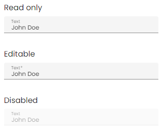
<o-form editable-detail="no" show-header="no">
    <o-text-input attr="name" label="Name" data="Jhon Doe"></o-text-input>
    <o-text-input attr="city" label="City" data="Toronto" read-only="no" required="yes"></o-text-input>
    <o-text-input attr="state" label="Country" data="Canada" enabled="no"></o-text-input>
</o-form>
You can see this and more examples of this component in the OntimizeWeb playground.
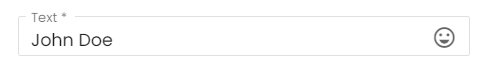
Prefix and suffix
Custom content can be included before and after the input tag, as a prefix or suffix adding the oMatPrefix directive to an element inside the
   <o-text-input attr="input" label="Text" data="John Doe" read-only="no" required="yes">
      <mat-icon oMatSuffix>sentiment_very_satisfied</mat-icon>
    </o-text-input>
String case
If your use case requires to manage value in lowercase or uppercase, you can do so by setting string-case input in o-text-input. This behavior can be configured globally using the O_INPUTS_OPTIONS injection token.
<o-text-input attr="ADDRESS" class="gap" string-case="uppercase"></o-text-input>
or/and
...
  { provide: O_INPUTS_OPTIONS, useValue: {stringCase: 'uppercase' } },
...
Regulate-pattern
You can use regulate-pattern attribute to restrict inputs based on a regex pattern.
<o-text-input #inputRepulate attr="input-repulate" label="Only Numbers" read-only="no" required="yes" regulate-pattern="^[A-Z]*$"></o-text-input>
Here the o-text-input is regulated to have only numbers any other inputs will be restricted
Validation
The o-text-input shows automatically an error message when the required attribute is set to “yes” and there is no value on the input.