Date range
This component is available since version 15.4.0.
The o-daterange-input component is based on Angular Material and is used in forms for getting or displaying start and end date values as a range from a calendar pop-up or by entering the value directly in an HTML input text box. .
The date range input is automatically registered on its parent o-form, which provides the value for the input programatically. Its value can be also set manually via the data parameter. This and other attributes are explained on the API section of this page.
Basic example
<o-form editable-detail="no" show-header="no" layout-direction="column">
<div fxLayout="column" layout-padding>
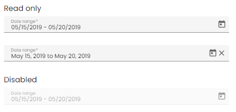
<label>Read only</label>
<o-daterange-input attr="daterange1" label="DateRange" required="yes" [data]="valueTimestamp">
</o-daterange-input>
</div>
<div fxLayout="column" layout-padding>
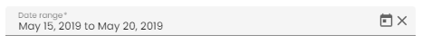
<label>Editable</label>
<o-daterange-input attr="daterange2" label="DateRange" read-only="no" required="yes" [data]="valueTimestamp"
format="LL" separator=" to " [touch-ui]="mode.checked">
</o-daterange-input>
</div>
<div fxLayout="column" layout-padding>
<label class="input-comp-title">Disabled</label>
<o-daterange-input attr="daterange3" label="DateRange" enabled="no" [data]="valueTimestamp">
</o-daterange-input>
</div>
</o-form>
export class InputDateRangeComponent {

  public selected = {};
  public valueTimestamp: { startDate: number; endDate: number; };

  constructor() {

     this.selected = {
      startDate: moment('2019-05-15T00:00Z'),
      endDate: moment('2019-05-20T00:00Z')
    };

    this.valueTimestamp = {
      startDate: this.selected['startDate'].valueOf(),
      endDate: this.selected['endDate'].valueOf()
    }
  }
}
Disable the text input
It is possible to disable the date range input by adding the text-input-enabled property is set to “no”. By default, the value is true .
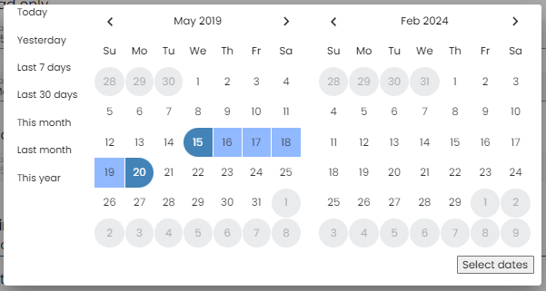
Touch UI mode
The o-daterange-input normally opens as a popup under the input, however the component has a touch-ui property that can be set to true in order to enable a more touch friendly UI where the calendar opens in a large dialog.
Customizing the parse and display formats
The o-daterange-input supports date Moments formats setting, all you have to do is to set the format via format input. The format MomentJS by default is L (see Localized formats in MomentJS format)
<div fxLayout="column" layout-padding>
  <o-daterange-input attr="daterange" label="Date range" read-only="no"
    required="yes" [data]="valueTimestamp" format="LL" separator=" to " text-input-enabled="no">
  </o-daterange-input>
</div>
export class InputDateRangeComponent {

  public selected = {};
  public valueTimestamp: { startDate: number; endDate: number; };

  constructor() {

     this.selected = {
      startDate: moment('2019-05-15T00:00Z'),
      endDate: moment('2019-05-20T00:00Z')
    };

    this.valueTimestamp = {
      startDate: this.selected['startDate'].valueOf(),
      endDate: this.selected['endDate'].valueOf()
    }
  }
}
StartKey and endKey
Theses 2 options are for the key you want for the value, default are startDate and endDate, it means the value we have from ngModel are: {startDate: Date, endDate: Date} by default;
Specifying startKey and endKey would have different model. For example, the model in the example below would be {start:Date, endDate:Date}.
<o-daterange-input attr="daterange" label="Date range" read-only="no" startKey="start" endKey="end"
  required="yes" [data]="valueTimestamp" format="LL" separator=" to "  text-input-enabled="no">
</o-daterange-input>
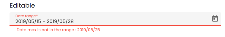
Validation
The o-daterange-input shows automatically an error message when the required attribute is set to “yes” and there is no value on the input.
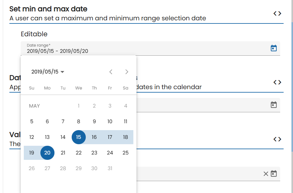
The min and max properties will disable all dates on the calendar popup before or after the respective values and prevent the user from advancing the calendar past the month or year (depending on current view) containing the min or max date.
 <o-daterange-input attr="daterange4" label="Date range" read-only="no" required="yes"
       format="YYYY/MM/DD" value-type="string" min="2019/05/05" max="2019/05/25" [data]="valueString">
  </o-daterange-input>
export class InputDateRangeComponent {

  public selected = {};
  public valueTimestamp: { startDate: number; endDate: number; };

  constructor() {

    this.selected = {
      startDate: moment('2019-05-15T00:00Z'),
      endDate: moment('2019-05-20T00:00Z')
    };

    this.valueString = {
      startDate: '2019/05/15',
      endDate: '2019/05/20'
    };
  }
}
You can see this and more examples of this component in the OntimizeWeb playground.