List
The o-list component is used to display a series of items. There is different types of predefined list items you can add to the list component.
Data binding
The o-list component supports data binding and you can command the component to display data either from local or remote data storage
The data array can be provided in two ways:
- Provide an array of objects to the
static-dataattribute. - Configure the component to query the data from a service. Using
serviceandentityattributes.
Passing function calls directly to
static-data(e.g.[static-data]="getData()") is a bad practice that causes continuous re-evaluation and leads to malfunctioning behavior in components such as o-list, o-table, o-grid and o-tree. Always pass a static reference instead (e.g.[static-data]="data").
List item
For adding a list component to your application you must insert the o-list in your page and include a o-list-item component wrapping the desired list item type you want to display. Check the different list items types below.
List item: text
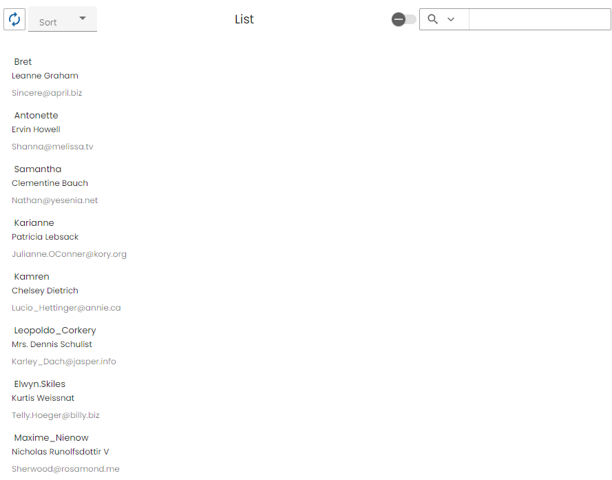
The o-list-item-text component is used to display list items with a maximum of two lines of text and a title.
<o-list #list keys="id" columns="id;name;username;email" [static-data]="users"
  title="List" quick-filter="true" quick-filter-columns="name;username;email"
  refresh-button="true" insert-button="false" delete-button="false"
  selectable="false" detail-button-in-row="false"
  detail-button-in-row-icon="chevron_right" edit-button-in-row="false"
  edit-button-in-row-icon="edit" detail-mode="none" pagination-controls="false"
  page-size-options="5;10" insert-button-position="bottom" show-buttons-text="false">
  <o-list-item *ngFor="let row of list.dataArray">
    <o-list-item-text #item  title="{{ row.username }}"
      primary-text="{{ row.name }}" secondary-text="{{ row.email }}" (icon-action)="addToFavorites(row, item)">
    </o-list-item-text>
  </o-list-item>
</o-list>
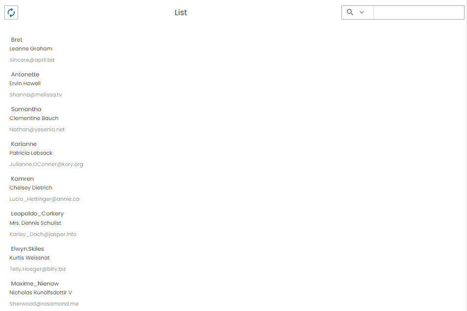
You can see an example of this component in the OntimizeWeb playground.
List item: avatar
The o-list-item-avatar component is used to display list items with an avatar and a maximum of two lines of text and a title.
<o-list #list keys="id" columns="id;name;username;email" [static-data]="users"
  title="List" quick-filter="true" quick-filter-columns="name;username;email"
  refresh-button="true" insert-button="false" delete-button="false"
  selectable="false" detail-button-in-row="false"
  detail-button-in-row-icon="chevron_right" edit-button-in-row="false"
  edit-button-in-row-icon="edit" detail-mode="none">
  <o-list-item *ngFor="let row of list.dataArray">
    <o-list-item-avatar #item  avatar="{{ row.thumbnailUrl }}" title="{{ row.username }}" primary-text="{{ row.name }}"
      secondary-text="{{ row.email }}" (icon-action)="addToFavorites(row, item)">
    </o-list-item-avatar>
  </o-list-item>
</o-list>
![]()
You can see an example of this component in the OntimizeWeb playground.
List item: card
The o-list-item-card component is used to display a card list item with text, image and action buttons.
<o-list #list attr="list" title="List" columns="id;name;username;email;street;phone" keys="id"
  [static-data]="data" refresh-button="true" quick-filter="true" insert-button="false"
  row-height="medium" detail-mode="none">
  <o-list-item *ngFor="let row of list.dataArray">
    <o-list-item-card #item title="{{ row.username }}" subtitle="{{ row.name }}" show-image="true" image="{{ row.image }}"
      action-1-text="ACTION 1" action-2-text="ACTION 2"
      (action-1)="onAction1()" (action-2)="onAction2()">
    </o-list-item-card>
  </o-list-item>
</o-list>
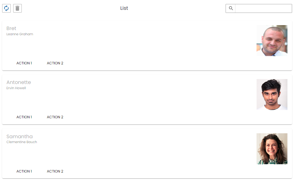
You can see an example of this component in the OntimizeWeb playground.
List item: card image
The o-list-item-card-image component is used to display card list items with a big image.
<o-list #list attr="list" title="List" columns="id;name;username;email;street;phone" keys="id"
  [static-data]="data" refresh-button="true" insert-button="false"
  quick-filter="no" row-height="medium" detail-mode="none">
  <o-list-item *ngFor="let row of #list.dataArray">
    <o-list-item-card-image title="{{ row.username }}" subtitle="{{ row.name }}" content="{{ row.body }}"
      image="{{ row.image }}" action-1-text="ACTION 1" action-2-text="ACTION 2" (action-1)="onAction1()" (action-2)="onAction2()"
       (icon-action)="onIconAction()" collapsible="false" collapsed="true">
    </o-list-item-card-image>
  </o-list-item>
</o-list>
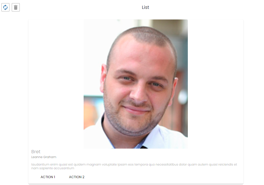
You can see an example of this component in the OntimizeWeb playground.
Custom list item
When building an o-list component you can include one of the predefined list items the OntimizeWeb offers or you can include your own list item. For including a custom list item, OntimizeWeb offers the o-list-item directive that can be attached to an angular material list item (mat-list-item) or an angular material card (mat-card).
<o-list #list attr="list" columns="id;name;username;email;street;phone" quick-filter-columns="name;username" [static-data]="data">
  <mat-card *ngFor="let row of list.dataArray" [o-list-item]="row">
    <mat-card-header>
      <div mat-card-avatar>
        <img src="{{ row.image }}" fxFill />
      </div>
      <mat-card-title>{{ row.name }}</mat-card-title>
      <mat-card-subtitle>{{ row.body }}</mat-card-subtitle>
    </mat-card-header>
  </mat-card>
</o-list>
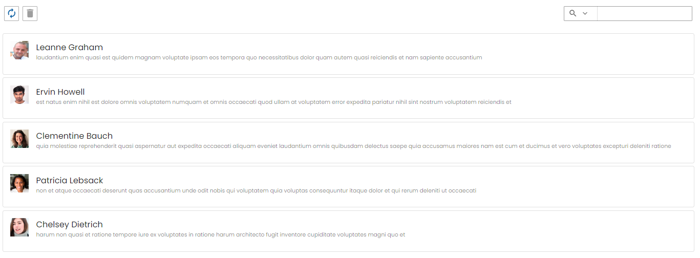
Custom content in toolbar
The o-list component allows to add content in the toolbar with the selector o-list-toolbar at start position by default but you can configure the position with position='start' at the start or at the end with the position='end'.
If the selector o-list-toolbar is used together with position='start' the content will always be placed to the right of the New/Refresh/Delete buttons and if used together with position='end' the content will always be placed to the left of the quickfilter
<o-list #list attr="list" ... refresh-button="yes" quick-filter="yes" ... >
  <!-- Custom content toolbar in position start -->
  <o-combo o-list-toolbar position="start" label="Sort" width="100px" ... ></o-combo>
  <!-- Custom content toolbar in position end -->
  <o-slide-toggle o-list-toolbar position="end" ... ></o-slide-toggle>
</o-list>
Pagination
By default, the list is not paginating the data, but if you want that behaviour you must set pagination-controls= "yes" in the o-list component.
The paginator displays a dropdown of page sizes for you to choose from. The options for this dropdown can be set via page-size-options. For more information see the API.
You can also configure the number of records initially displayed with query-rows attribute.
Support JDBC UUID
Ontimize web now supports the JDBC UUID sql type. To indicate that a key column is of type UUID, all you have to do is to set to set the UUID via input keys-sql-types in the o-list as indicated in the following example.
<o-list  #list service="..." entity="..." keys="ID" keys-sql-types="UUID">
  <o-list-item *ngFor="let list of list.dataArray">
     ....
  </o-list-item>
</o-list>