Dialog
The DialogService service can be used to open modal dialogs.
There are five types of dialog
- Alert : In this case the dialog open it with the
alert()method. - Info : In this case the dialog open it with the
info()method. - Warning : In this case the dialog open it with the
info()method. - Error : In this case the dialog open it with the
error()method. - Confirm : In this case the dialog open it with the
confirm()method.
Check the methods of the DialogService in the API section of this page.
Basic example
<o-button attr="info" type="RAISED" label="DIALOG.INFO_DIALOG" layout-padding (click)="showInfo($event)"></o-button>
constructor(
protected dialogService: DialogService) {
}
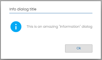
showInfo(evt: any) {
if (this.dialogService) {
this.dialogService.info('Info dialog title',
'This is an amazing "Information" dialog');
}
}
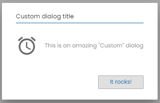
ODialogConfig
Through ODialogConfig you can configure component parameters as type of alert, the text of ‘ok’ button, the text of ‘cancel’ button and the icon.
For example
const config: ODialogConfig = {
          icon: 'alarm',
          okButtonText: 'It rocks!'
        };
        this.dialogService.info('Info dialog title',
          'This is an amazing "Information" dialog', config);
Get Response of Dialog
You can get the response of the dialog, for example, in a confirm Dialog you can get that confirmation or cancellation.
Example
  showConfirm(evt: any) {
    if (this.dialogService) {
      this.dialogService.confirm('Confirm dialog title', 'Do you really want to accept?');
      this.dialogService.dialogRef.afterClosed().subscribe( result => {
        if(result) {
          // Actions on confirmation
        } else {
          // Actions on cancellation
        }
      })
    }
  }
You can see examples of this section in the OntimizeWeb playground.