Gallery
Introduction
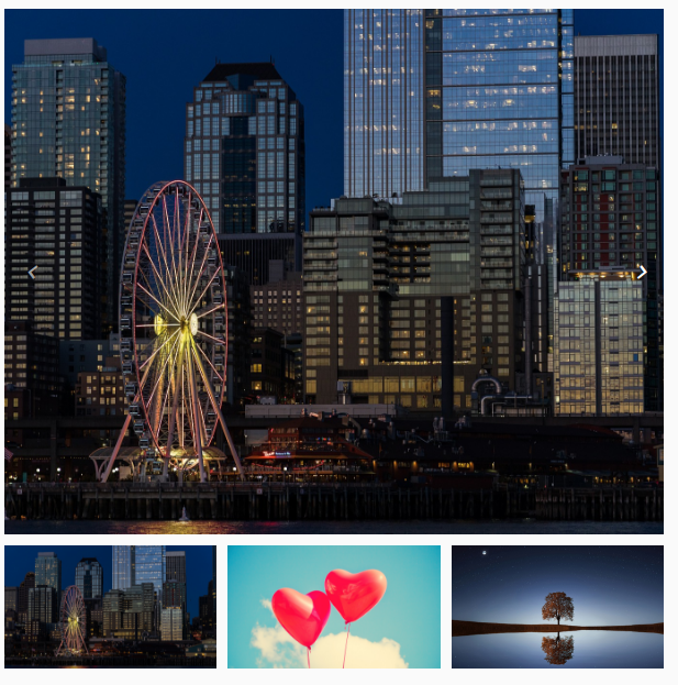
The o-gallery component allows to create beautiful image and videos galleries for the web and mobile devices like a carousel.
Gallery
By itself, the <o-gallery> element does not render anything, it’s necessary to configure the array de images in gallery-images input. For more information see the API.
<o-gallery [gallery-images]="galleryImages"></o-gallery>
  this.galleryImages = [
      {
        small: 'assets/images/photo1.jpg',
        medium: 'assets/images/photo1.jpg',
        big: 'assets/images/photo1.jpg'
      }, {
        small: 'assets/images/photo2.jpg',
        medium: 'assets/images/photo2.jpg',
        big: 'assets/images/photo2.jpg'
      }, {
        small: 'assets/images/photo3.jpg',
        medium: 'assets/images/photo3.jpg',
        big: 'assets/images/photo3.jpg'
      }
    ];
  or
   this.galleryImages = [
      {
        medium: 'assets/images/photo1.jpg'
      }, {
        medium: 'assets/images/photo2.jpg',
      }, {
        medium: 'assets/images/photo3.jpg'
      }
    ];
    ...
Options
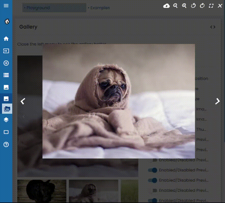
The o-gallery component allow multiple options for configurating with gallery-options input such as width, height, thumbnails configuration, preview configuration, …
<o-gallery [gallery-images]="galleryImages" [gallery-options]="galleryOptions"></o-gallery>
...
  this.galleryImages = [
      {
        small: 'assets/images/photo1.jpg',
        medium: 'assets/images/photo1.jpg',
        big: 'assets/images/photo1.jpg'
      },
      {
        small: 'assets/images/photo2.jpg',
        medium: 'assets/images/photo2.jpg',
        big: 'assets/images/photo2.jpg'
      },
      {
        small: 'assets/images/photo3.jpg',
        medium: 'assets/images/photo3.jpg',
        big: 'assets/images/photo3.jpg'
      },
      {
        small: 'assets/images/i_video.jpg',
        medium: 'assets/videos/video1.mp4',
        big: 'assets/videos/video1.mp4'
      }
    ];

      this.galleryOptions = [
      {
        breakpoint: 1920,
        height: "200px",
        width: "300px",
        image: true,
        thumbnails: false,
        preview: false
      }
    ];
    ...
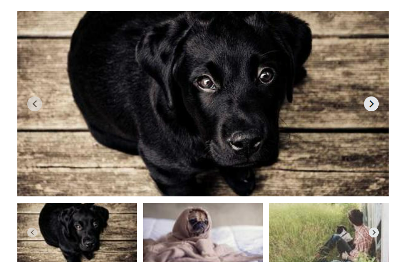
Swipe
The o-gallery component allows to navigate images and videos with mouse, touch, and keyboard events in the thumbnail, image slider or/and preview section with thumbnailsSwipe, imageSwipe, previewSwipe in gallery-options input. The default values are true.
Aspect ratio
By default, the image width and height is calculated depends on height, width and imagePercent in gallery-options input and the thumbnail width and height is calculated depends on height, width, thumbnailPercent, thumbnailsColumns or thumbnailsRows in gallery-options
However, the o-gallery component allows you to define the desired width-to-height ratio with aspectRatio in gallery-options input
NOTE:: If the aspect ratio is configured in the
o-gallerycomponent, the height property is disabled, so that the height of the gallery will depend on the width and the configured ratio
 this.galleryOptions = [
    {
      width: "600px",
      thumbnailsColumns: 3,
      aspectRatio:"4:2"
    }
  ];
Actions
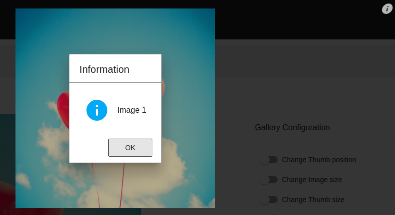
You can add “actions” to the gallery, it shows icons on the top right corner and trigger your custom method.
Form example
constructor(
  protected dialogService: DialogService) {
}


showInfo(event: Event, i: number): void {
  this.dialogService.info('INFO', 'Image ' + i);
}


ngOnInit(): void {

  // bind "this" to the method callback before assign if not lost context
  this.showInfo = this.showInfo.bind(this);

  this.galleryOptions = [
    {
      ...
      actions: [
        { icon: 'info', onClick: this.showInfo, titleText: 'info' }
      ]
    ...
    }
  ]
}