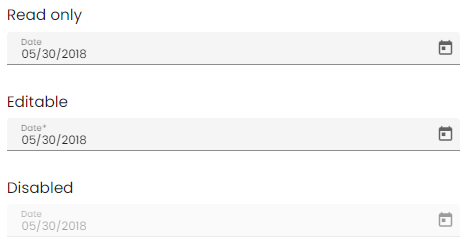
Date
The o-date-input component is used in forms for getting or displaying date input submitted by the user.
The date input is automatically registered on its parent o-form, which provides the value for the input programatically. Its value can be also set manually via the data parameter. This and other attributes are explained on the API section of this page.
Basic example

<o-form editable-detail="no" show-header="no">
    <o-date-input attr="date1" label="Date"></o-date-input>
    <o-date-input attr="date2" label="Date" read-only="no" required="yes" format="LL"></o-date-input>
    <o-date-input attr="date3" label="Date" enabled="no"></o-date-input>
</o-form>
Disable the text input
It is possible to disable the date input by adding the text-input-enabled property is set to “no”. By default, the value is true .
Touch UI mode
The o-dateinput normally opens as a popup under the input, however the component has a touch-ui property that can be set to true where the calendar opens in a large dialog.
Setting the calendar starting view
The startView property of o-date-input can be used to set the view that will show up when the calendar first opens. It can be set to month or year; by default it will open to month view
Validation
The o-date-input shows automatically an error message when the required attribute is set to “yes” and there is no value on the input.
You can see this and more examples of this component in the OntimizeWeb playground.