Checkbox
The o-checkbox component is used in forms for getting or displaying multiple option selection input submitted by the user.
The checkbox is automatically registered on its parent o-form, which provides the value for the checkbox programatically. Its value can be also set manually via the data parameter. This and other attributes are explained on the API section of this page.
Basic example
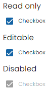
<o-form editable-detail="no" show-header="no">
    <o-checkbox attr="checkbox1" label="Checkbox" [data]="true" read-only="no" required="yes"></o-checkbox>
    <o-checkbox attr="checkbox2" label="Checkbox" enabled="no"></o-checkbox>
</o-form>
You can see this and more examples of this component in the OntimizeWeb playground.