Table
Introduction
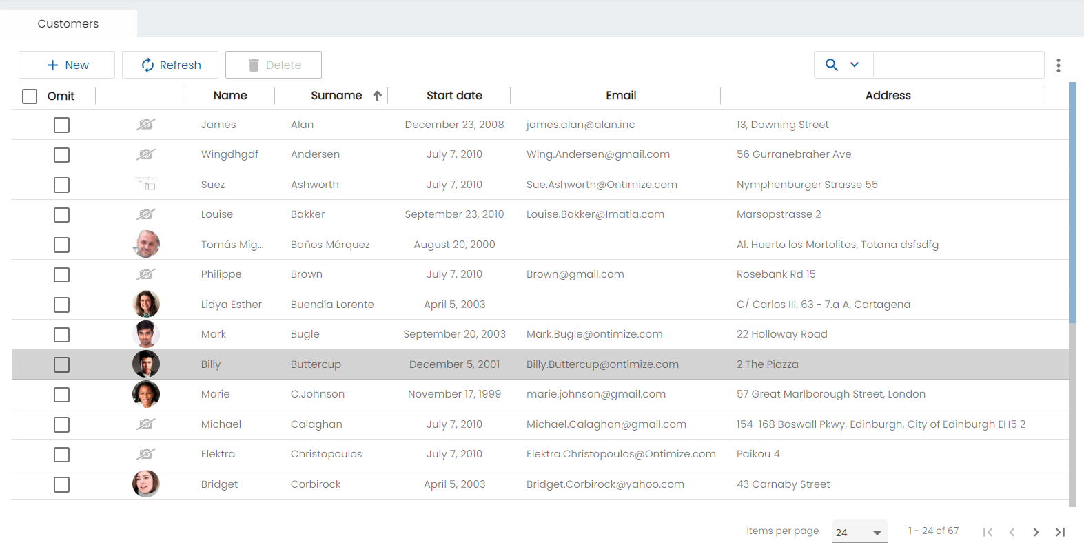
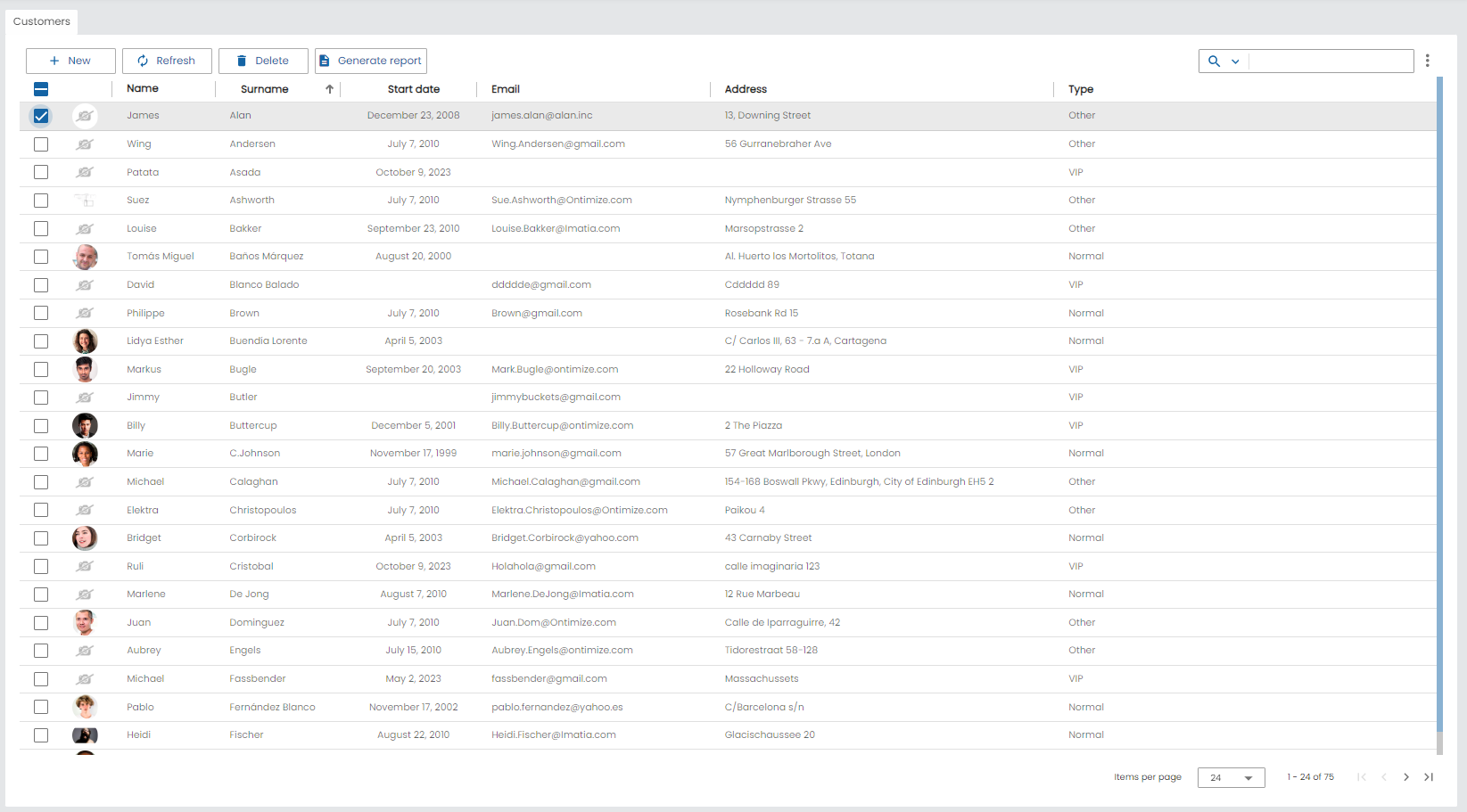
The o-table provides a table of data that can be used to display rows of data and include a ready-to-use features like crud operations, paging, filtering, sorting, editing, grouping, resizing, exporting to PDF and excel, and virtual scrolling.
If the table also is inside a form, the attr property is required for registry the table in the form.
WARNING: table is storing changes made by user (order changes, filters, etc.) in the browser local storage. That values will take precedence over table html definition. For example: if a ID column is not in the sort-columns attribute but the user has ordered other column it manually, it will be order in future loads. For restoring initial state is enough to go to the Configuration -> Load Configuration option in the table menu and load the default configuration that deletes in browser local storage and restore the values defined over table html definition.
To define a table, it is necessary to define the columns
You can define it as follows:
- Using the input
columns, adding the columns separated by ‘;’. - Using the
o-table-columncomponent. If o-table component contains inner o-table-column elements, using renderers and editors defined in them. If you use this option, theattrattribute is required. For more information see the API.
With visible-columns you can indicate which columns will be visible. You can also use default-visible-columns input to select which columns of the setted ones in visible-columns will be visible on first load, user will be able to show or not columns in context menu of the table.
Using default renderer (o-table-cell-renderer-string) if column attr is present in visible-columns attribute from its parent o-table. In the same way, using the default editor (o-table-cell-editor-string) if column attr is contained in the editable-columns attribute from its parent o-table.
Define columns
Firstly, you must define the columns of the entity that queries the database in columns, in visible-columns you can configure the visible columns.
You can represent the columns in extended mode with o-table-column component. To define a column it’s necessary to add the attr property in the visible-columns property, with the exception of the columns generated for the calculated columns. To consult all the parameters of the ‘o-table-column’ see the API.
Example
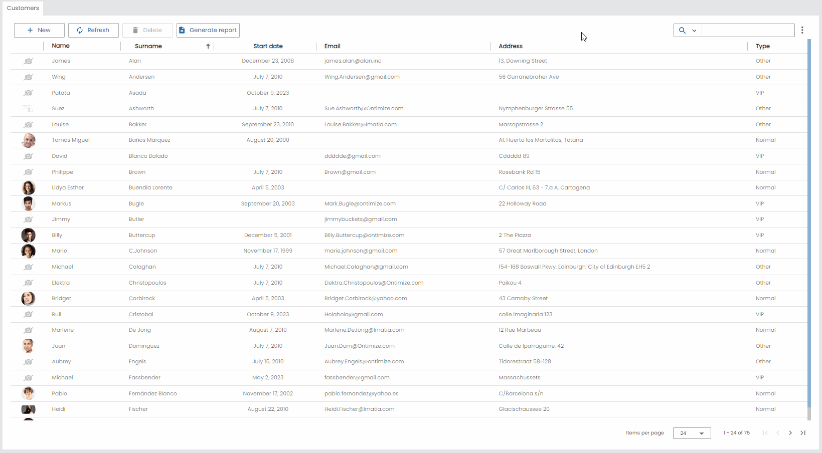
<o-table attr="customers" entity="ECustomers" title="CUSTOMERS"
  columns="CUSTOMERID;PHOTO;NAME;STARTDATE;CUSTOMERTYPEID;BOOLEAN;INTEGER;REAL;CURRENCY"
  visible-columns="PHOTO;NAME;STARTDATE;CUSTOMERTYPEID;BOOLEAN;INTEGER;REAL;CURRENCY"
  editable-columns="NAME;STARTDATE;CUSTOMERTYPEID;BOOLEAN;INTEGER;REAL;CURRENCY"
  sort-columns="SURNAME" keys="CUSTOMERID" parent-keys="n:NAME;CUSTOMERTYPEID"
  query-on-init="true" query-rows="6" quick-filter="yes" insert-table="yes">
  <!--definition o-table-column-->
  <o-table-column attr="PHOTO" orderable="no" searchable="no" type="image"
    image-type="base64" empty-image="assets/images/no-image.png" avatar="yes">
  </o-table-column>
  <o-table-column attr="NAME" title="NAME"></o-table-column>
  <o-table-column attr="STARTDATE" title="STARTDATE" type="date"
    format="MM/DD/YYYY HH:mm:ss">
  </o-table-column>
  <o-table-column attr="CUSTOMERTYPEID" title="TYPE" editable="true">
    <o-table-cell-renderer-service entity="ECustomerTypes"
      value-column="CUSTOMERTYPEID"
      columns="CUSTOMERTYPEID;DESCRIPTION" visible-columns="DESCRIPTION">
    </o-table-cell-renderer-service>
  </o-table-column>
  <o-table-column attr="BOOLEAN" title="BOOLEAN" type="boolean"
    true-value-type="string" true-value="YES"
    false-value-type="icon" false-value="not_interested">
  </o-table-column>
  <o-table-column attr="INTEGER" title="INTEGER" type="integer" grouping="yes"
    thousand-separator=".">
  </o-table-column>
  <o-table-column attr="REAL" title="REAL" type="real" grouping="yes"
    thousand-separator="." decimal-separator="," max-decimal-digits="4">
  </o-table-column>
  <o-table-column attr="CURRENCY" title="CURRENCY" type="currency"
    currency-symbol="€" currency-symbol-position="right" grouping="yes"
    thousand-separator="." decimal-separator="," max-decimal-digits="2">
  </o-table-column>

</o-table>
CRUD operations
The o-table allows to perform the basic operations like create, read, update and delete. There are various ways you can use for editing like cell editing by click on them or use an o-form component to edit the currently selected item.
Ontimize Web provides several modes for editing its data by o-form like editable detail, dialog, split pane, tabs. For more information about o-form lifecycle you can see this url and the dialog, split pane, tabs modes are explained in o-form-layout-manager component.
These operations are available from the table toolbar or from the context menu. This operations are configured by default if detail-mode is other than none but you can disable them with delete-button='no', insert-button='no', refresh-button='no'
Sorting
Since this functionality is built-in, all you have to do is to set the sorting configuration via sort-columns input in the o-table component using [ ASC or DESC ] format.
All columns are sortable by default, if you don’t want to avoid to set column as sortable you must add sortable= "no" in its column definition.
Example
<o-table attr="customers" entity="ECustomers" keys="CUSTOMERID" sort-columns="SURNAME:DESC"
  columns="CUSTOMERID;PHOTO;NAME;STARTDATE;CUSTOMERTYPEID;BOOLEAN;INTEGER;REAL;CURRENCY"
  visible-columns="PHOTO;NAME;STARTDATE;CUSTOMERTYPEID;BOOLEAN;INTEGER;REAL;CURRENCY"
  query-on-init="true" query-rows="6" quick-filter="yes" insert-table="yes">
...
  <o-table-column attr="SURNAME" orderable="yes" searchable="no" type="string">
  </o-table-column>
</o-table>
Pagination
By default, the table is paginating the data, but if you want avoid that behaviour you must set pagination-controls= "no" in the o-table component.
You can configure the pagination using the o-table-paginator component inside the table. For more information see the API.
You can also configure the number of records initially displayed with query-rows attribute.
Below is an example of how to define a paginator for the table.
Example
<o-table attr="customers" entity="ECustomers" title="CUSTOMERS"
  columns="CUSTOMERID;PHOTO;NAME;STARTDATE;CUSTOMERTYPEID;BOOLEAN;INTEGER;REAL;CURRENCY"
  visible-columns="PHOTO;NAME;STARTDATE;CUSTOMERTYPEID;BOOLEAN;INTEGER;REAL;CURRENCY"
  sort-columns="SURNAME" keys="CUSTOMERID" parent-keys="n:NAME;CUSTOMERTYPEID"
  query-on-init="true" query-rows="6" quick-filter="yes" >

  <o-table-button attr="myButton" label="My button" icon="account_circle"></o-table-button>
  <o-table-column attr="NAME" title="NAME"></o-table-column>

  <o-table-paginator page-size="20"></o-table-paginator>
</o-table>
Data binding
The o-table component supports data binding and you can command the component to display data either from local or remote data storage
Binding to local data
For local data binding you simply need to supply an array of TypeScript objects/JSON via the static-data property. Adicional, you need to set query-on-init="false" in the o-table component.
Example
 <o-table attr="accounts" columns="CARDID;CARDTYPE;NUMCARD;TOTALCREDIT;TOTALREADY;BALANCE" visible-columns="NUMCARD;TOTALCREDIT;TOTALREADY;BALANCE" title="ACCOUNTS" [static-data]="account" sort-columns="ACCOUNT:DESC" query-on-init="false" quick-filter="yes" insert-button="no" delete-button="no" refresh-button="no" pagination-controls="no" export-button="no">
  <o-table-columns-filter columns="NUMCARD;TOTALCREDIT;TOTALREADY;BALANCE"></o-table-columns-filter>
  <o-table-column attr="NUMCARD" title="NUMCARD">
    <o-table-column-renderer-cardtype></o-table-column-renderer-cardtype>
  </o-table-column>
  <o-table-column attr="TOTALCREDIT" type="currency" title="TOTALCREDIT" thousand-separator="." decimal-separator="," currency-symbol="€" currency-symbol-position="right"></o-table-column>
  <o-table-column attr="TOTALREADY" title="TOTALREADY">
    <o-table-column-renderer-totalready></o-table-column-renderer-totalready>
  </o-table-column>
  <o-table-column attr="BALANCE" title="BALANCE">
    <o-table-column-renderer-balance></o-table-column-renderer-balance>
  </o-table-column>
</o-table>
 const account =  [
    { PRODUCTID: 1, 'PRODUCTNAME': 'Alice Mutton', UNITPRICE: 39, UNITSINORDER: 0, UNITSINSTOCK: 1 },
    { PRODUCTID: 2, 'PRODUCTNAME': 'Gorgonzola Telino', UNITPRICE: 12.5, UNITSINORDER: 70, UNITSINSTOCK: 2 },
    { PRODUCTID: 3, 'PRODUCTNAME': 'Louisiana Hot Spiced Okra', UNITPRICE: 17, UNITSINORDER: 100, UNITSINSTOCK: 4 },
    { PRODUCTID: 4, 'PRODUCTNAME': 'Sir Rodney Scones', UNITPRICE: 10, UNITSINORDER: 40, UNITSINSTOCK: 3 },
    { PRODUCTID: 5, 'PRODUCTNAME': 'Alice Mutton', UNITPRICE: 39, UNITSINORDER: 0, UNITSINSTOCK: 0 }
  ];
If you need the data query to be performed after the parent-keys is updated, query-on-init = false and query-on-bind = true must be changed.
Passing function calls directly to
static-data(e.g.[static-data]="getData()") is a bad practice that causes continuous re-evaluation and leads to malfunctioning behavior in components such as o-list, o-table, o-grid and o-tree. Always pass a static reference instead (e.g.[static-data]="data"). —
Binding to remote data
To manage server data, it is necessary to configure the service and the entity attributes. You may need configure the service-type attribute in case you don’t use the default OntimizeWebService to manage. For more information see in App configuration.
Example
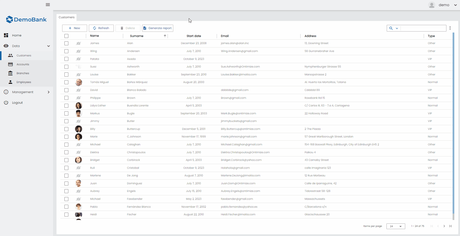
<o-table fxFlex attr="customers" title="CUSTOMERS" service="customers" entity="customer"
keys="CUSTOMERID" columns="CUSTOMERID;PHOTO;NAME;SURNAME;ADDRESS;STARTDATE;EMAIL" visible-columns="PHOTO;NAME;SURNAME;STARTDATE;EMAIL;ADDRESS" sort-columns="SURNAME" query-rows="10" quick-filter="yes" row-height="medium" select-all-checkbox="true">
  <o-table-columns-filter columns="STARTDATE;SURNAME"></o-table-columns-filter>
  <o-table-column async-load="true" width="48px" attr="PHOTO" orderable="no" searchable="no" type="image" image-type="base64"
    empty-image="assets/images/no-image.png" avatar="yes">
  </o-table-column>
  <o-table-column attr="NAME" title="NAME" orderable="no"></o-table-column>
  <o-table-column attr="STARTDATE" title="STARTDATE" type="date" format="LL"></o-table-column>
</o-table>
You can configure the methods by default with the ìnsert-method,update-method,delete-method
By default the filtering is local, you can enable remote filtering setting pageable="yes".
Quick filter
This option is enabled by default and the filter is visible in the top right. You can disable it setting quick-filter="no". You can also configure filtering to be case sensitive with filter-case-sensitive="yes". By default, it’s disabled.
This option creates the o-table-quickfilter component within the o-table. This component displays a checkbox list (when you click on the icon) where you can select which columns to filter by when the input value changes, also allows to change the filter case sensitive option during execution.
All columns will be searchable by quickfilter component. The only way to remove columns of beeing searched is by setting searchable input to false in o-column definition, this will make this column to not appear in the checkbox list.
If you want to override this component to configure its options you can define your own quickfilter within your o-table and it will replace the default implementation. You can see its properties configuration in the API section.
<o-table attr="customers" entity="ECustomers" title="CUSTOMERS"
  columns="CUSTOMERID;PHOTO;NAME;STARTDATE;CUSTOMERTYPEID;BOOLEAN;INTEGER;REAL;CURRENCY"
  visible-columns="PHOTO;NAME;STARTDATE;CUSTOMERTYPEID;BOOLEAN;INTEGER;REAL;CURRENCY">

  <o-table-quickfilter placeholder="MY_OWN_PLACEHOLDER" (onChange)="myOnChangeMethod()">
  </o-table-quickfilter>

</o-table>
The option to change the filter case sensitive filtering may not appear if
pageableattribute is setted to false in table component.
Additionally, you can specify default filter function to be applied when the user enters value in the filter textbox in quick-filter-function property.
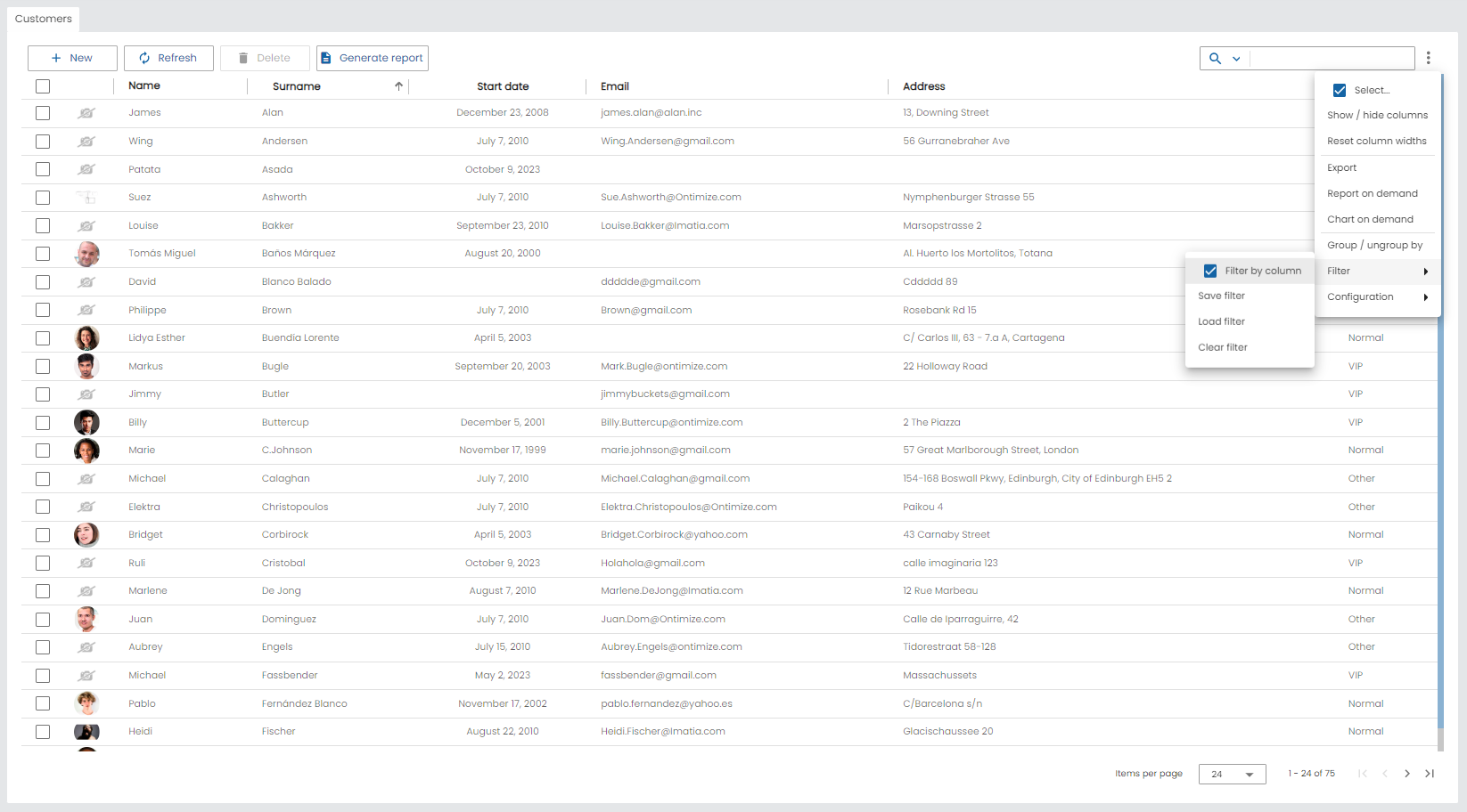
Filtering by columns
This option is active by default but it is also possible to configure filtering by columns as follows:
- Using the input
columnsof the componento-table-columns-filter, adding the columns separated by ‘;’. - Using the
o-table-columns-filter-columncomponent. Ifo-table-columns-filtercomponent contains innero-table-columns-filter-columnelements, theattrof the columns attribute is required. For more information see the API.
This option will be available in table menu and in table header by default. However, you can configure it unavailable in table header with filter-column-active-by-default= 'no'. You can also disable/enable the entire application or a certain module with the O_TABLE_GLOBAL_CONFIG injection token as shown below.
@NgModule({
  declarations: [
  ...
  ],
  ...
  providers: [
    ...
    { provide: O_TABLE_GLOBAL_CONFIG, useValue: { filterColumnActiveByDefault: false } },
    ...
  ],
  ...
})
Example
<o-table service="branches" entity="account" keys="ACCOUNTID"
    columns="ACCOUNTID;ENTITYID;OFFICEID;CDID;ANID;BALANCE;STARTDATE;ENDDATE;INTERESRATE;ACCOUNTTYP"
    visible-columns="ENTITYID;OFFICEID;CDID;ANID;ACCOUNTTYP;BALANCE,INTERESRATE"
    fxFlex layout-padding attr="accounts" title="ACCOUNTS"
    sort-columns="ANID:DESC" query-on-init="true" quick-filter="yes" filter-case-sensitive="true">
    <o-table-columns-filter columns="OFFICEID;NAME" ></o-table-columns-filter>

    ...

</o-table>
Example with o-table-columns-filter-column component
<o-table service="branches" entity="account" keys="ACCOUNTID"
    columns="ACCOUNTID;ENTITYID;OFFICEID;CDID;ANID;BALANCE;STARTDATE;ENDDATE;INTERESRATE;ACCOUNTTYP"
    visible-columns="ENTITYID;OFFICEID;CDID;ANID;ACCOUNTTYP;BALANCE,INTERESRATE"
    fxFlex layout-padding attr="accounts" title="ACCOUNTS"
    sort-columns="ANID:DESC" query-on-init="true" quick-filter="yes" filter-case-sensitive="true">
    <o-table-columns-filter>
      <o-table-columns-filter-column attr="OFFICEID"> </o-table-columns-filter-column>
      <o-table-columns-filter-column attr="ACCOUNTTYP" sort="desc"> </o-table-columns-filter-column>
    </o-table-columns-filter>

    ...

</o-table>
o-table-columns-filter component can filter in one of three different ways based on the mode property.
| Mode | Description |
|---|---|
| default | Combines selection and custom mode |
| selection | Allows filtering selected by the values in the column. |
| custom | Allows filtering by a form control |
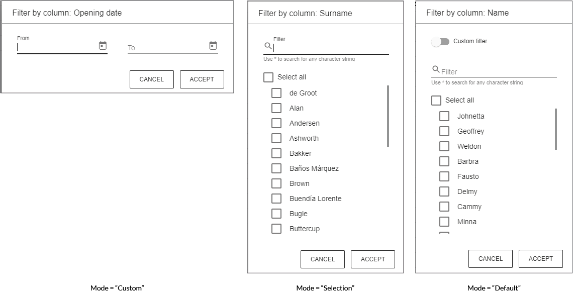
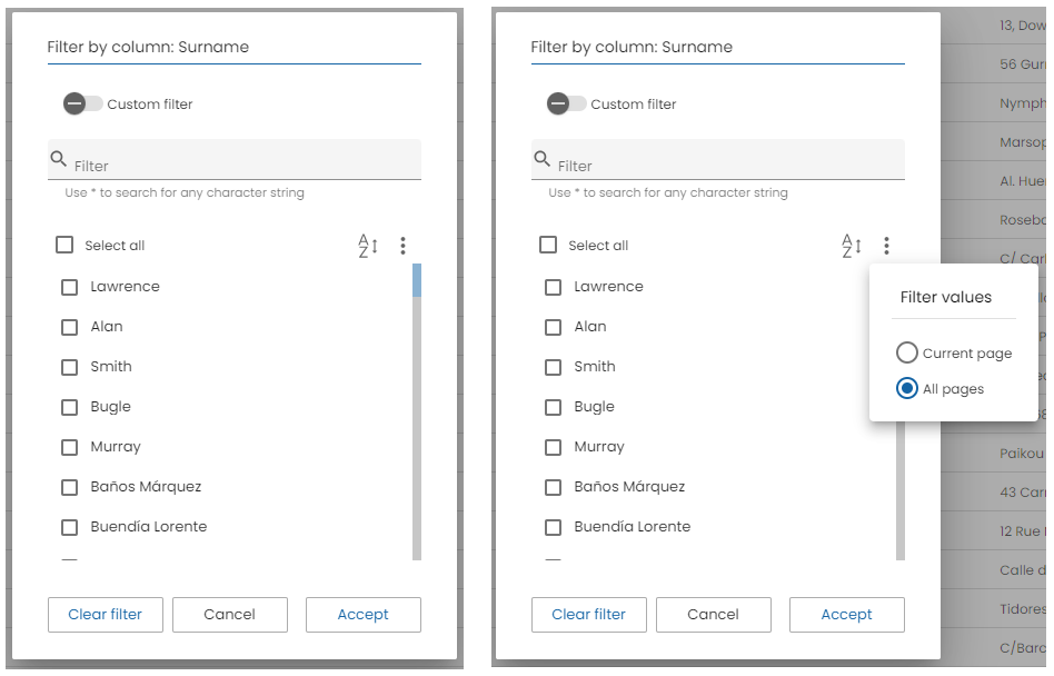
You can also configure whether you want to filter by the values of the current page or by all the values in the table with filter-values-in-data input in o-table-columns-filter and o-table-columns-filter-column. Whether the o-table set pageable=no, the default value is 'all-data', however if set pageable=’yes’ the default value would be 'current-page' .
Additionally, in the o-table-columns-filter-column component you can configure the query-method to supply values asynchronously to the set filter, if this input is configured it is no longer necessary to add filter-values-in-data="all-data".
A button will also appear to the right of the sort button to change whether you want to filter by the values of the current page or all pages.
Example not recommended
 <o-table ...>
      <o-table-columns-filter columns="STARTDATE;SURNAME" filter-values-in-data="all-data">
      </o-table-columns-filter>
</o-table>
Recommended example
 <o-table ...>
      <o-table-columns-filter columns="STARTDATE;SURNAME" >
        <o-table-columns-filter-column attr="SURNAME"  query-method="selectDistinctBySurname"> </o-table-columns-filter-column>
        <o-table-columns-filter-column attr="STARTDATE"  query-method="selectDistinctByStartDate" > </o-table-columns-filter-column>
      </o-table-columns-filter>
</o-table>
WARNING: We recommend configuring the query-method so that the post requests are more optimal, since if it is not configured, all the values will be obtained without taking into account whether they are different.
Filtering date columns
When the column to be filtered is of type date, you can configure how the date value is interpreted and displayed using the date-format and date-value-type inputs.
date-formatsets the format string used to parse and show the date (using moment.js tokens). If not set, the format of theo-table-columnwith the sameattris used automatically.date-value-typedefines how the value is stored internally: as atimestamp(number), astring, as aiso-8601(date) or adateobject.
<o-table service="branches" entity="account" keys="ACCOUNTID"
    columns="ACCOUNTID;STARTDATE;ENDDATE;BALANCE"
    visible-columns="STARTDATE;ENDDATE;BALANCE"
    attr="accounts" title="ACCOUNTS" quick-filter="yes">
    <o-table-columns-filter>
      <o-table-columns-filter-column attr="STARTDATE"
        date-format="DD/MM/YYYY" date-value-type="iso-8601">
      </o-table-columns-filter-column>
    </o-table-columns-filter>
    <o-table-column attr="STARTDATE" type="date"></o-table-column>
</o-table>
Custom filter
OntimizeWeb allows to customize the table data filtering by building your own filters. You can build complex filtering structures by adding the o-filter-builder component to you application.
The o-filter-builder component uses the Expression interface that represents a filtering expression. You can read more about how to build complex filtering expressions here.
Cell renderers
The data is displayed in the table cells as simple text by default. OntimizeWeb allows you to modify the way the data is displayed by adding renderers to the table columns. You have different options to include table cell renderers in your table component:
- Do nothing, the cell data is displayed as simple text.
- Use a predefined cell renderer in the table column. The predefined renderers are: action, boolean, real, currency, date, integer, image, percentage and service.
- Use one of the predefined table cell renderer components that OntimizeWeb offers. This option is equivalent to the previous one.
- Create a custom renderer component and use it in your table.
<!-- 1.Do nothing, simple strings get used to display the table -->
<o-table-column attr="PHOTO" > </o-table-column>

<!-- 2. Use one of cell renderer predefined -->
<o-table-column attr="PHOTO" orderable="no" searchable="no" type="image" image-type="base64" empty-image="assets/images/no-image.png" avatar="yes"></o-table-column>

<!-- 3. Use equivalent code -->
<o-table-column attr="PHOTO" orderable="no" searchable="no">
  <o-table-cell-renderer-image image-type="base64" empty-image="assets/images/no-image.png" avatar="yes"></o-table-cell-renderer-image>
</o-table-column>

<!-- 4. Custom renderer -->
<o-table-column attr="NAME" orderable="no" searchable="no">
  <o-table-cell-renderer-name></o-table-cell-renderer-name>
</o-table-column>
Predefined renderers
OntimizeWeb offers you a set of prebuilt table cell renderers to include in your table. This cell renderers are the following data types: action, boolean, real, currency, date, integer, image, percentage, service, chip and list.
For adding a cell renderer to the cells of a table column, you have to configure the attribute type in the desired table column with the value that indicates the cell render you want to use. You may need to configure additional parametres depending on the cell renderer configured. Check the examples in the following sections and the attributes for each cell renderer in the API section of this page.
You can see different predefined table cell renderers in the example below.
<o-table  attr="accounts"
    columns="PHOTO;NAME;ACCOUNT;ACCOUNTTYP;STARTDATE;HAS_CARDS;CARDS;BALANCE;INTERESRATE;CLOSED;COMMISSION"
    visible-columns="PHOTO;NAME;ACCOUNT;ACCOUNTTYP;STARTDATE;HAS_CARDS;CARDS;BALANCE;INTERESRATE;COMMISSION"
    title="ACCOUNTS" [static-data]="tableData" sort-columns="ACCOUNT:DESC" query-on-init="false" quick-filter="yes" insert-button="no" delete-button="no" refresh-button="no" pagination-controls="no" export-button="no">
  <!--Date Renderer-->
  <o-table-column attr="STARTDATE" title="STARTDATE" type="date"> </o-table-column>
  <!--Currency Renderer-->
  <o-table-column attr="BALANCE" title="BALANCE" type="currency" thousand-separator="." decimal-separator="," currency-symbol="€" currency-symbol-position="right"></o-table-column>
  <!--Percentage Renderer-->
  <o-table-column attr="INTERESRATE" title="INTERESRATE" type="percentage" decimal-separator="," max-decimal-digits="2"></o-table-column>
  <!--Integer Renderer-->
  <o-table-column attr="NUMCARDS" title="NUMCARDS" type="integer"></o-table-column>
  <!--Boolean Renderer-->
  <o-table-column attr="COMMISSION" title="COMMISSION" type="boolean" render-true-value="check_circle" render-false-value="highlight_off" render-type="icon" boolean-type="string"></o-table-column>
  <!--Translate Renderer-->
  <o-table-column attr="HAS_CARDS" title="CARDS">
    <o-table-cell-renderer-translate [translate-params]="translateArgsFn"></o-table-cell-renderer-translate>
  </o-table-column>
  <!--Chip Renderer-->
  <o-table-column attr="ACCOUNTTYP">
    <o-table-cell-renderer-chip></o-table-cell-renderer-chip>
  </o-table-column>
  <!--List Renderer-->
  <o-table-column attr="CARDS"  tooltip="yes">
    <o-table-cell-renderer-list></o-table-cell-renderer-list>
  </o-table-column>
</o-table>
.o-table-cell-renderer-chip-savings_account{
  background-color: #E3ECF4FF;
}
.o-table-cell-renderer-chip-personal_account {
  background-color: #D4C2E9BF;
}
You can see this live example in the OntimizeWeb playground.
Action cell renderer
The action cell renderer is used for displaying a button in a table cell. Include this renderer in your table column by configuring the attribute type in the column with the value action or adding the o-table-cell-renderer-action to the table column.
<o-table-column attr="EMPLOYEENAME" type="action" icon="person" (onClick)="showMessage($event)"></o-table-column>

<!-- Equivalent code -->

<o-table-column attr="EMPLOYEENAME">
  <o-table-cell-renderer-action icon="person" (onClick)="showMessage($event)"></o-table-cell-renderer-action>
</o-table-column>
You can display a text and/or a icon in the cell, also choosing the icon position using the icon-position attribute.
<o-table-column attr="EMPLOYEENAME">
  <o-table-cell-renderer-action icon="person" text="user" icon-position="right"></o-table-cell-renderer-action>
</o-table-column>
When an action cell is clicked you can trigger a predefined action or execute your custom callback. In the first case there are two predefined actions: detail or edit, that will trigger navigation to table detail or edition route. Otherwise, you can listen to the onClick event to perform your defined action. Check the definition of this and more attributes in the API section of this page.
<!-- Navigation to detail mode -->
<o-table-column attr="EMPLOYEENAME">
  <o-table-cell-renderer-action icon="person" action="detail"></o-table-cell-renderer-action>
</o-table-column>

<!-- Triggering showMessage method -->
<o-table-column attr="EMPLOYEENAME">
  <o-table-cell-renderer-action icon="person" (onClick)="showMessage($event)"></o-table-cell-renderer-action>
</o-table-column>
Boolean cell renderer
Include the table cell renderer boolean in your table column by configuring the attribute type in the column with the value boolean or adding the o-table-cell-renderer-boolean to the table column. You can indicate the type of the retrieved data by configuring the boolean-type attribute. Display a custom value by configuring false-value and true-value attributes depending on the false-value-type and true-value-type attributes. Display a custom value by configuring render-false-value and render-true-value attributes depending on the false-value-type and true-value-type attributes. Check the configuration of this attributes in the API section of this page.
<o-table-column attr="COMMISSION" title="COMMISSION" type="boolean" render-true-value="check_circle" render-false-value="highlight_off" render-type="icon" boolean-type="string"></o-table-column>

<!-- Equivalent code -->

<o-table-column attr="COMMISSION" title="COMMISSION">
  <o-table-cell-renderer-boolean render-true-value="check_circle" render-false-value="highlight_off" render-type="icon" boolean-type="string">
  </o-table-cell-renderer-boolean>
</o-table-column>
Currency cell renderer
Include the table cell renderer currency in your table column by configuring the attribute type in the column with the value currency or adding the o-table-cell-renderer-currency to the table column. Configure the currency symbol with the currency-symbol attribute. Check this and other attributes in the API section of this page.
<o-table-column attr="BALANCE" title="BALANCE" type="currency" currency-symbol="€" currency-symbol-position="right" thousand-separator="." decimal-separator=","></o-table-column>

<!-- Equivalent code -->

<o-table-column attr="BALANCE" title="BALANCE">
  <o-table-cell-renderer-currency currency-symbol="€" currency-symbol-position="right" thousand-separator="." decimal-separator=","></o-table-cell-renderer-currency>
</o-table-column>
Also you can configure different currency symbols for each row by using the currency-symbol-column attribute. This attribute specifies the column name in your data that contains the currency symbol for each row.
<o-table-column attr="BALANCE" title="BALANCE" type="currency" currency-symbol-column="currencyCode" currency-symbol-position="right"></o-table-column>

<!-- Equivalent code -->

<o-table-column attr="BALANCE" title="BALANCE">
  <o-table-cell-renderer-currency currency-symbol-column="currencyCode" currency-symbol-position="right"></o-table-cell-renderer-currency>
</o-table-column>
The currency-symbol-column attribute supports nested properties using dot notation:
<o-table-column attr="BALANCE" title="BALANCE" type="currency" currency-symbol-column="currency.symbol"></o-table-column>
Example data structure:
{
  BALANCE: 1500.50,
  currencyCode: "€"
}

// Or with nested properties:
{
  BALANCE: 1500.50,
  currency: {
    symbol: "€",
    code: "EUR"
  }
}
Note: When
currency-symbol-columnis specified, it takes precedence over thecurrency-symbolattribute for each row where the column value is available.
Date cell renderer
You can include the table cell renderer date in your table column by configuring the attribute type in the column with the value date or adding the o-table-cell-renderer-date to the table column. You may want to set the displaying date format by configuring the format attribute. Check this and other attributes in the API section of this page.
<o-table-column attr="STARTDATE" title="STARTDATE" type="date"></o-table-column>

<!-- Equivalent code -->

<o-table-column attr="STARTDATE" title="STARTDATE">
  <o-table-cell-renderer-date></o-table-cell-renderer-date>
</o-table-column>
Integer cell renderer
Include the table cell renderer integer in your table column by configuring the attribute type in the column with the value integer or adding the o-table-cell-renderer-integer to the table column. Check the attributes of this component in the API section of this page.
<o-table-column attr="NUMCARDS" title="NUMCARDS" type="integer"></o-table-column>

<!-- Equivalent code -->

<o-table-column attr="NUMCARDS" title="NUMCARDS">
  <o-table-cell-renderer-integer></o-table-cell-renderer-integer>
</o-table-column>
Image cell renderer
You can include the table cell renderer image in your table column by configuring the attribute type in the column with the value image or adding the o-table-cell-renderer-image to the table column. Check the attributes of this component in the API section of this page.
<o-table-column attr="PHOTO" orderable="no" searchable="no" type="image" image-type="base64" empty-image="assets/images/no-image.png" avatar="yes"></o-table-column>

<!-- Equivalent code -->

<o-table-column attr="PHOTO" orderable="no" searchable="no">
  <o-table-cell-renderer-image image-type="base64" empty-image="assets/images/no-image.png" avatar="yes"></o-table-cell-renderer-image>
</o-table-column>
Percentage cell renderer
You can include the table cell renderer percentage in your table column by configuring the attribute type in the column with the value percentage or adding the o-table-cell-renderer-percentage to the table column. Check the attributes of this component in the API section of this page.
<o-table-column attr="INTERESRATE" title="INTERESRATE" type="percentage" decimal-separator="," max-decimal-digits="2"></o-table-column>

<!-- Equivalent code -->

<o-table-column attr="INTERESRATE" title="INTERESRATE">
  <o-table-cell-renderer-percentage decimal-separator="," max-decimal-digits="2"></o-table-cell-renderer-percentage>
</o-table-column>
Real cell renderer
Include the table cell renderer real in your table column by configuring the attribute type in the column with the value real or adding the o-table-cell-renderer-real to the table column. Check the attributes of this component in the API section of this page.
<o-table-column attr="UNITPRICE" title="UNITPRICE" type="real" thousand-separator="." decimal-separator=","></o-table-column>

<!-- Equivalent code -->

<o-table-column attr="UNITPRICE" title="UNITPRICE">
  <o-table-cell-renderer-real thousand-separator="." decimal-separator=","></o-table-cell-renderer-real>
</o-table-column>
Service cell renderer
The table cell renderer service component is used for retrieving data form an entity that is related to the current table entity. The most common usage of this is displaying some text description when the current table entity has the identifier for that entity.
You can include this component in your table in two different ways:
- Configuring the attribute
typein the column with the value service and including the attributes of the table cell renderer service. Check all the attributes of the table cell renderer service in the API section of this page. - Adding the
o-table-cell-renderer-servicecomponent to the table column like in the example below.
<o-table-column attr="EMPLOYEETYPEID" title="EMPLOYEETYPEID">
  <o-table-cell-renderer-service service="employees" entity="employeeType" columns="TYPEID;EMPLOYEETYPENAME"
    parent-keys="TYPEID:EMPLOYEETYPEID" value-column="EMPLOYEETYPENAME">
  </o-table-cell-renderer-service>
</o-table-column>

<!-- Equivalent code -->

<o-table-column attr="EMPLOYEETYPEID" title="EMPLOYEETYPEID" type="service" service="employees"
  entity="employeeType" columns="TYPEID;EMPLOYEETYPENAME" parent-keys="TYPEID:EMPLOYEETYPEID"
  value-column="EMPLOYEETYPENAME">
</o-table-column>
You can see this example in the OntimizeWeb QuickStart or check the code in GitHub.
Translate cell renderer
You can include the table cell renderer translate in your table column by configuring the attribute type in the column with the value translate or adding the o-table-cell-renderer-translate to the table column. Check the attributes of this component in the API section of this page.
<o-table-column attr="CODE" type="translate"></o-table-column>

<!-- Equivalent code -->

<o-table-column attr="CODE">
  <o-table-cell-renderer-translate></o-table-cell-renderer-translate>
</o-table-column>
Chip cell renderer
The chip table cell renderer allows displaying the content of a table cell as one or multiple visual chips, with support for icons, SVG icons, and automatic translation, set the column type to chip
 <o-table-column attr="status" title="STATUS" type="chip"> </o-table-column>

<!-- Equivalent code -->
<o-table-column attr="status" title="STATUS">
   <o-table-cell-renderer-chip></o-table-cell-renderer-chip>
</o-table-column>
List cell renderer
The list table cell renderer is used to display array values in a compact and user-friendly way inside a table cell.To use this renderer, set the column type to list
- If the cell value is an array, only the first element is shown.
- If the array contains more than one element, the number of remaining items is appended using the format
(+N). - A tooltip displays the full list of values, each one on a new line.
This renderer is especially useful when table cells contain lists or multiple values and you want to avoid wide columns.
Display behavior
| Cell value | Displayed text | Tooltip |
|---|---|---|
[] | (empty) | (empty) |
['A'] | A | A |
['A', 'B'] | A (+1) | A\nB |
['A', 'B', 'C'] | A (+2) | A\nB\nC |
'Single value' | Single value | (empty) |
  <o-table-column  attr="items"   title="Items"  type="list"> </o-table-column>
  <!-- Equivalent code -->
  <o-table-column attr="status" title="STATUS">
    <o-table-cell-renderer-list></o-table-cell-renderer-list>
  </o-table-column>
Custom renderers
A custom renderer allows you to display the data of a table cell formatted as you desire. For this, you need to create a new component that extends the base cell renderer class and place it into your table.
The requisites for a custom table cell renderer component are the following:
-
The component must extend the
OBaseTableCellRendererclass. -
Your renderer template must reference the template container. For this, wrap the content of your component HTML with the
ng-templatetag and define a template variable. Then create an attribute to your component referencing the template container defined previously, add this line to your component:@ViewChild('templateref', { read: TemplateRef }) public templateref: TemplateRef<any>. This will give your component a reference to acces the template container. -
If you want to customize the internal value of the cell (this value is used for filtering or exporting the table data), you must overwrite the
getCellDatamethod.
You have an example of a custom renderer below. It displays a person full name in a table cell, for this, it concat the values in the getCellData method and displays its value in the template.
import { Component, Injector, TemplateRef ViewChild } from '@angular/core';
import { OBaseTableCellRenderer } from 'ontimize-web-ngx';

@Component({
  selector: 'custom-render',
  templateUrl: './custom-render.component.html'
})

export class OTableCellRendererName extends OBaseTableCellRenderer {

  @ViewChild('templateref', { read: TemplateRef, static: false }) public templateref: TemplateRef<any>;

  constructor(protected injector: Injector) {
    super(injector);
  }

  getCellData(cellvalue: any, rowvalue: Object) {
    return rowvalue['SURNAME'].toUpperCase() + ', ' + rowvalue['NAME'];
  }

}
  <ng-template #templateref let-cellvalue="cellvalue" let-rowvalue="rowvalue">
    {{ getCellData(cellvalue, rowvalue) }}
  </ng-template>
The let keyword declares a template input variable that you reference within the template. The input variables are cellvalue and rowvalue. The parser translates let cellvalue and let rowvalue into variables named, let-cellvalue and let-rowvalue.
Finally, add the created component to your module for including it in your table.
Cell editing
The o-table component supports cell editing.
All you have to do to enable data editing capabilities for the component is to:
- Configure
edition-mode="click"anddetail-mode='none' - Configure data binding
You can also disable/enable cell editing the entire application or a certain module with the O_TABLE_GLOBAL_CONFIG injection token as shown below.
 @NgModule({
  declarations: [
  ...
  ],
  ...
  providers: [
    ...
    { provide: O_TABLE_GLOBAL_CONFIG, useValue: { editionMode: 'click', detailMode: 'none' } }
    ...
  ],
  ...
})
NOTE: It is necessary to configure
detail-mode='none'attribute for editing in a table column cell.
Cell editing results in the following events.
| Event | Description |
|---|---|
| editionCancelled | Event triggered when component input is canceled |
| editionCommitted | Event triggered when component input is committed |
| editionStarted | Event triggered when component input element started |
| onPostUpdateRecord | Event triggered after component record is succesfully updated |
Default editors
Next we are specifing how to add a editor for a table column cell.
By default, the table will no define a editor for your data into a cell. If you want to be able to edit that data you have to use a cell editor. So, for editing your values, you have the following options.
1. Use one of the predefined cell editor, you should add editable="yes" in o-table-column. The predefined types are boolean, date, integer, real and text.
If a column haven’t type will be string. You can find all information here.
2. Use equivalent code.
3. Custom editor. Below is an example but you can find all information here.
You can see examples of this section in the OntimizeWeb playground.
For example:
// 1. Use one of the predefined cell editor
<o-table-column attr="STARTDATE" title="STARTDATE" type="date" format="LL" editable="yes"></o-table-column>

// 2. Use equivalent code
<o-table-column attr="STARTDATE" title="STARTDATE">
  <o-table-cell-editor-date format="LL">
  </o-table-cell-editor-date>
</o-table-column>

// 3. Custom editor.
<o-table-column attr="STARTDATE" title="STARTDATE">
  <o-table-cell-editor-startdate></o-table-cell-editor-startdate>
</o-table-column>
Boolean
The configuration is similar to the renderer boolean. The following example uses the second option named before, adding the o-table-cell-editor-boolean component inside the o-table-column. To consult all the parameters of the editor see the API.
  <o-table-column attr="CLOSED" title="CLOSED">
    <o-table-cell-editor-boolean true-value="1" false-value="0" boolean-type="number" (editionStarted)="editionStarted($event)"
    (editionCancelled)="editionCancelled($event)" (editionCommitted)="editionCommitted($event)"></o-table-cell-editor-boolean>
  </o-table-column>
 editionStarted(arg: any) {
    console.log('editionStarted');
    console.log(arg);
  }

  editionCancelled(arg: any) {
    console.log('editionCancelled');
    console.log(arg);
  }

  editionCommitted(arg: any) {
    console.log('editionCommitted');
    console.log(arg);
  }
Date
The configuration is similar to the renderer date. The following example uses the first option named before, in this case its required to add type="date" editable="yes" in o-table-column component. To consult all the parameters of the editor see the API.
  <o-table-column attr="STARTDATE" title="STARTDATE" format="LL" type="date" editable="yes" (editionStarted)="editionStarted($event)"
        (editionCancelled)="editionCancelled($event)" (editionCommitted)="editionCommitted($event)">
  </o-table-column>
Integer
The configuration is similar to the renderer integer. The following example uses the second option named before, adding the o-table-cell-editor-integer component inside the o-table-column. To consult all the parameters of the editor see the API.
  <o-table-column attr="NUMCARDS" title="NUMCARDS" class="o-table-column-centered">
    <o-table-cell-editor-integer (editionStarted)="editionStarted($event)" (editionCancelled)="editionCancelled($event)" (editionCommitted)="editionCommitted($event)">
        </o-table-cell-editor-integer>
  </o-table-column>
Real
The configuration is similar to the renderer real. The following example uses the first option named before, in this case its required to add type="currency" editable="yes" in o-table-column component. To consult all the parameters of the editor see the API.
 <o-table-column attr="BALANCE" title="BALANCE" editable="yes" type="currency" thousand-separator="." decimal-separator=","
        currency-symbol="€" currency-symbol-position="right" (editionStarted)="editionStarted($event)" (editionCancelled)="editionCancelled($event)"
        (editionCommitted)="editionCommitted($event)">
  </o-table-column>
Text
The configuration is similar to the renderer text. The following example uses the second option named before, adding the o-table-cell-editor-integer component inside the o-table-column. To consult all the parameters of the editor see the API.
    <o-table-column attr="NAME" title="NAME">
        <o-table-cell-editor-text (editionStarted)="editionStarted($event)" (editionCancelled)="editionCancelled($event)" (editionCommitted)="editionCommitted($event)"></o-table-cell-editor-text>
    </o-table-column>
The configuration is similar to the text editor. To consult all the parameters of the editor see the API.
    <o-table-column attr="EMAIL" title="EMAIL">
        <o-table-cell-editor-email (editionStarted)="editionStarted($event)" (editionCancelled)="editionCancelled($event)" (editionCommitted)="editionCommitted($event)"></o-table-cell-editor-email>
    </o-table-column>
Custom editors
To create a custom editor, you need to create a new component to display custom editor information and place it inside a cell.
Here’s how you might begin in your file .ts:
-
Your component must extend
OBaseTableCellEditorclass. -
It also must get the
templaterefview child reference, using@ViewChild('templateref', { read: TemplateRef, static: false }) public templateref: TemplateRef<any>where you’ll acquire the<ng-template>contents with a TemplateRef and access the view container. -
In your editor constructor you must set its
typeproperty value. -
In your editor constructor you must register it as a new editor, using the
OTableColumnComponentaddEditorstatic method. -
In your editor, the input must register
formControl
In the following example shows how to render two values of column in a cell (“SURNAME, name”) and how to override the getCellData method.
The o-table-cell-editor-name.ts file is as follows:
import { Component, Injector, ViewChild, TemplateRef } from '@angular/core';
import { OBaseTableCellEditor, OTableColumnComponent } from 'ontimize-web-ngx';

@Component({
  selector: 'custom-editor',
  templateUrl: './custom-editor.component.html'
})
export class OTableCellEditorName extends OBaseTableCellEditor {

  @ViewChild('templateref', { read: TemplateRef, static: false }) public templateref: TemplateRef<any>;

  constructor(protected injector: Injector) {
    super(injector);
    this.type = 'custom-editor';
    OTableColumnComponent.addEditor(this.type, OTableCellEditorName);
  }

}
Here’s how you might build your editor html template:
- You must wrap your component template with
<ng-template #templateref let-cellvalue="cellvalue" let-rowvalue="rowvalue">and</ng-template>. The let keyword declares a template input variable that you reference within the template. The input variables are cellvalue and rowvalue. The parser translates ‘let cellvalue’ and ‘let rowvalue’ into variables named, let-cellvalue and let-rowvalue.
The o-table-cell-editor-name.html file is as follows:
<ng-template #templateref let-cellvalue="cellvalue" let-rowvalue="rowvalue">
  <div [formGroup]="formGroup">
    <mat-form-field floatLabel="never">
      <input #input matInput type="text" [placeholder]="getPlaceholder()" [formControl]="formControl" [required]="orequired">
      <mat-error *ngIf="hasError('required')">FORM_VALIDATION.REQUIRED</mat-error>
    </mat-form-field>
  </div>
</ng-template>
Finally, add the OTableCellEditorName component to your module.
Validators on editors
You can setup validation on the editors configured in the table with o-validator component.
Using the o-validator component has the advantage that the user can define any validation error message for their editors. For doing that user has to include the o-validator component inside the HTML definition of the o-table-cell-editor.
Below is an example of using the pattern validator.
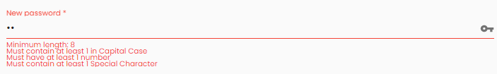
  <o-table-column attr="PASSWORD" title="PASSWORD" [validators]="validatorsNewPasswordArray">
    <o-table-cell-editor-text>
      <o-validator error-name="hasCapitalCase" error-text="Must have a capital case"></o-validator>
      <o-validator error-name="hasNumber" error-text="Must have a number"></o-validator>
      <o-validator error-name="hasSmallCase" error-text="Must have a small case"></o-validator>
      <o-validator error-name="hasSpecialCharacters" error-text="Must have one special character"></o-validator>
    </o-table-cell-editor-text>
  </o-table-column>
...
  validatorsNewPasswordArray: ValidatorFn[] = [];
  constructor() {
    // check whether the entered password has a number
    this.validatorsNewPasswordArray.push(OValidators.patternValidator(/\d/, 'hasNumber'));
    // check whether the entered password has upper case letter
    this.validatorsNewPasswordArray.push(OValidators.patternValidator(/[A-Z]/, 'hasCapitalCase'));
    // check whether the entered password has small case letter
    this.validatorsNewPasswordArray.push(OValidators.patternValidator(/[a-z]/, 'hasSmallCase'));
    // check whether the entered password has a special character
    this.validatorsNewPasswordArray.push(OValidators.patternValidator(/[ `!@#$%^&*()_+\-=\[\]{};':"\\|,.<>\/?~]/, 'hasSpecialCharacters'));
  }
...
Features
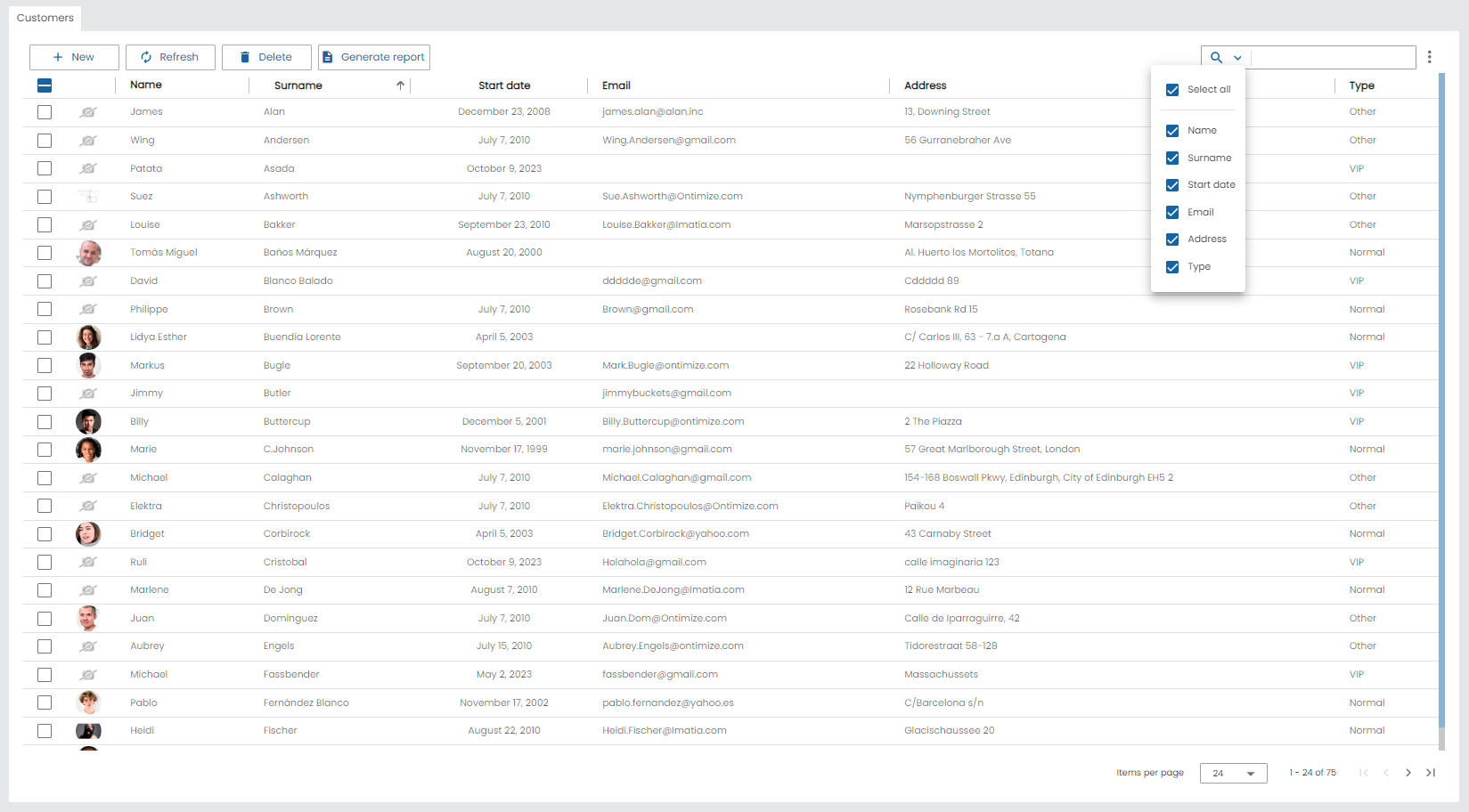
Checkbox selection
The table supports checkbox selection with select-all-checkbox-visible property. If this property is activated will display the row checkboxes, including a master toggle checkbox for the header. It is disabled by default.
OntimizeWeb allows to customize the title, resizing, width, minwidth and maxwidth of the master toggle checkbox for the header by adding the o-table-column-select-all directive to you application. For more information see the API.
<o-table fxFlex attr="customer" title="CUSTOMERS" service="customers" entity="customer" keys="CUSTOMERID" columns="CUSTOMERID;PHOTO;NAME;SURNAME;ADDRESS;STARTDATE;EMAIL;CUSTOMERTYPEID"
      visible-columns="PHOTO;NAME;SURNAME;STARTDATE;EMAIL;ADDRESS;CUSTOMERTYPEID" sort-columns="SURNAME" query-rows="24" quick-filter="yes"
      row-height="medium" select-all-checkbox-visible="true" pageable="no" virtual-scroll="no">
     <o-table-column-select-all title="Omit"></o-table-column-select-all>
</o-table>
You can configure show in the menu on the upper right the option of select row with select-all-checkbox property. It is disabled by default.
Additionally, you can specify a function setting the input disable-selection-function to disable the checkboxes depending on a condition. This function receives full data record for allowing you to enable/disable selection checkbox depending on value/s of the record.
Fixed header and footer
The o-table component supports fixed header and footer setting fixed-header="yes" when its content is greater than its own height. For that, you must set the height of the table, using, for example [ngStyle]="height: 400px;". By default, it’s disabled.
Example
<o-table #table attr="table" title="ACCOUNTS" fixed-header="yes" [static-data]="tableData" columns="ACCOUNTID;ENTITYID;OFFICEID;CDID;ANID;BALANCE;STARTDATE;ENDDATE;INTERESRATE;ACCOUNTTYP"
    visible-columns="ENTITYID;OFFICEID;CDID;ANID;ACCOUNTTYP;BALANCE" layout-padding sort-columns="ANID" query-on-init="false"
    quick-filter="yes" insert-button="no" delete-button="no" refresh-button="no" pagination-controls="no" export-button="no"
    [ngStyle]="height:400px">
    <o-table-column attr="ENTITYID" title="ENTITYID" width="14%"></o-table-column>
    <o-table-column attr="OFFICEID" title="OFFICEID" width="14%"></o-table-column>
    <o-table-column attr="CDID" title="CDID" width="14%"></o-table-column>
    ...
  </o-table>
Aggregates
Often when displaying numbers in a table, users want to show summary results of aggregate calculations at the bottom of the table columns. The o‑table component supports commonly used aggregation functions (count, sum, avg, min, max) using aggregate input and also allows specifying a custom aggregation function using the aggregate-function input, which may return either a synchronous number or a **Promise
Example
<o-table service="branches" entity="account" keys="ACCOUNTID"
    columns="ACCOUNTID;ENTITYID;OFFICEID;CDID;ANID;BALANCE;STARTDATE;ENDDATE;INTERESRATE;ACCOUNTTYP"
    visible-columns="ENTITYID;OFFICEID;CDID;ANID;ACCOUNTTYP;BALANCE,INTERESRATE"
    fxFlex layout-padding attr="accounts" title="ACCOUNTS"
    sort-columns="ANID:DESC"  query-on-init="true"
    quick-filter="yes"   filter-case-sensitive="true" >
    <o-table-column attr="BALANCE" title="BALANCE" type="currency" currency-symbol="€" thousand-separator=","></o-table-column>
    <o-table-column attr="INTERESRATE" title="INTERESRATE" type="real" ></o-table-column>
    <o-table-column-aggregate attr="BALANCE" title="sum"></o-table-column-aggregate>
    <o-table-column-aggregate attr="INTERESRATE" [aggregate-function]="custom"></o-table-column-aggregate>
</o-table>
Typescript code
  ...

  custom(data:any[]):number{
    let result = 0;
    for(var i=0;i<data.length;i++){
      if(i%2==0) result+=data[i];
    }
    return result;
  }
You can see this and more examples of this component in the OntimizeWeb playground.
Calculated columns
The o-table supports calculated columns, used when user wants to show an additional column which contains a result of an operation.
Example
In the following example, two calculated columns are defined that perform the same operation but one uses the operation attribute (BALANCExINTERESRATE) and the other the function calculateBenefit.
  <o-table
    service="branches" entity="account" keys="ACCOUNTID"
    columns="ACCOUNTID;ENTITYID;OFFICEID;CDID;ANID;BALANCE;STARTDATE;ENDDATE;INTERESRATE;ACCOUNTTYP"
    visible-columns="ENTITYID;OFFICEID;CDID;ANID;ACCOUNTTYP;BALANCE;INTERESRATE;BENEFIT;BENEFIT2"
    attr="accounts" title="ACCOUNTS"
    layout-padding
    sort-columns="ANID" query-rows="15" pageable="no" >

    <o-table-column attr="ENTITYID" title="ENTITYID"></o-table-column>
    <o-table-column attr="CDID" title="CDID"></o-table-column>
    <o-table-column attr="ANID" title="ANID"></o-table-column>
    <o-table-column attr="BALANCE" title="BALANCE" currency-symbol="€" type="currency" grouping="yes" thousand-separator=","> </o-table-column>
    <o-table-column attr="INTERESRATE" title="INTERESRATE" type="percentage" decimal-separator=","></o-table-column>

  <!--calculated column-->
    <o-table-column-calculated attr="BENEFIT" title="BENEFIT" type="currency" thousand-separator="." decimal-separator="," currency-symbol="€"
      currency-symbol-position="right" operation="(BALANCE*INTERESRATE)" > </o-table-column-calculated>
    <o-table-column-calculated attr="BENEFIT2" title="BENEFIT2"  type="currency" thousand-separator="." decimal-separator="," currency-symbol="€"
      currency-symbol-position="right" [operation-function]="calculateBenefit" > </o-table-column-calculated>


  </o-table>
Typescript code
  ...


  calculateBenefit(rowData: any[]): number {

    return (rowData['BALANCE'] * rowData['INTERESRATE']);
  }
You can see this and more examples of this component in the OntimizeWeb playground.
Table options
The o-table-option component allows to add extra options to the table menu. You only have to add the component to your table and subscribe to the onClick event in your component to perform the desired actions. Check the example below.
<o-table attr="customers" entity="ECustomers" title="CUSTOMERS"
  columns="CUSTOMERID;PHOTO;NAME;STARTDATE;CUSTOMERTYPEID;BOOLEAN;INTEGER;REAL;CURRENCY"
  visible-columns="PHOTO;NAME;STARTDATE;CUSTOMERTYPEID;BOOLEAN;INTEGER;REAL;CURRENCY">

  <o-table-option #myOption label="My option"></o-table-option>

</o-table>
  import { Component, ViewChild } from '@angular/core';
  import { OTableOptionComponent } from 'ontimize-web-ngx';

  @Component({
    selector: 'my-page',
    templateUrl: 'my-page.component.html'
  })
  export class MyPageComponent {

    @ViewChild('myOption', {static: false})
    protected myOption: OTableOptionComponent;

    ngAfterViewInit() {
      this.myButton.onClick.subscribe(event => {
        alert('my option click');
      });
    }

  }
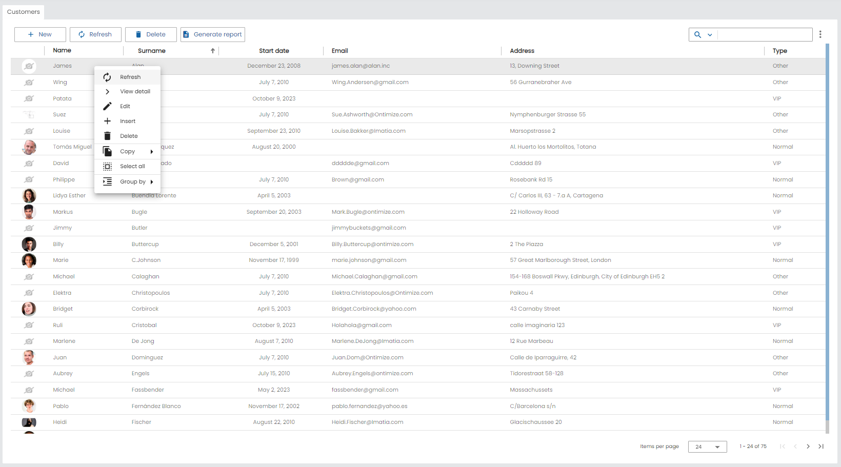
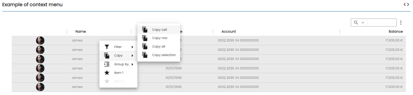
Table context menu
The o-table allows to add a context menu to table rows, the menu is displayed by right clicking in the table row. For including the context menu in your table you have to include the o-table-context-menu component in your table.
By default, o-table-context-menu include the next options:
- Refresh
- View detail.
- Edit.
- Insert.
- Delete
- Copy options.
- Filter options.
- Select/Deselect all.
- Group by
Below an example.
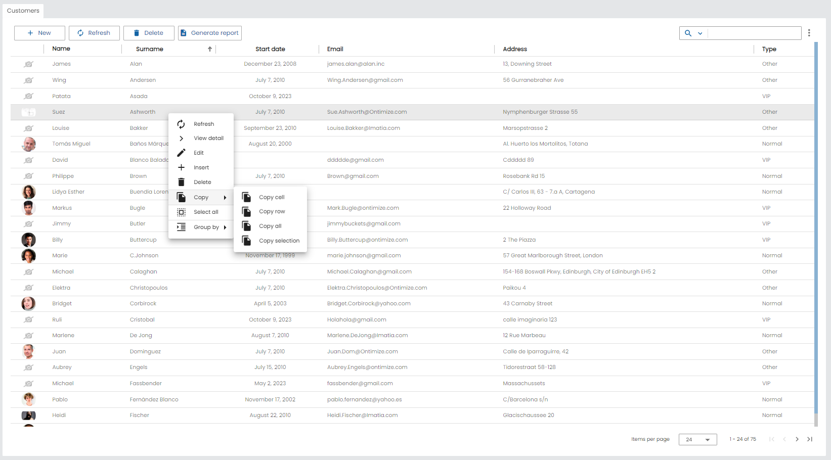
The o-table-context-menu allows to hide these options by setting the attributes insert, edit, view-detail, delete,copy, select-all,refresh,filter to no. You can also include your own context-menu with the reference to a o-context-menucomponent like in the example below.
Example
<o-table attr="customers" entity="ECustomers" title="CUSTOMERS"
  columns="CUSTOMERID;PHOTO;NAME;STARTDATE;CUSTOMERTYPEID;BOOLEAN;INTEGER;REAL;CURRENCY"
  visible-columns="PHOTO;NAME;STARTDATE;CUSTOMERTYPEID;BOOLEAN;INTEGER;REAL;CURRENCY"
  sort-columns="SURNAME" keys="CUSTOMERID" parent-keys="n:NAME;CUSTOMERTYPEID"
  query-on-init="true" query-rows="6" quick-filter="yes" >

  <o-table-button attr="myButton" label="My button" icon="account_circle"></o-table-button>

  <o-table-column attr="NAME" title="NAME"></o-table-column>

  ...
   <o-table-context-menu [context-menu]="myContextMenu" insert="no" edit="no" view-details="no"></o-table-context-menu>
</o-table>

<o-context-menu #myContextMenu>
  <o-context-menu-item icon="face" label="Item 1" (execute)="onExecute($event)"></o-context-menu-item>
  <o-context-menu-item icon="star_rate" label="Item 2" enabled="no"></o-context-menu-item>
  <o-context-menu-item label="Item 3" [visible]="getVisible" (execute)="onExecute($event)"></o-context-menu-item>
</o-context-menu>
For more information about the o-context-menu component definition, please read the docs.
You can see this and more examples of this component in the OntimizeWeb playground.
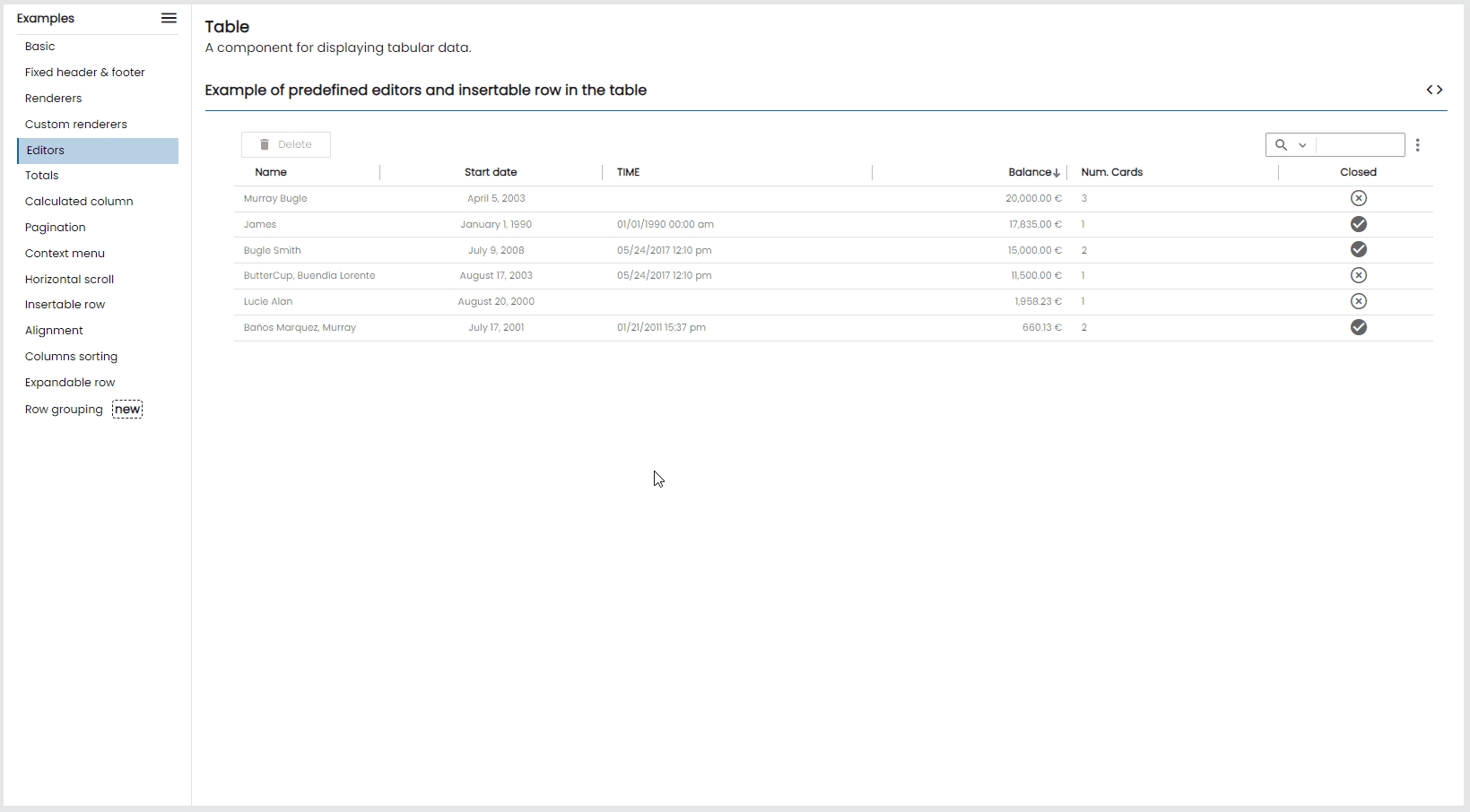
Insertable row
The o-table component allow to insert rows adding the o-table-insertable-row component into the o-table definition. In this component you can define the columns and required columns with columns and required-columns attributes.
Example
In the following example the table has a insertable row where the user may introduce the name, surname or email for inserting a new customer. Name column is required.
<o-table fxFlex attr="customers" title="CUSTOMERS" service="customers" entity="customer" keys="CUSTOMERID" columns="CUSTOMERID;PHOTO;NAME;SURNAME;ADDRESS;STARTDATE;EMAIL"
  visible-columns="NAME;SURNAME;STARTDATE;EMAIL;ADDRESS" sort-columns="SURNAME" query-rows="10" quick-filter="yes"
  pageable="no" row-height="medium" select-all-checkbox="true" pagination-controls="yes">

  <o-table-insertable-row columns="NAME;SURNAME;EMAIL" required-columns="NAME"></o-table-insertable-row>

  <o-table-column attr="NAME" title="NAME" orderable="no"></o-table-column>
  <o-table-column attr="STARTDATE" title="STARTDATE" type="date" format="LL"></o-table-column>
</o-table>
The o-table-insertable-row support 2 differnent positions which can be set via the position input, first and last. By default, it’s last.
To create a custom insertable column, you must define a custom editor for the column following the same steps as in Custom editors and add the column attr column in columns attribute in o-table-insertable-row.
If you add validators to your o-table-cell-editor this validation will work also in the insertable row editors.
You can see more examples of this component in the OntimizeWeb playground.
Table buttons
The o-table component allows to add extra buttons in the toolbar with the o-table-button component.
You can configure:
- The icon in `icon` property, this name must to be of google icon (see [Google material design icons](https://design.google.com/icons/){:target='_blank'}))
- The label in `label` property
Example
<o-table attr="customers" entity="ECustomers" title="CUSTOMERS"
  columns="CUSTOMERID;PHOTO;NAME;STARTDATE;CUSTOMERTYPEID;BOOLEAN;INTEGER;REAL;CURRENCY"
  visible-columns="PHOTO;NAME;STARTDATE;CUSTOMERTYPEID;BOOLEAN;INTEGER;REAL;CURRENCY"
  sort-columns="SURNAME" keys="CUSTOMERID" parent-keys="n:NAME;CUSTOMERTYPEID"
  query-on-init="true" query-rows="6" quick-filter="yes" >

  <o-table-button attr="myButton" label="My button" icon="account_circle"></o-table-button>

  <o-table-column attr="NAME" title="NAME"></o-table-column>

  ...

</o-table>
Typescript code
  ...
  import { OTableButtonComponent } from 'ontimize-web-ngx';
  ...
  @ViewChild('myButton', {static: false})
  protected myButton: OTableButtonComponent;
  ...
  ngAfterViewInit() {
    this.myButton.onClick.subscribe(event => {
      alert('my button click');
    });
  }
Export table data
The table data can be exported to EXCEL, CSV,.. using the option Export in the table menu.
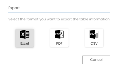
The same data that is in the table gets exported but none the values processed in GUI, ie:
- the values obtained by the formatters of the cell renderers
- header, cell and row styles
- calculated columns
- cell aligment
- if row grouping, all data will be exported without grouping
- if expandable rows exist, all data will be exported without expanding
The operation of the exports depends on whether Ontimize, OntimizeJEE or Ontimize Boot servers are used. You can read more about this topic in the export table data.
Ontimize Web data export is compatible with Ontimize, OntimizeEE and Ontimize Boot servers from
ontimize-web-ngx: 8.8.0, with previous versions it is compatible with Ontimize and OntimizeEE servers.
Table export button
The o-table component allows to add extra exportation buttons in the exportation dialog with the o-table-export-button component.
You can configure:
- The icon using the `icon` property, this name must to be of google icon (see [Google material design icons](https://design.google.com/icons/){:target='_blank'}))
- The label with the `label` property
- The exportation type by setting the `export-type` property. The value configured here will be used for making the requests to the backend and also al extension for the downloaded file.
Column titles alignment
By default, the o-table columns title texts are aligned depending on the column type.
- start: service types and default value when auto-align-titles is active.
- center: image, date, action and boolean types.
- end: currency, integer, real and percentage types.
Using the o-table-column component title-align input user can modify that default value.
When the auto-align-titles input is set to false in o-table, the title of the table column is aligned centered. The user can also define a title-align in the columns (its value has precedence over the default type alignment).
Global title alignment settings can be specified by providing a value for O_TABLE_GLOBAL_CONFIG in your application root or in a specific module.
@NgModule({
  declarations: [
  ...
  ],
  ...
  providers: [
    ...
    { provide: O_TABLE_GLOBAL_CONFIG, useValue: { autoAlignTitles: false } },
    ...
  ],
  ...
})
Column resizing
The o-table component allows column resizing by default. Using the resizable input you can modify that default value on the table. To disabled resizing for each column, set resizable='no' on the column definition.
Columns multiple sorting
Table allows multiple columns sorting by default. Using the multiple-sort input user can modify that default value.
A column is sorted when user clicks on its header. If the multiple sorting is active the previously sorted columns keeps its state, otherwise the previously sorted column returns to its original state.
Aquí la propuesta del apartado nuevo para la documentación:
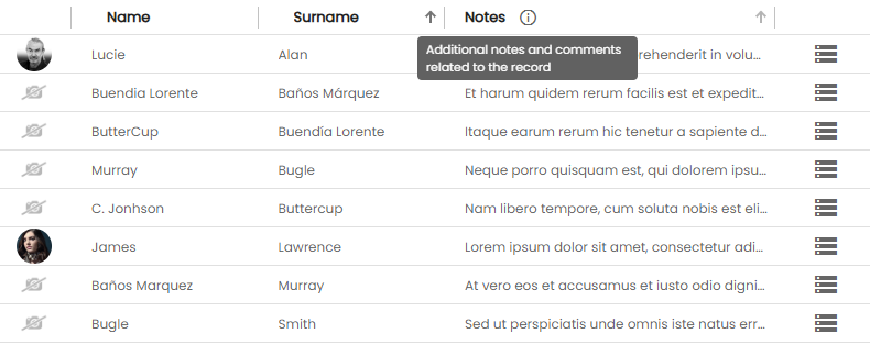
Header tooltip
The o-table component provides several ways to configure tooltips on column headers, from global configuration to individual column customization.
Basic usage
Enable a tooltip for all column headers at once using the show-header-tooltip input on the table. This will display the column title as the tooltip text on hover.
<o-table attr="customers" service="customers" entity="customer"
  show-header-tooltip="yes">
  <o-table-column attr="ID" title="ID"></o-table-column>
  <o-table-column attr="NAME" title="Customer full name"></o-table-column>
  <o-table-column attr="STATUS" title="Status"></o-table-column>
</o-table>
Custom tooltip per column
Use header-tooltip on each o-table-column to define a specific tooltip text, optionally combined with a Material icon using header-tooltip-icon.
<o-table ..>

  <!-- Tooltip displayed on an icon next to the title -->
  <o-table-column attr="NOTES" title="Notes"
    header-tooltip="Additional notes and comments related to the record"
    header-tooltip-icon="info_outline">
  </o-table-column>

</o-table>
Custom tooltip styling
Use header-tooltip-class to apply a custom CSS class to the tooltip, allowing full control over its appearance.
<o-table-column attr="NOTES" title="Notes"
  header-tooltip="Additional notes and comments related to the record"
  header-tooltip-icon="info_outline"
  header-tooltip-class="my-custom-tooltip">
</o-table-column>
// styles.scss
.my-custom-tooltip {
  background-color: #333;
  color: #fff;
  font-size: 13px;
  max-width: 250px;
}
Global configuration
To apply showHeaderTooltip globally across all o-table instances in the application, use O_TABLE_GLOBAL_CONFIG:
// app.module.ts
import { O_TABLE_GLOBAL_CONFIG } from 'ontimize-web-ngx';

@NgModule({
  providers: [
    {
      provide: O_TABLE_GLOBAL_CONFIG,
      useValue: {
        showHeaderTooltip: true
      }
    }
  ]
})
export class AppModule { }
Priority order
When multiple tooltip configurations are present simultaneously, the following priority order applies — higher levels override lower ones:
1. header-tooltip (o-table-column level)        ← highest priority
2. show-header-tooltip (o-table level)
3. showHeaderTooltip (OTableGlobalConfig)        ← lowest priority
Tooltip in columns
The o-table component provides a text that is displayed when the user hovers over an column.
...
  <o-table-column attr="NOTES" title="NOTES" multiline="no" width="300px" tooltip="yes"></o-table-column>
...
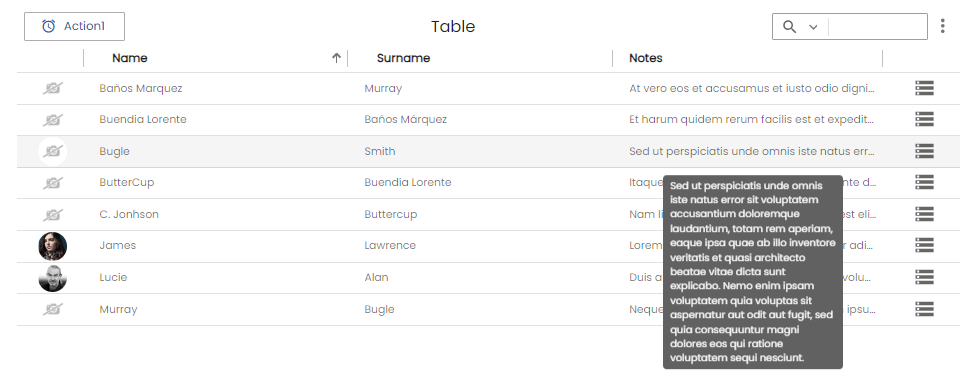
You can configure the value that is displayed with the attribute tooltip-value. Additionally, you can specify default function to be applied when the user over column with tooltip-function attribute.
You can customize the tooltip styles by redefining the class o-table-cell-tooltip.
If you have a custom render in the column and it is not overwritten the getCelldata method will show the internal value of the table.
Reinitialize method
The reinitialize method is used to refresh the o-table whenever its configuration changes. You should call this method when any of the table’s main parameters are updated — such as columns, visible columns, filters, service, entity, keys, or parent keys.
This ensures that the table’s display and data remain synchronized with the latest configuration. For more information, see the API documentation.
...
const columnsOfTable = 'PHOTO;ID;NAME;SURNAME;EMAIL;ADDRESS';
const filterColumnsOfTable = 'NAME;EMAIL';
const defaultVisibleColumns = 'PHOTO;ID;NAME;EMAIL';

// Example pagination data
const paginationData = {
  pageNumber: 1,
  pageSize: 20,
  startRecordIndex: 0,
  totalQueryRecordsNumber: 100
};

// Reinitialize table with updated parameters
this.table.reinitialize({
  columns: columnsOfTable,
  visibleColumns: columnsOfTable,
  defaultVisibleColumns: defaultVisibleColumns,
  filterColumns: filterColumnsOfTable,
  paginationData: paginationData
});
...
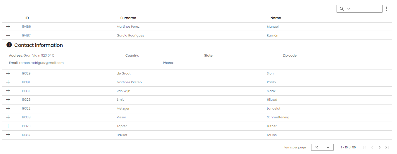
Expandable row
The o-table-row-expandable component enable you to provide additional details about a particular row of table data through expanding or collapsing its content. It’s necessary to wrap the content of your template with the <ng-template let-row></ng-template> tag and add the template definition inside.
Ontimize Web provides two posibilities for attaching child rows to a parent row in the o-table.
- Simple template
- A template with context
Simple template
The example below makes use of simple template, the content of the child row in this example is defined by the ng-template with the let-row attribute so that exposes the variable row in the template to show the information.
 <o-table fxFill #table service-type="DummyService" service="customers" entity="customer" keys="CUSTOMERID" columns="CUSTOMERID;SURNAME;NAME"
      title="CUSTOMERS" insert-button="no" delete-button="no" refresh-button="no" pagination-controls="yes" detail-mode="none" export-button="no"
      query-rows="10" fixed-header="yes">
      <o-table-row-expandable>
        <ng-template let-row>
          <o-column title="CONTACT_DATA" icon="info" class="vertical-margin-10" layout-gap="12px">
            <div fxLayout="row wrap" fxLayoutGap="14px">
              <span fxFlex="30%"><strong>{{'ADDRESS' | oTranslate}}</strong>: {{row.ADDRESS}}</span>
              <span fxFlex="20%"><strong>{{'COUNTRY' | oTranslate}}</strong>: {{row.COUNTRY}}</span>
              <span fxFlex="20%"><strong>{{'STATE' | oTranslate}}</strong>: {{row.STATE}}</span>
              <span fxFlex="20%"><strong>{{'ZIPCODE' | oTranslate}}</strong>: {{row.ZIPCODE}}</span>
            </div>
            <div fxLayout="row wrap" fxLayoutGap="14px">
              <span fxFlex="20%"><strong>{{'EMAIL' | oTranslate}}</strong>: {{row.EMAIL}}</span>
              <span fxFlex="20%"><strong>{{'PHONE' | oTranslate}}</strong>: {{row.PHONE}}</span>
            </div>
          </o-column>
        </ng-template>
      </o-table-row-expandable>

    </o-table>
A template with context
It is possible to define a template with context, so that if the defined template contains a component (such as o-table, o-list, o-chart and o-grid), this context provide functionalities like parent-keys and query the component data automatically when the row is expanded, for example.
It is necessary define
targetsinput and[data]="row"to query the data automatically, it will be the references of the components whose query will be launched when expanding the row. The context is established with[data]="row"
<o-table fxFill #table service-type="DummyService" service="customers" entity="customer" keys="CUSTOMERID" columns="CUSTOMERID;SURNAME;NAME"
  title="CUSTOMERS" insert-button="no" delete-button="no" refresh-button="no" pagination-controls="no" detail-mode="none" export-button="no"
  store-state="false" query-rows="10" fixed-header="yes">
  <o-table-row-expandable>
    <ng-template let-row>
      <o-expandable-container [targets]="[accountsTable]" [data]="row">
        <o-table #accountsTable service-type="DummyService" service="customers" entity="customerAccount" parent-keys="CUSTOMERID" keys="ACCOUNTID"
          columns="ACCOUNTID;ENTITYID;OFFICEID;CDID;ANID;ACCOUNT;BALANCE;CUSTOMERID;STARTDATE" visible-columns="ACCOUNT;BALANCE;STARTDATE"
          title="ACCOUNTS" sort-columns="STARTDATE" query-on-init="false" query-rows="6" pageable="no" insert-button="no" delete-button="no"
          detail-mode="none">
          <o-table-column attr="ACCOUNT" title="ACCOUNT" class="o-table-column-centered"></o-table-column>
          <o-table-column attr="STARTDATE" title="STARTDATE" type="date" format="LL"></o-table-column>
          <o-table-column attr="BALANCE" title="BALANCE" type="currency" currency-symbol="€" currency-symbol-position="right"
            thousand-separator="." decimal-separator=",">
          </o-table-column>
        </o-table>
      </o-expandable-container>
    </ng-template>
  </o-table-row-expandable>
</o-table>
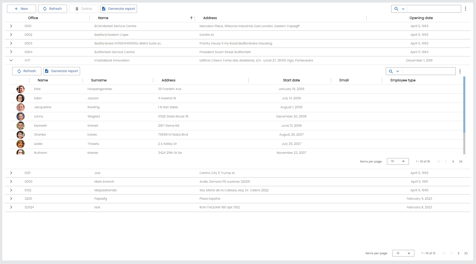
The o-table component has an input to control expandable row and show or not the expansion icon. This input show-expandable-icon-function must set a function that will receive data of expandable row and has to return a boolean observable. You can check a complete example here.
Autoadjust
The o-table component supports automatically adjust to the content of the column. This means that it will always take up the minimum width required to present its content. If you want avoid that behaviour setting auto-adjust = no in the o-table component.
Global default autoadjust can be specified by providing a value for O_TABLE_GLOBAL_CONFIG in your application’s root module.
@NgModule({
  declarations: [
  ...
  ],
  ...
  providers: [
    ...
    { provide: O_TABLE_GLOBAL_CONFIG, useValue: { autoAdjust: false } },
    ...
  ],
  ...
})
Example
 <o-table fxFlex attr="customers" title="CUSTOMERS" service="customers" entity="customer" keys="CUSTOMERID"
    columns="CUSTOMERID;PHOTO;NAME;SURNAME;ADDRESS;STARTDATE;EMAIL;CUSTOMERTYPEID"
    visible-columns="PHOTO;NAME;SURNAME;STARTDATE;EMAIL;ADDRESS;CUSTOMERTYPEID" sort-columns="SURNAME" query-rows="10" quick-filter="yes"
    row-height="medium" select-all-checkbox="true" pageable="yes" fixed-header="yes" auto-adjust="yes">
    <o-table-columns-filter columns="STARTDATE;SURNAME"></o-table-columns-filter>
    <o-table-column async-load="true" width="48px" attr="PHOTO" orderable="no" searchable="no" type="image"
      image-type="base64" empty-image="assets/images/no-image.png" avatar="yes">
    </o-table-column>
    <o-table-column attr="NAME" title="NAME" orderable="no"></o-table-column>
    <o-table-column attr="STARTDATE" title="STARTDATE" type="date" format="LL"></o-table-column>
    <o-table-column attr="CUSTOMERTYPEID" title="CUSTOMERTYPEID" editable="true">
      <o-table-cell-renderer-service service="customers" entity="customerType"
        value-column="DESCRIPTION" translate="no"
        columns="CUSTOMERTYPEID;DESCRIPTION" visible-columns="DESCRIPTION">
      </o-table-cell-renderer-service>
    </o-table-column>
  </o-table>
There is a possibility that the content is large and the result is not what is expected like the example shown below.

However, if you want to control similar case, you can do so by configuring auto-adjust="yes" with several options such as:
horizontal-scroll=yesmultiline=yesmax-widthof theo-table-column.
-
In the next case we have applied
horizontal-scroll=yesandauto-adjust="yes", the result would be the following.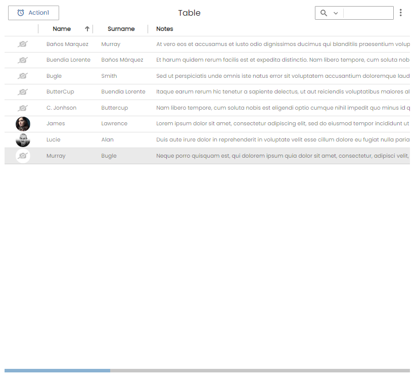
-
As you can see, in the next case we have applied
multiline=yesandauto-adjust="yes", the result would be the following.
-
In the next case we have applied
max-width="300px"ino-table-columnandauto-adjust="yes", the result would be the following..<o-table-column attr="NOTES" title="NOTES" multiline="no" max-width="300px"></o-table-column>
Row grouping
Ontimize Web allows to merge fields belonging to one column so that the consecutive fields have the same value through the row grouping. Each group will be marked with one row with joined cells above containing the group value.
By default, the table is groupable and for grouping/ungrouping by one o more columns, you can:
-
Configure grouped columns by default with the
grouped-columnsproperty. As you can see in the example below, as soon as there is at least one active row.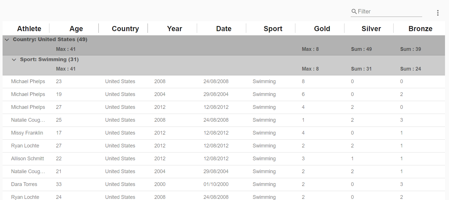
-
Use the table menu: click the Group / Ungroup by option to configure the columns you need to group / ungroup by.
-
Use the table context menu: Right-click the column data to invoke context menu and click on Group by -> Group by column . The context menu also allows you to ungroup by a column or by all.
You can collapse/expand all grouped rows if you right-click on the grouped row.
-
Use the o-table-columns-grouping and o-table-columns-grouping-column components: this components are used to configure the initial state of the row grouping and override the table grouping configuration.
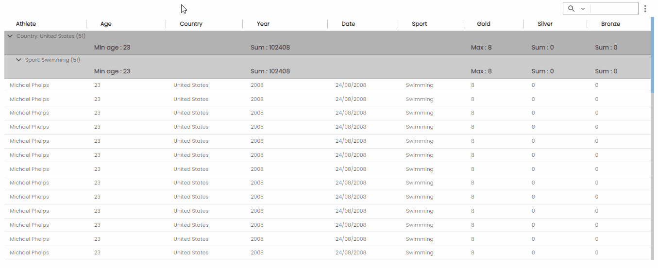
If there is at least one grouping, the table automatically applies the sum function on those of type currency, integer and real and whose value will be displayed in the grouped row. If you want to exclude this function from being performed, you must add this column in the excluded-aggregate-columns attribute in o-table-columns-grouping component.
You can configure the aggregate functions (count,sum,avg,min,max) in the o-table-columns-grouping component. Additionally, you can specify aggregate function to be applied with aggregate-function attribute.
By default, when you change the aggregate function in a column, it will change in all grouped rows of the same level, if you want to avoid this behavior you must add change-aggregate-same-level="no".
  <o-table fxFill #table service-type="DummyService" service="olympicWinners" entity="olympicWinners"
      columns="athlete;age;country;year;date;sport;gold;silver;bronze" grouped-columns="country;year;date;sport" layout-padding title="ACCOUNTS"
      quick-filter="yes" insert-button="no" delete-button="no" refresh-button="no" pagination-controls="no" export-button="no"
      detail-mode="none">
      <o-table-columns-grouping columns="country;sport" excluded-aggregate-columns=''>
        <o-table-columns-grouping-column attr="age" title="edad" aggregate="max"> </o-table-columns-grouping-column>
        <o-table-columns-grouping-column attr="gold" aggregate="max"> </o-table-columns-grouping-column>
      </o-table-columns-grouping>
      <o-table-context-menu insert="no" edit="no" view-detail="no" refresh="no" delete="no"></o-table-context-menu>
    </o-table>
If the table is groupable but you want the column isn’t groupable you must add groupable=false in this column definition.
Table allows expands/collapses all rows on same level by default. Using expand-groups-same-level property you can modify the default value.
You can configure if you want the groups to appear by default expanded or collapsed with collapse-grouped-columns property.
For more information see the API.
There is no limit on the number of columns that the table can group by.
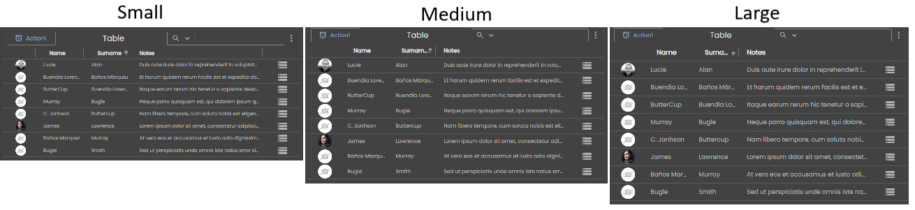
Row height
In the o-table you can configure various density levels using row-height property that it is easy to specify the font and the paddings on the table defined in this link.
The default value being medium with small being the most compact option and large being the least.
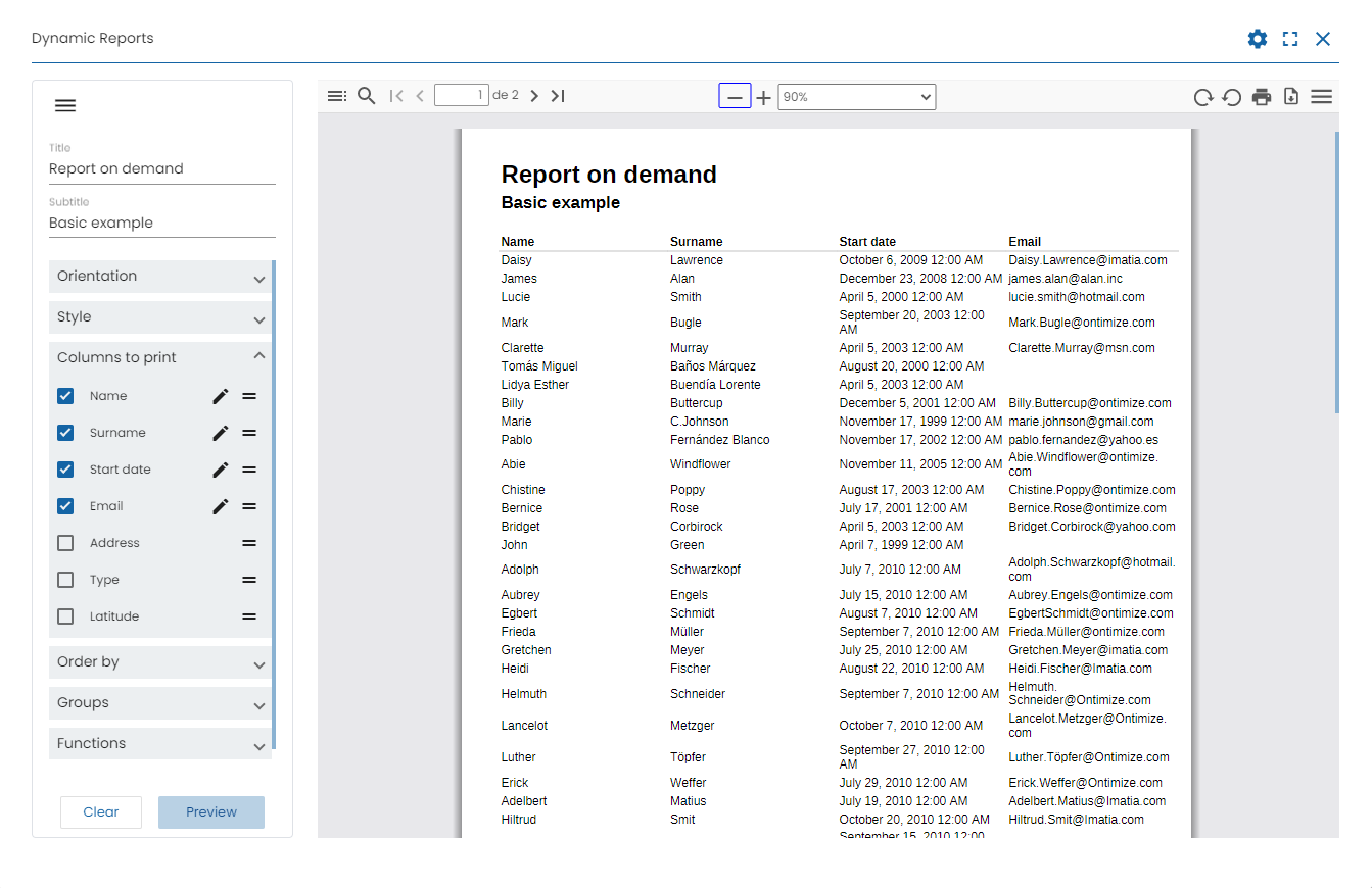
Report on demand
The o-table component has a new option in table menu that allows the final users of the applications developed with Ontimize to define, view and store reports from any table available in the application. This menu option is enabled by default. Using show-report-on-demand-option property you can modify the default value. For more information see the API. You can also find more information about reports in their documentation following this link.
Reset columns width
The o-table component has a new option in table menu that allows the width of the table columns to be reset to their initial width. This menu option is enabled by default. Using show-reset-width-option property you can modify the default value. For more information see the API.
Custom content in toolbar
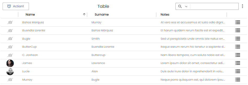
The o-table component allows to add content in the toolbar with the selector o-table-toolbar at start position by default but you can configure the position with position='start' at the start or at the end with the position='end'.
If the selector o-table-toolbar is used together with position='start' the content will always be placed to the right of the New/Refresh/Delete and o-table-buttons buttons and if used together with position='end' the content will always be placed to the left of the quickfilter
 <o-table #table fxFlex attr="table" title="Table" quick-filter="true" insert-button="false"  delete-button="false" refresh-button="false" ..>
    <!-- Custom definition button -->
    <o-table-button attr="action1" (onClick)="onAction1()" label="Action1" icon="alarm"></o-table-button>
    <!-- Custom content toolbar in position start -->
    <o-combo o-table-toolbar position="start" label="Sort" width="100px"...></o-combo>
    <!-- Custom content toolbar in position end -->
    <o-slide-toggle o-table-toolbar position="end"....></o-slide-toggle>
    ...
  </o-table>
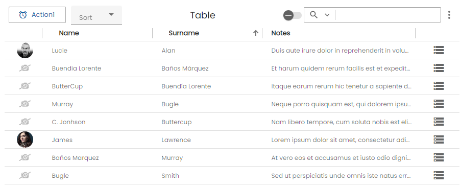
Support JDBC UUID
Ontimize web now supports the JDBC UUID sql type. To indicate that a table column is of type UUID, all you have to do is to set sql-type="UUID" in the o-table-column component as indicated in the following example.
    <o-table #table ...>
      <o-table-column attr="ID" sql-type="UUID"> </o-table-column>
      ...
    </o-table>
Theming
The table headers
You can customize the tables changing the color of the headers. For example with the primary palette by following the steps below.
- Define the style of mat-header-cell in a “theme file”
First, create a Sass mixin that accepts an Angular Material color theme and outputs the color-specific styles for the component.
custom-row-header-theme.scss
// Import library functions for theme creation.
@use '@angular/material'as mat;
@use 'sass:map';

@mixin table-theme($theme) {
  // Extract the palettes you need from the theme definition.
  $primary: map.get($theme, color, primary);

// Define the styles that affect the table header by the theme
  .o-table {
    .mat-mdc-header-cell.mdc-data-table__header-cell.cdk-header-cell {
      background-color: mat.get-color-from-palette($primary, 500);
      color: mat.get-color-from-palette($primary, default-contrast);
    }
  }
}
Note: using the mat-color function to extract colors from a palette.
- Include the theme mixin in your application
Use the Sass @include keyword to include a component’s theme mixin wherever you’re already including Angular Material’s built-in theme mixins.
app.scss
@use 'ontimize-web-ngx/theming/themes/ontimize.scss'as theme;
@use 'ontimize-web-ngx/theming/ontimize-style.scss';

// Include ontimize styles
@include ontimize-style.ontimize-theme-styles(theme.$theme);

@import 'node_modules/ontimize-web-ngx-gallery/o-gallery-theme.scss';
@include o-gallery-theme(theme.$theme);

/*
* Import application themes.
*/

...

@import '../../app/main/data/table/table-theme.scss';
@include table-theme(theme.$theme);
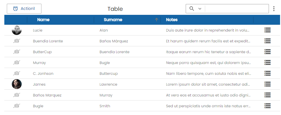
Demo
You can see this and more examples of this component in the OntimizeWeb playground.