App layout
The o-app-layout components builds a side navigator for application using the application menu configuration. For adding it to the application you just have to wrap the content of the main page with this component like in the example below.
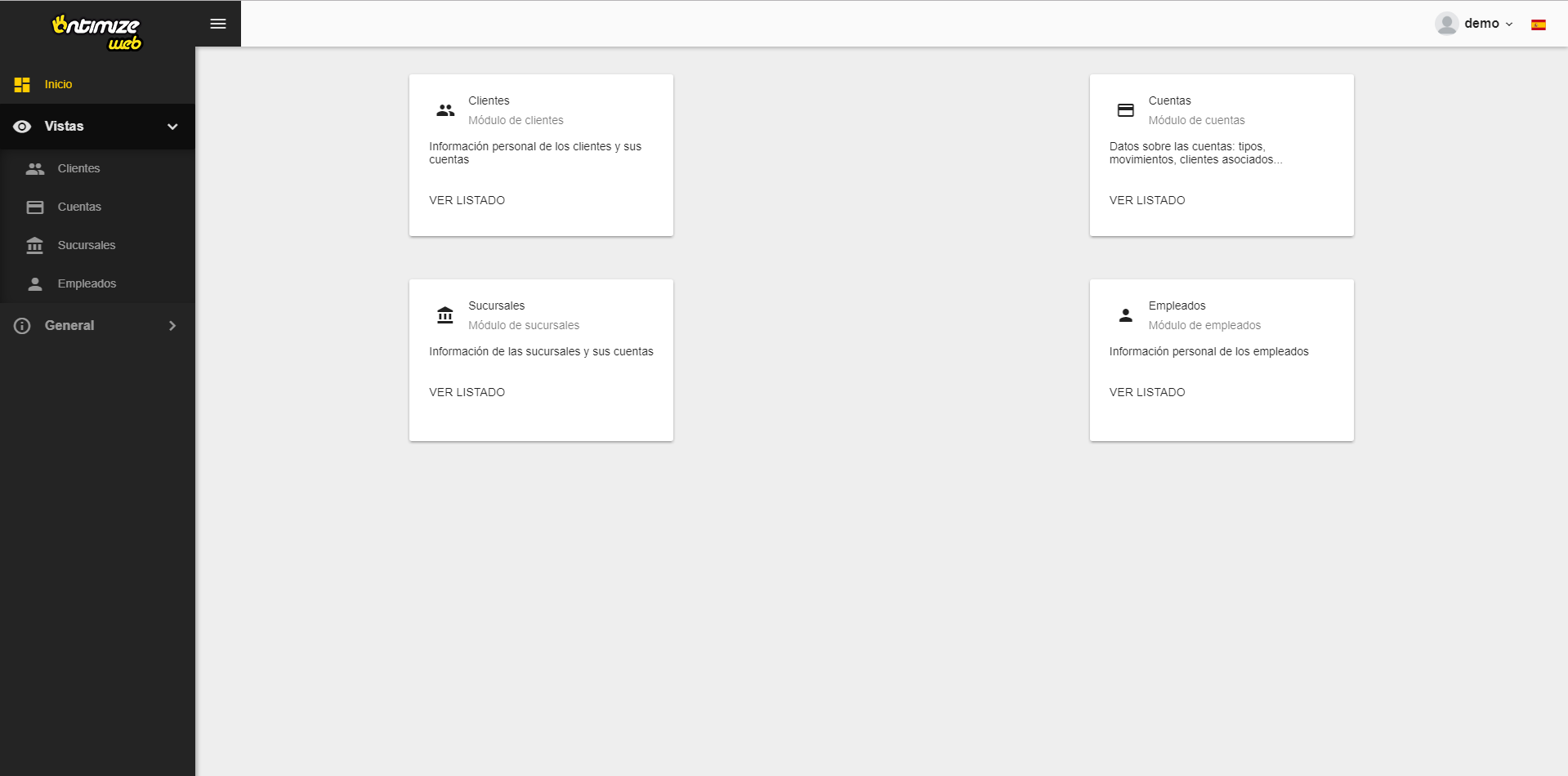
Example
<o-app-layout opened-sidenav-image="assets/images/sidenav-opened.png"
  closed-sidenav-image="assets/images/sidenav-closed.png" mode="desktop">
  <router-outlet></router-outlet>
</o-app-layout>
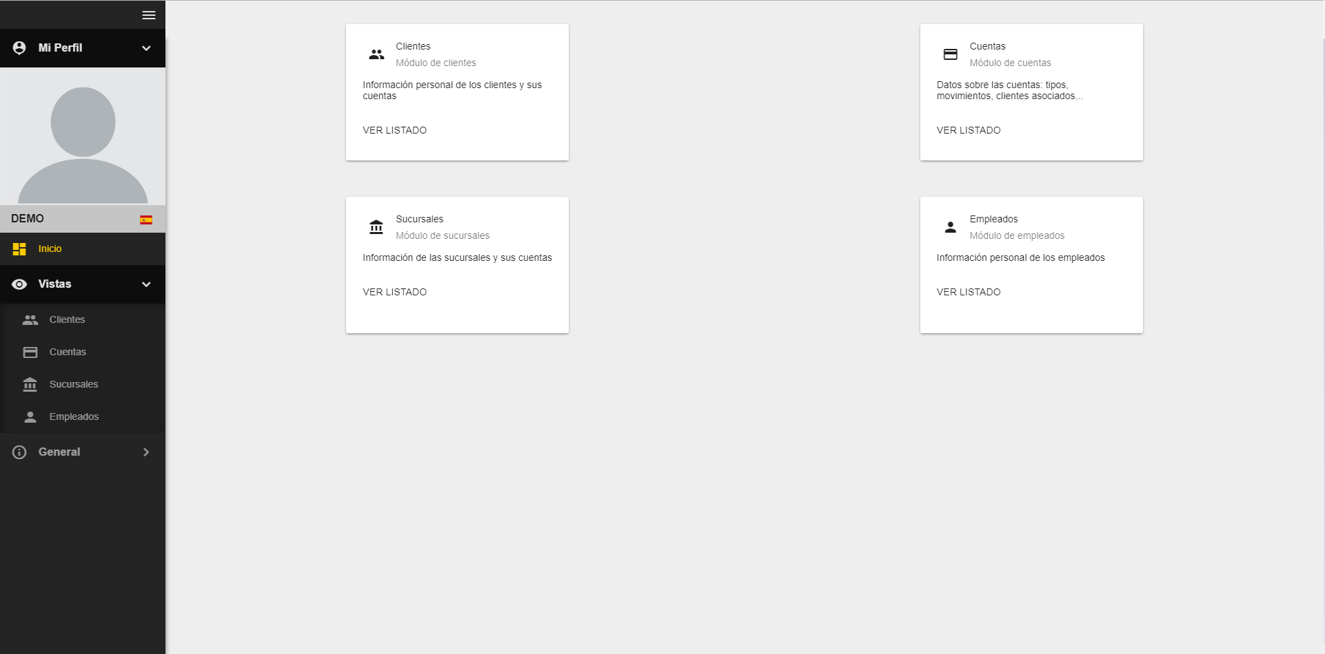
The result of this example is shown below.
You can see a working example of this in the OntimizeWeb QuickStart or check the code in GitHub.
Custom content
You can attach your own content to the side navigator using the o-app-layout-sidenav component inside the o-app-layout-sidenav of you application.
<o-app-layout opened-sidenav-image="assets/images/sidenav-opened.png" closed-sidenav-image="assets/images/sidenav-closed.png">

  <o-app-layout-sidenav>
    <!-- YOUR CUSTOM CONTENT HERE -->
  </o-app-layout-sidenav>

  <router-outlet></router-outlet>
</o-app-layout>
Modes
The o-app-layout components has two performance modes designed for making this component more usable in desktop and mobile applications. This modes are the following:
- Desktop This is the default mode of the
o-app-layoutcomponent. This mode displays the side menu and allows the user to partially hide it.
- Mobile Configure this mode by setting the mobile value in the
modeattribute in theo-app-layoutcomponent. This mode shows the side menu and a toolbar on the top with a button for show/hide the side menu.
Toolbar
The application layout component show a toolbar at the top of the screen by default, but if you want avoid displaing you must set the show-header attribute to no. Check this and other attributes in the API section of this page.
In the toolbar, it can show a title.

There are two ways to show the title in the toolbar:
- Display a static title: The same title is displaing in whole application. To configure this option you must set
static-titleandshow-static-titletoyes.
<o-app-layout [static-title]="staticTitle" show-static-title="yes"... ></o-app-layout>
- Display a no static title: The title based on the route configuration. To configure this option you must set
show-titletoyesand addoAppHeaderTitleproperty in data object during route declaration
<o-app-layout ... show-title="yes" ... ></o-app-layout>
  export const routes: Routes = [
  {
    path: '', component: MainComponent,
    children: [
    ...
      { path: 'about',
        loadChildren: () => import('./about/about.module').then(m => m.AboutModule),
        //uses 'no static' title
        data: { oAppHeaderTitle:'About'}
      },
      { path: 'accounts',
        loadChildren: () => import('./accounts/accounts.module').then(m => m.AccountsModule),
         //uses 'no static' title
        data: { oAppHeaderTitle: 'Accounts' }
      },
      ...
The o-app-layout component allows you to configure whether or not to show flags on the language selector by setting the attribute use-flag-icons to yes. In order to show the language flags, it is necessary install the dependency flag-icon-css:
$ npm install flag-icon-css
And import the flag icon styles in your application’s angular.json file:
"node_modules/flag-icon-css/css/flag-icons.css"
Adding custom content to the toolbar
If you want to add your own components to the layout toolbar you must use the o-app-layout-header component.
<o-app-layout opened-sidenav-image="assets/images/sidenav-opened.png"
  closed-sidenav-image="assets/images/sidenav-closed.png"
  mode="desktop" show-header="yes">
  <o-app-layout-header>
      <!-- YOUR CUSTOM CONTENT HERE -->
  </o-app-layout-header>

  <router-outlet></router-outlet>
</o-app-layout>
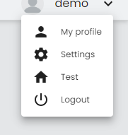
Adding custom user info
OntimizeWeb allows to customize the user info to the toolbar with the o-user-info-configuration and o-user-info-configuration-item components. Check the API section of this page for more information.
Example
<o-app-layout show-header="yes" opened-sidenav-image="assets/images/sidenav-opened.png"
  closed-sidenav-image="assets/images/sidenav-closed.png">
  <o-user-info-configuration show-profile="yes">
    <o-user-info-configuration-item name="test" icon="home" [action]="myAction" confirm="yes">
    </o-user-info-configuration-item>
  </o-user-info-configuration>
  <router-outlet></router-outlet>
</o-app-layout>
import { Component, ViewEncapsulation } from '@angular/core';

@Component({
  selector: 'app-main',
  templateUrl: './main.component.html',
  styleUrls: ['./main.component.scss'],
  encapsulation: ViewEncapsulation.None
})
export class MainComponent  {

  constructor() { }

  myAction() {
    alert('Test')
  }
}
Side Menu Behavior Options
The <o-app-layout> component is the main layout wrapper that provides a consistent structure for applications, including a top toolbar, side navigation menu, and main content area. It supports responsive behavior and is highly customizable.
Example:
<o-app-layout show-ellipsis-menu="true" tooltip-display-mode="always">
  <router-outlet></router-outlet>
</o-app-layout>
Show ellipsis menu
The show-ellipsis-menu input controls whether long menu item labels should be visually truncated with an ellipsis (...) when they don’t fit in the available horizontal space. By default, this behavior is disabled and text may wrap or overflow depending on layout styles.
Tooltip display behavior
The tooltip-display-mode input lets you control when tooltips should appear on side navigation items. This is especially helpful when the menu is collapsed, and labels are hidden. By default, this value es only-collapsed
Available modes:
'always'– Tooltips are always shown, regardless of the menu state.'never'– Tooltips are never shown.'only-collapsed'– Tooltips are shown only when the side menu is collapsed (default).'only-expanded'– Tooltips are shown only when the side menu is expanded.
This setting improves accessibility and user experience by offering contextual information only when it’s needed.
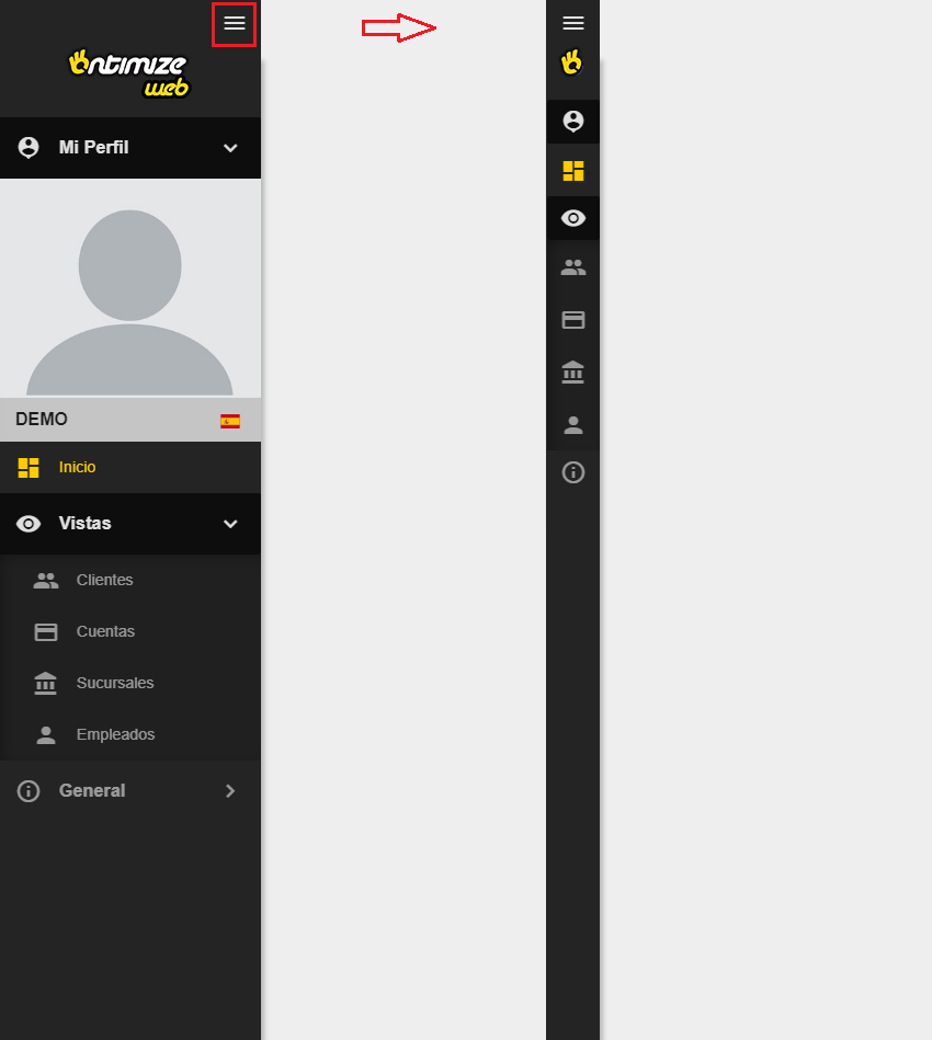
Images
You can set provide images to be shown in the side navigator using the attributes opened-sidenav-image and closed-sidenav-image. Check this and other attributes in the API section of this page.