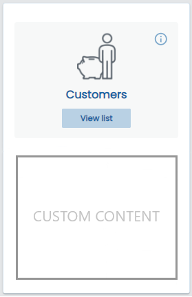
Card menu item
The o-card-menu-item component is a leaf component used inside the o-card-menu-layout component to display the menu options. As it was said, an instance of this component is built automatically by the card menu layout component for each children of the menu item provided.
Example
  <o-card-menu-item button-text="button text" title="Card title" tooltip="Tooltip information"
    image="assets/images/ontimize.png"></o-card-menu-item>
  <o-card-menu-item button-text="button text" title="Card title" tooltip="Tooltip information" image="assets/images/ontimize.png"
    [detail-component]="cardContent" [detail-component-inputs]="cardContentAttributes">
  </o-card-menu-item>
import { Component, Injector } from '@angular/core';

import { CardContentComponent } from '../../shared/card-content/card-content.component';

@Component({
  selector: 'home',
  templateUrl: './home.component.html',
  styleUrls: ['./home.component.scss']
})

export class HomeComponent {

  cardContent = CardContentComponent;
  cardContentAttributes: Object = {
    color: 'gray'
  };

}
