This theming page make reference to Ontimize Web 15.x.x versions, to access old documentation about theming go to the 8.x.x documentation page.
What is a theme?
A theme is the set of colors that are applied to the Angular Material components. The library’s approach to theming is based on guidance from the Material Design spec.
In Angular Material, a theme is created by composing multiple palettes. In particular, a theme consists of:
- A primary palette: colors most widely used across all screens and components.
- An accent palette: colors used for the floating action button and interactive elements.
- A warn palette: colors used to convey error state.
- A foreground palette: colors for text and icons.
- A background palette: colors used for element backgrounds.
It can help you create a color theme that reflects your brand or style.
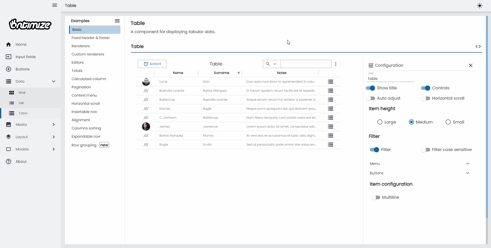
Each Ontimize Web application follows material design guidelines proposed by Google. In this chapter we will see how to configure these palettes by both using predefined ones and creating new ones.
Below you can see an application with several different themes and variants


Dark and light primary variants
Your primary color can be used to make a color theme for your app, including dark and light primary color variants.
What is a dark variant?
A dark variant is a low-light UI that displays mostly dark surfaces.
Example app with dark and light variants
Below an exemplary Angular application can be found that has implemented the Pure Sass approach. If you enable the Dark Mode in the settings of your operating system, the app will appear in dark colors, otherwise in bright colors.
Configuration
To make the theming job easier we integrate the theming module into the core library. In the following lines you are going to see how to properly use our theming engine.
Files to configure in the proyect
angular.json
{
  ...
  "projects": {
    "your-project-name": {
      ...
      "architect": {
        "build": {
          ...
          "options": {
            ...
            "styles": [
              "node_modules/ontimize-web-ngx/ontimize.scss",
              "src/assets/css/app.scss",
              "src/styles.scss"
            ]
            ...
          }
          ...
        }
        ...
      }
    }
    ...
  }
  ...
}
app.css
/* Imports of the Ontimize theme and the Ontimize styles of our application */
@use 'ontimize-web-ngx/theming/themes/ontimize.scss'as theme;
@use 'ontimize-web-ngx/theming/ontimize-style.scss';

/* Applies the Ontimize styles */
@include ontimize-style.ontimize-theme-styles(theme.$theme);

/* Imports the application themes */
@import '../../app/login/login.theme.scss';
@import '../../app/main/main-theme.scss';

/* Creates the mixin with the themes imported before */
@mixin app-themes($theme) {
  @include main-theme($theme);
  @include login-theme($theme);
}

/* Dark mode class used if you want dark mode in your applicatin */
.o-dark {
  @include ontimize-style.ontimize-theme-all-component-color(theme.$dark-theme);
  @include app-themes(theme.$dark-theme);
}

/* Propagate theme to screen styles definition */
@include app-themes(theme.$theme);
Predefined themes
The OntimizeWeb core module provides predefined themes. All of them are stored in their corresponding files in the path node_modules/ontimize-web-ngx/theming/themes/
- ontimize.scss
- ontimize-blue.scss
- ontimize-black-yellow.scss
- fashion.scss
Custom theme definition
If none of predefined themes satisfies your needs, you can define your own stylesheet. Here is the structure of a theme file:
custom_theme.scss
@use '@angular/material'as mat;
@use 'node_modules/ontimize-web-ngx/theming/ontimize-style.scss'as ontimize-style;

/* Color definitions */
$mat-custom-primary: (50 : #e3ecf4, 100 : #b9d1e4, 200 : #8ab2d2, 300 : #5b93c0, 400 : #377bb3, 500 : #1464a5, 600 : #125c9d, 700 : #0e5293, 800 : #0b488a, 900 : #063679, A100 : #a8c7ff, A200 : #75a7ff, A400 : #4286ff, A700 : #2876ff, contrast: (50 : #000000, 100 : #000000, 200 : #000000, 300 : #000000, 400 : #ffffff, 500 : #ffffff, 600 : #ffffff, 700 : #ffffff, 800 : #ffffff, 900 : #ffffff, A100 : #000000, A200 : #000000, A400 : #ffffff, A700 : #ffffff));

/* Color definitions */
$mat-custom-primary-dark: (50 : #f1f6fa, 100 : #dce8f2, 200 : #c5d9e9, 300 : #adc9e0, 400 : #9cbed9, 500 : #8ab2d2, 600 : #82abcd, 700 : #77a2c7, 800 : #6d99c1, 900 : #5a8ab6, A100 : #ffffff, A200 : #ebf5ff, A400 : #b8dcff, A700 : #9ed0ff, contrast: (50 : #000000, 100 : #000000, 200 : #000000, 300 : #000000, 400 : #000000, 500 : #000000, 600 : #000000, 700 : #000000, 800 : #000000, 900 : #000000, A100 : #000000, A200 : #000000, A400 : #000000, A700 : #000000, ));

// Define a theme.
$primary: mat.define-palette($mat-custom-primary);
$accent:$primary;
$primary-dark: mat.define-palette($mat-custom-primary-dark);
$accent-dark: $primary-dark;

/* Light theme */
$theme: ontimize-style.o-mat-light-theme($primary, $accent);

/* Dark theme */
$dark-theme: ontimize-style.o-mat-dark-theme($primary-dark, $accent-dark);
Then you need to change the theme import on the app.scss file.
app.css
/* Imports of the Ontimize theme and the Ontimize styles of our application */
/* @use 'ontimize-web-ngx/theming/themes/ontimize.scss'as theme; OLD IMPORT */
@use './custom_theme.scss'as theme; /*                           NEW IMPORT */
@use 'ontimize-web-ngx/theming/ontimize-style.scss';

/* Applies the Ontimize styles */
@include ontimize-style.ontimize-theme-styles(theme.$theme);

/* Imports the application themes */
@import '../../app/login/login.theme.scss';
@import '../../app/main/main-theme.scss';

/* Creates the mixin with the themes imported before */
@mixin app-themes($theme) {
  @include main-theme($theme);
  @include login-theme($theme);
}

/* Dark mode class used if you want dark mode in your applicatin */
.o-dark {
  @include ontimize-style.ontimize-theme-all-component-color(theme.$dark-theme);
  @include app-themes(theme.$dark-theme);
}

/* Propagate theme to screen styles definition */
@include app-themes(theme.$theme);
Tools for picking colors
To help with defining color palettes, you can use these online tools:
To define a theme, you just need to declare three palettes: primary, accent and warn. You can declare a new palette as you can see in the example ($mat-custom-primary) or you can reuse one of the [standard palettes][1].
After that you can choose between the light or dark themes by calling their corresponding functions o-mat-light-theme(…) or o-mat-dark-theme(…). The function returns the theme configuration that you need to pass to the angular material library to configure the component colors.
Theming your own components
To style your own components with Angular Material’s tools, the component’s styles must be defined with Sass.
Using @mixin to automatically apply a theme
Advantages of using @mixin
The advantage of using a @mixin function is that when you change your theme, every file that uses it will be updated automatically. Calling it with a different theme argument allow multiple themes within the app or component.
How to use @mixin
We can more modularly theme our custom components adding a @mixin function to its theme file and then calling this function to apply a theme.
All you need is to create a @mixin function in the custom-component-theme.scss
custom-component-theme.scss
/* Import all the tools needed to customize the theme and extract parts of it*/
@use '@angular/material/theming';

/* Define a mixin that accepts a theme and outputs the color styles for the component.*/
@mixin custom-component-theme($theme) {
  /* Extract whichever individual palettes you need from the theme.*/
  $primary: map-get($theme, primary);
  $accent: map-get($theme, accent);

  /* Use mat-color to extract individual colors from a palette as necessary.*/
  .foo-class {
    background-color: mat-color($primary);
    border-color: mat-color($accent, A400);
  }
}
Now you just have have to call the @mixin function to apply the theme definition in app.scss:
app.scss
@use 'ontimize-web-ngx/theming/themes/ontimize.scss'as theme;
@use 'ontimize-web-ngx/theming/ontimize-style.scss';
/* Import the custom component mixin */
@use './custom-component-theme.scss'as custom-component-theme;

/* Applies the Ontimize styles */
@include ontimize-style.ontimize-theme-styles(theme.$theme);
@import '../../app/login/login.theme.scss';
@import '../../app/main/main-theme.scss';

/* Creates the mixin with the themes imported before */
@mixin app-themes($theme) {
  @include main-theme($theme);
  @include login-theme($theme);
}

/* Use the mixin previous created */
@include custom-component-theme.custom-component-theme(theme.$theme);

/* Propagate theme to screen styles definition. */
@include app-themes(theme.$theme);
Multiples themes
Adding multiples themes
To use multiple themes we simply need to import additional themes and create respective css classes for each theme.
app.css
@use 'ontimize-web-ngx/theming/themes/ontimize.scss' as theme-ontimize;
@use './custom.scss' as theme-custom;
@use 'ontimize-web-ngx/theming/ontimize-style.scss';

/* any component inside of an element with`.ontimize-theme` will be affected by ontimize theme */
.ontimize-theme {
  @include ontimize-style.ontimize-theme-styles(theme-ontimize.$theme);
  /* Creates the mixin with the themes imported before */
  @mixin app-themes($theme) {
    @include main-theme($theme);
    @include login-theme($theme);
  }

/* Propagate theme to screen styles definition. */
@include app-themes(theme.$theme);

}

/* any component inside of an element with`.custom-theme` will be affected by the custom theme */
.custom-theme {
  @include ontimize-style.ontimize-theme-styles(theme-custom.$theme);
  /* Creates the mixin with the themes imported before */
  @mixin app-themes($theme) {
    @include main-theme($theme);
    @include login-theme($theme);
  }

/* Propagate theme to screen styles definition. */
@include app-themes(theme.$theme);

}
Theme class and overlay handling
Depending on our particular use case we might need to implement some dynamic css class switching (with class) to enable user to switch themes using application preferences during runtime or use parametrized build to build our application using desired theme by adding correct css class to the <body> tag during build.
Angular Material contains components like dropdown or dialog which create overlay over the application’s default layout, to theme these elements we have to set theme class also on the overlayContainer
import { OverlayContainer } from '@angular/cdk/overlay';

export class AppComponent implements OnInit {

  // use this to set correct theme class on app holder
  // ex: <div [class]="themeClass">...</div>
  themeClass: string;

  constructor(
    private overlayContainer: OverlayContainer
  ) {}

  ngOnInit(): void {
    // subscribe to some source of theme change events, then...
    this.themeClass = newThemeClass;

    // remove old theme class and add new theme class
    // we're removing any css class that contains '-theme' string but your theme classes can follow any pattern
    const overlayContainerClasses = this.overlayContainer.getContainerElement().classList;
    const themeClassesToRemove = Array.from(classList).filter((item: string) => item.includes('-theme'));
    if (themeClassesToRemove.length) {
       overlayContainerClasses.remove(...themeClassesToRemove);
    }
    overlayContainerClasses.add(newThemeClass);
  }

}