This section describes a set of tools and recommendations that will help you on styling your application. The goal of this guidelines include improving UI consistency and quality, making the design and development process more consistent and efficient.
Containers
OntimizeWeb defines a set of containers components that allow you to distribute the elements on the screen as you need. Use the attribute layout-align to distribute the elements inside the container and layout-gap to define the spacing between them.
<o-column title="Column" layout-gap="14px">
<o-row title="Row" layout-align="start center" layout-gap="14px">
    <span>First element</span>
    <span>Second element</span>
</o-row>
<span>Last element</span>
</o-column>
Spacing
The goal of whitespace is to maximize readability and understanding of content/data. You can set margin or padding for an element without creating an extra CSS class, just using the directive or CSS class that most fits your requirements. OntimizeWeb uses a 8px system to define its whitespaces.
- CSS classes:
.vertical-margin-4,.vertical-margin-4whereverticalcan be replaced byhorizontal,margincan be replaced bypaddingand4can be replaced by8,12,16,20or24. - Directives:
layout-padding | Adds padding to the attached element |
layout-padding-vertical | Adds padding top and bottom to the attached element |
layout-padding-horizontal | Adds padding left and right to the attached element |
layout-padding-left | Adds padding left to the attached element |
layout-padding-right | Adds padding right to the attached element |
layout-padding-top | Adds padding top to the attached element |
layout-padding-bottom | Adds padding bottom to the attached element |
layout-margin | Adds margin to the attached element |
layout-margin-vertical | Adds margin top and bottom to the attached element |
layout-margin-horizontal | Adds margin left and right to the attached element |
layout-margin-left | Adds margin left to the attached element |
layout-margin-right | Adds margin right to the attached element |
layout-margin-top | Adds margin top to the attached element |
layout-margin-bottom | Adds margin bottom to the attached element |
<div directive-goes-here class="class-goes-here">Sample content</div>
Surfaces
What is a surface?
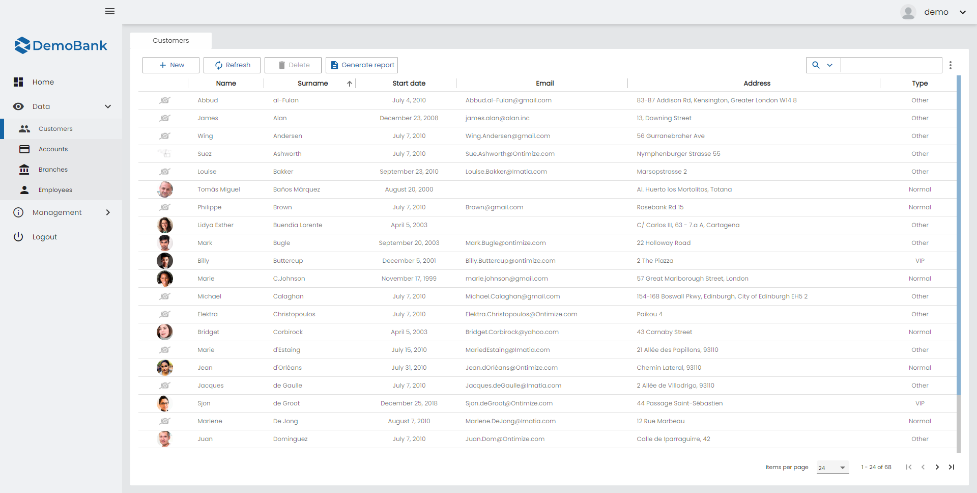
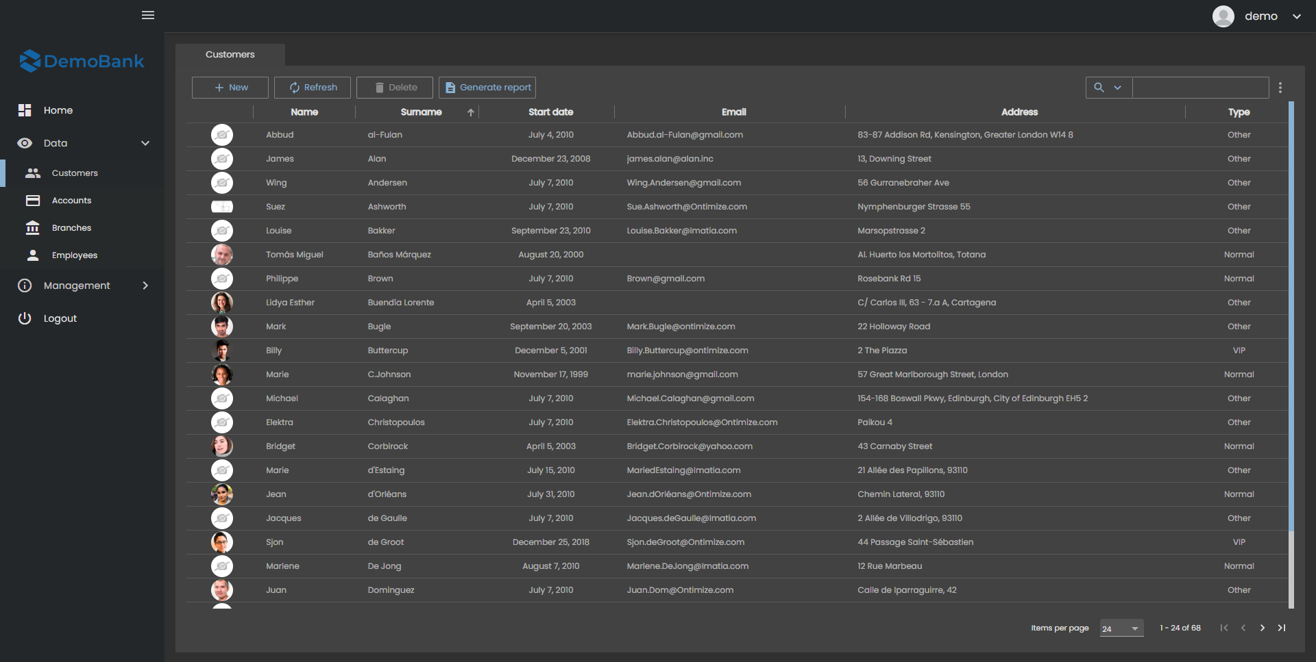
We call surface to the different levels of background colors on the aplication. As you can see in the examples below there is a difference between the background of the aplication and the background of the table, those diference of colors are different surfaces.
When the content is at different elevations it is for different reasons:
- Contain more important content.
- Focus attention, like a dialogue.
- Control the surfaces behind it, like the actions on an app bar.
How many levels of surfaces do we have?
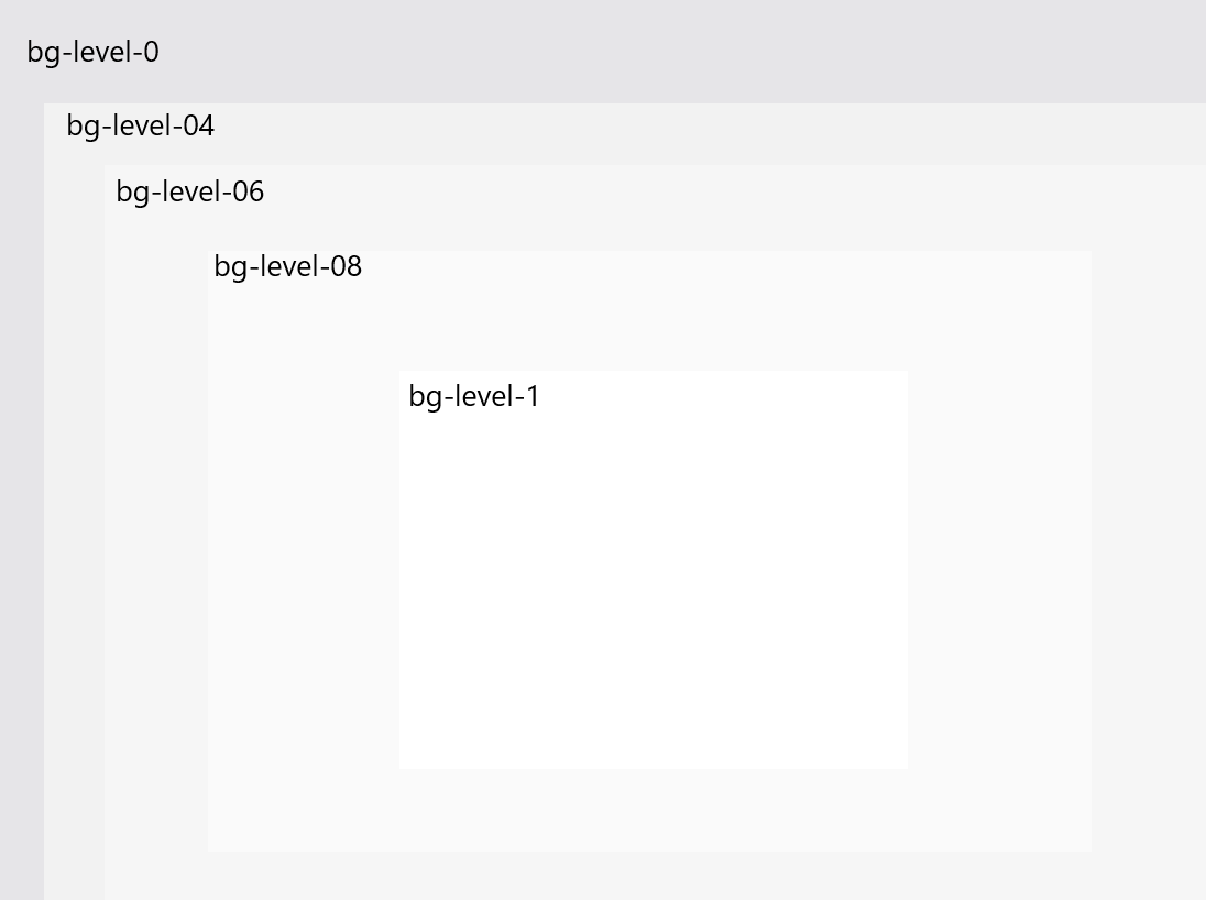
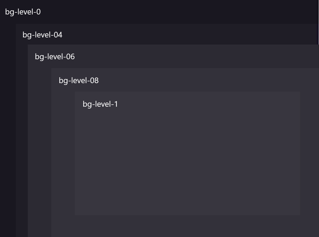
Depending if our aplication is on dark or light mode we got two difference types of surfaces. Inside each color mode we have five different colors of surfaces, we define this surfaces with the SASS classes name: bg-level-0, bg-level-04, bg-level-06, bg-level-08 and bg-level-1.
How can we use the surfaces on Ontimize apps?
There are two difference ways to get the surface colors in our aplications, one way is to get the values directly from the background function as you can see on the example below (the name of the color it’s the defined here but to search it on the map you need to delete bg-):
@use '@angular/material'as mat;
$colors: map.get(theme.$theme, color);
$bg-colors: map.get($colors, background);
$color: map.get($bg-colors, level-04);
The other way is to use the clases defined in our style file. The name of each color it’s defined here. See the example below:
<div class="bg-level-04">Container with background<div>


