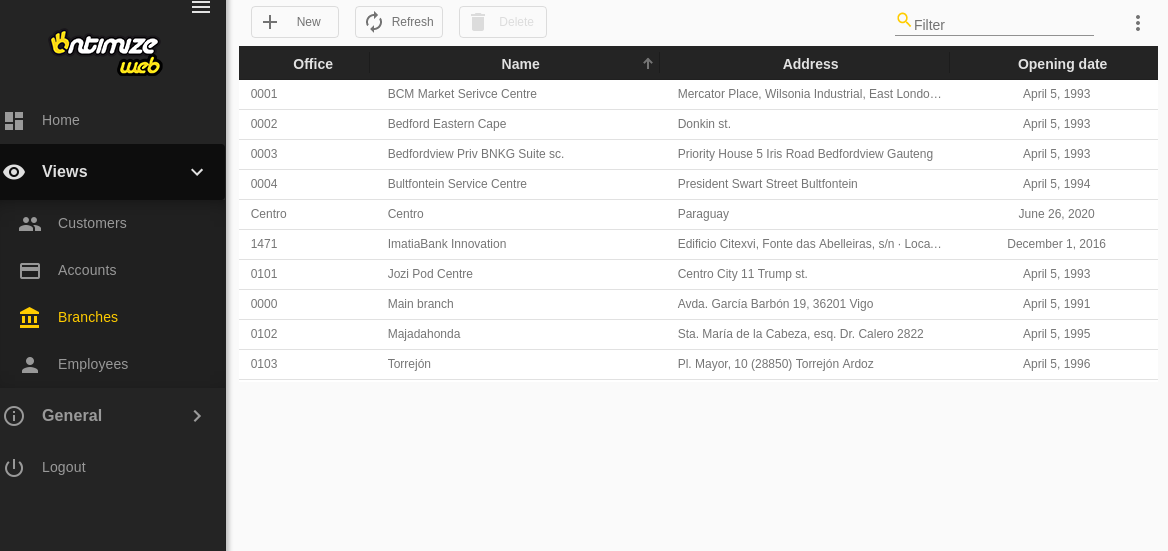
Table
Introduction
The o-table provides a table of data that can be used to display rows of data.
If the table also is inside a form, the attr property is required for registry the table in the form.
WARNING: table is storing changes made by user (order changes, filters, etc.) in the browser local storage. That values will take precedence over table html definition. For example: if a ID column is not in the sort-columns attribute but the user has ordered other column it manually, it will be order in future loads. For restoring initial state is enough to go to the Configuration -> Load Configuration option in the table menu and load the default configuration that deletes in browser local storage and restore the values defined over table html definition.
To define a table, it is necessary to define the columns
You can define it as follows:
- Using the input
columns, adding the columns separated by ‘;’. - Using the
o-table-columncomponent. If o-table component contains inner o-table-column elements, using renderers and editors defined in them. If you use this option, theattrattribute is required. For more information see the API.
With visible-columns you can indicate which columns will be visible.
Using default renderer (o-table-cell-renderer-string) if column attr is present in visible-columns attribute from its parent o-table. In the same way, using the default editor (o-table-cell-editor-string) if column attr is contained in the editable-columns attribute from its parent o-table.
Define columns
Firstly, you must define the columns of the entity that queries the database in columns, in visible-columns you can configure the visible columns.
You can represent the columns in extended mode with o-table-column component. To define a column it’s necessary to add the attr property in the visible-columns property, with the exception of the columns generated for the calculated columns. To consult all the parameters of the ‘o-table-column’ see the API.
Example
<o-table attr="customers" entity="ECustomers" title="CUSTOMERS"
  columns="CUSTOMERID;PHOTO;NAME;STARTDATE;CUSTOMERTYPEID;BOOLEAN;INTEGER;REAL;CURRENCY"
  visible-columns="PHOTO;NAME;STARTDATE;CUSTOMERTYPEID;BOOLEAN;INTEGER;REAL;CURRENCY"
  editable-columns="NAME;STARTDATE;CUSTOMERTYPEID;BOOLEAN;INTEGER;REAL;CURRENCY"
  sort-columns="SURNAME" keys="CUSTOMERID" parent-keys="n:NAME;CUSTOMERTYPEID"
  query-on-init="true" query-rows="6" quick-filter="yes" insert-table="yes">
  <!--definition o-table-column-->
  <o-table-column attr="PHOTO" orderable="no" searchable="no" type="image"
    image-type="base64" empty-image="assets/images/no-image.png" avatar="yes">
  </o-table-column>
  <o-table-column attr="NAME" title="NAME"></o-table-column>
  <o-table-column attr="STARTDATE" title="STARTDATE" type="date"
    format="MM/DD/YYYY HH:mm:ss">
  </o-table-column>
  <o-table-column attr="CUSTOMERTYPEID" title="TYPE" editable="true">
    <o-table-cell-renderer-service entity="ECustomerTypes"
      value-column="CUSTOMERTYPEID"
      columns="CUSTOMERTYPEID;DESCRIPTION" visible-columns="DESCRIPTION">
    </o-table-cell-renderer-service>
  </o-table-column>
  <o-table-column attr="BOOLEAN" title="BOOLEAN" type="boolean"
    true-value-type="string" true-value="YES"
    false-value-type="icon" false-value="not_interested">
  </o-table-column>
  <o-table-column attr="INTEGER" title="INTEGER" type="integer" grouping="yes"
    thousand-separator=".">
  </o-table-column>
  <o-table-column attr="REAL" title="REAL" type="real" grouping="yes"
    thousand-separator="." decimal-separator="," max-decimal-digits="4">
  </o-table-column>
  <o-table-column attr="CURRENCY" title="CURRENCY" type="currency"
    currency-symbol="€" currency-symbol-position="right" grouping="yes"
    thousand-separator="." decimal-separator="," max-decimal-digits="2">
  </o-table-column>

</o-table>
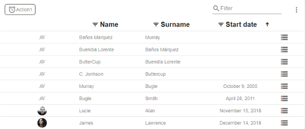
Sorting
Since this functionality is built-in, all you have to do is to set the sorting configuration via sort-columns input in the o-table component using [ ASC or DESC ] format.
All columns are sortable by default, if you don’t want to avoid to set column as sortable you must add sortable= "no" in its column definition.
Example
<o-table attr="customers" entity="ECustomers" keys="CUSTOMERID" sort-columns="SURNAME:DESC"
  columns="CUSTOMERID;PHOTO;NAME;STARTDATE;CUSTOMERTYPEID;BOOLEAN;INTEGER;REAL;CURRENCY"
  visible-columns="PHOTO;NAME;STARTDATE;CUSTOMERTYPEID;BOOLEAN;INTEGER;REAL;CURRENCY"
  query-on-init="true" query-rows="6" quick-filter="yes" insert-table="yes">
...
  <o-table-column attr="SURNAME" orderable="yes" searchable="no" type="string">
  </o-table-column>
</o-table>
Pagination
By default, the table is paginating the data, but if you want avoid that behaviour you must set pagination-controls= "no" in the o-table component.
You can configure the pagination using the o-table-paginator component inside the table. For more information see the API.
You can also configure the number of records initially displayed with query-rows attribute.
Below is an example of how to define a paginator for the table.
Example
<o-table attr="customers" entity="ECustomers" title="CUSTOMERS"
  columns="CUSTOMERID;PHOTO;NAME;STARTDATE;CUSTOMERTYPEID;BOOLEAN;INTEGER;REAL;CURRENCY"
  visible-columns="PHOTO;NAME;STARTDATE;CUSTOMERTYPEID;BOOLEAN;INTEGER;REAL;CURRENCY"
  sort-columns="SURNAME" keys="CUSTOMERID" parent-keys="n:NAME;CUSTOMERTYPEID"
  query-on-init="true" query-rows="6" quick-filter="yes" >

  <o-table-button attr="myButton" label="My button" icon="account_circle"></o-table-button>
  <o-table-column attr="NAME" title="NAME"></o-table-column>

  <o-table-paginator page-size="20"></o-table-paginator>
</o-table>
Data binding
The o-table component supports data binding and you can command the component to display data either from local or remote data storage
Binding to local data
For local data binding you simply need to supply an array of TypeScript objects/JSON via the static-data property. Adicional, you need to set query-on-init="false" in the o-table component.
Example
 <o-table attr="accounts" columns="CARDID;CARDTYPE;NUMCARD;TOTALCREDIT;TOTALREADY;BALANCE" visible-columns="NUMCARD;TOTALCREDIT;TOTALREADY;BALANCE" title="ACCOUNTS" [static-data]="getStaticData()" sort-columns="ACCOUNT:DESC" query-on-init="false" quick-filter="yes" insert-button="no" delete-button="no" refresh-button="no" pagination-controls="no" export-button="no">
  <o-table-columns-filter columns="NUMCARD;TOTALCREDIT;TOTALREADY;BALANCE"></o-table-columns-filter>
  <o-table-column attr="NUMCARD" title="NUMCARD">
    <o-table-column-renderer-cardtype></o-table-column-renderer-cardtype>
  </o-table-column>
  <o-table-column attr="TOTALCREDIT" type="currency" title="TOTALCREDIT" thousand-separator="." decimal-separator="," currency-symbol="€" currency-symbol-position="right"></o-table-column>
  <o-table-column attr="TOTALREADY" title="TOTALREADY">
    <o-table-column-renderer-totalready></o-table-column-renderer-totalready>
  </o-table-column>
  <o-table-column attr="BALANCE" title="BALANCE">
    <o-table-column-renderer-balance></o-table-column-renderer-balance>
  </o-table-column>
</o-table>
getTableData(){
  const account =  [
    { PRODUCTID: 1, 'PRODUCTNAME': 'Alice Mutton', UNITPRICE: 39, UNITSINORDER: 0, UNITSINSTOCK: 1 },
    { PRODUCTID: 2, 'PRODUCTNAME': 'Gorgonzola Telino', UNITPRICE: 12.5, UNITSINORDER: 70, UNITSINSTOCK: 2 },
    { PRODUCTID: 3, 'PRODUCTNAME': 'Louisiana Hot Spiced Okra', UNITPRICE: 17, UNITSINORDER: 100, UNITSINSTOCK: 4 },
    { PRODUCTID: 4, 'PRODUCTNAME': 'Sir Rodney Scones', UNITPRICE: 10, UNITSINORDER: 40, UNITSINSTOCK: 3 },
    { PRODUCTID: 5, 'PRODUCTNAME': 'Alice Mutton', UNITPRICE: 39, UNITSINORDER: 0, UNITSINSTOCK: 0 }
    ];
    return account;
}
If you need the data query to be performed after the parent-keys is updated, query-on-init = false and query-on-bind = true must be changed
Binding to remote data
To manage server data, it is necessary to configure the service and the entity attributes. You may need configure the service-type attribute in case you don’t use the default OntimizeWebService to manage. For more information see in App configuration.
Example
<o-table fxFlex attr="customers" title="CUSTOMERS" service="customers" entity="customer"
keys="CUSTOMERID" columns="CUSTOMERID;PHOTO;NAME;SURNAME;ADDRESS;STARTDATE;EMAIL" visible-columns="PHOTO;NAME;SURNAME;STARTDATE;EMAIL;ADDRESS" sort-columns="SURNAME" query-rows="10" quick-filter="yes" row-height="medium" select-all-checkbox="true">
  <o-table-columns-filter columns="STARTDATE;SURNAME"></o-table-columns-filter>
  <o-table-column async-load="true" width="48px" attr="PHOTO" orderable="no" searchable="no" type="image" image-type="base64"
    empty-image="assets/images/no-image.png" avatar="yes">
  </o-table-column>
  <o-table-column attr="NAME" title="NAME" orderable="no"></o-table-column>
  <o-table-column attr="STARTDATE" title="STARTDATE" type="date" format="LL"></o-table-column>
</o-table>
You can configure the methods by default with the ìnsert-method,update-method,delete-method
By default the filtering is local, you can enable remote filtering setting pageable="yes".
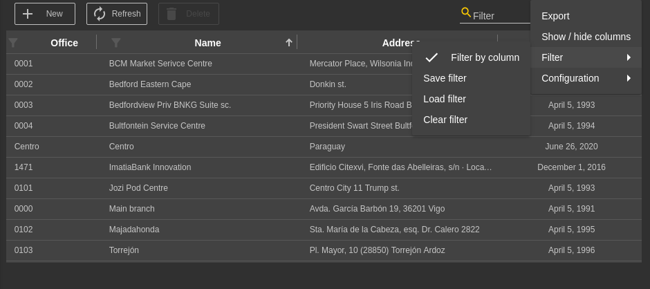
Quick filter
This option is enabled by default, the filter is visible in the top right. You can disable it setting quick-filter="no".
You can also configure filtering to be case sensitive with filter-case-sensitive="yes". By default, it’s disabled.
NOTE
The quick filter displays a checkbox list (click on the icon) where you can select which column to filter by, at the end of this list will appear a checkbox selector to be case sensitive. This option may not appear if pageable attribute is setted to false in table component.
Additionally, you can specify default filter function to be applied when the user enters value in the filter textbox in quick-filter-function property.
Filtering by columns
It is posible to configure filtering by columns as follows:
- Using the input columns, adding the columns separated by ‘;’.
- Using the
o-table-columns-filter-columncomponent. Ifo-table-columns-filtercomponent contains innero-table-columns-filter-columnelements, theattrof the columns attribute is required. For more information see the API.
This option will be available in table menu by default. However, you can configure it is allways available in table header with filter-column-active-by-default= 'yes'.
Example
<o-table service="branches" entity="account" keys="ACCOUNTID"
    columns="ACCOUNTID;ENTITYID;OFFICEID;CDID;ANID;BALANCE;STARTDATE;ENDDATE;INTERESRATE;ACCOUNTTYP"
    visible-columns="ENTITYID;OFFICEID;CDID;ANID;ACCOUNTTYP;BALANCE,INTERESRATE"
    fxFlex layout-padding attr="accounts" title="ACCOUNTS"
    sort-columns="ANID:DESC" query-on-init="true" quick-filter="yes" filter-case-sensitive="true">
    <o-table-columns-filter columns="OFFICEID;NAME" ></o-table-columns-filter>

    ...

</o-table>
Example with o-table-columns-filter-column component
<o-table service="branches" entity="account" keys="ACCOUNTID"
    columns="ACCOUNTID;ENTITYID;OFFICEID;CDID;ANID;BALANCE;STARTDATE;ENDDATE;INTERESRATE;ACCOUNTTYP"
    visible-columns="ENTITYID;OFFICEID;CDID;ANID;ACCOUNTTYP;BALANCE,INTERESRATE"
    fxFlex layout-padding attr="accounts" title="ACCOUNTS"
    sort-columns="ANID:DESC" query-on-init="true" quick-filter="yes" filter-case-sensitive="true">
    <o-table-columns-filter>
      <o-table-columns-filter-column attr="OFFICEID"> </o-table-columns-filter-column>
      <o-table-columns-filter-column attr="ACCOUNTTYP" sort="desc"> </o-table-columns-filter-column>
    </o-table-columns-filter>

    ...

</o-table>
o-table-columns-filter component can filter in one of three different ways based on the mode property.
| Mode | Description |
|---|---|
| default | Combines selection and custom mode |
| selection | Allows filtering selected by the values in the column. |
| custom | Allows filtering by a form control |
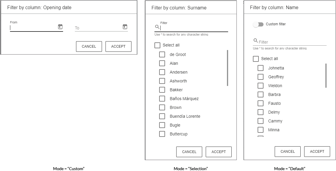
Custom filter
OntimizeWeb allows to customize the table data filtering by building your own filters. You can build complex filtering structures by adding the o-filter-builder component to you application.
The o-filter-builder component uses the IExpression interface that represents a filtering expression. You can read more about how to build complex filtering expressions here.
Cell renderers
The data is displayed in the table cells as simple text by default. OntimizeWeb allows you to modify the way the data is displayed by adding renderers to the table columns. You have different options to include table cell renderers in your table component:
- Do nothing, the cell data is displayed as simple text.
- Use a predefined cell renderer in the table column. The predefined renderers are: action, boolean, real, currency, date, integer, image, percentage and service.
- Use one of the predefined table cell renderer components that OntimizeWeb offers. This option is equivalent to the previous one.
- Create a custom renderer component and use it in your table.
<!-- 1.Do nothing, simple strings get used to display the table -->
<o-table-column attr="PHOTO" > </o-table-column>

<!-- 2. Use one of cell renderer predefined -->
<o-table-column attr="PHOTO" orderable="no" searchable="no" type="image" image-type="base64" empty-image="assets/images/no-image.png" avatar="yes"></o-table-column>

<!-- 3. Use equivalent code -->
<o-table-column attr="PHOTO" orderable="no" searchable="no">
  <o-table-cell-renderer-image image-type="base64" empty-image="assets/images/no-image.png" avatar="yes"></o-table-cell-renderer-image>
</o-table-column>

<!-- 4. Custom renderer -->
<o-table-column attr="NAME" orderable="no" searchable="no">
  <o-table-cell-renderer-name></o-table-cell-renderer-name>
</o-table-column>
Predefined renderers
OntimizeWeb offers you a set of prebuilt table cell renderers to include in your table. This cell renderers are the following data types: action, boolean, real, currency, date, integer, image, percentage and service.
For adding a cell renderer to the cells of a table column, you have to configure the attribute type in the desired table column with the value that indicates the cell render you want to use. You may need to configure additional parametres depending on the cell renderer configured. Check the examples in the following sections and the attributes for each cell renderer in the API section of this page.
You can see different predefined table cell renderers in the example below.
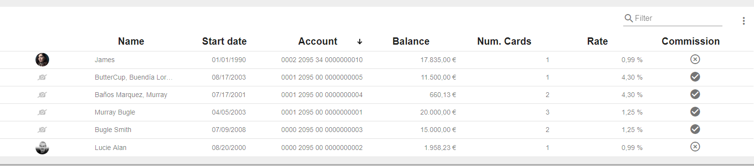
<o-table  attr="accounts" columns="PHOTO;NAME;ACCOUNT;BALANCE;STARTDATE;NUMCARDS;ENDDATE;INTERESRATE;CLOSED" visible-columns="PHOTO;NAME;STARTDATE;ACCOUNT;BALANCE;NUMCARDS;INTERESRATE;COMMISSION" title="ACCOUNTS" [static-data]="getTableData()" sort-columns="ACCOUNT:DESC" query-on-init="false" quick-filter="yes" insert-button="no" delete-button="no" refresh-button="no" pagination-controls="no" export-button="no">
  <!--Date Renderer-->
  <o-table-column attr="STARTDATE" title="STARTDATE" type="date"> </o-table-column>
  <!--Currency Renderer-->
  <o-table-column attr="BALANCE" title="BALANCE" type="currency" thousand-separator="." decimal-separator="," currency-symbol="€" currency-symbol-position="right"></o-table-column>
  <!--Percentage Renderer-->
  <o-table-column attr="INTERESRATE" title="INTERESRATE" type="percentage" decimal-separator="," max-decimal-digits="2"></o-table-column>
  <!--Integer Renderer-->
  <o-table-column attr="NUMCARDS" title="NUMCARDS" type="integer"></o-table-column>
  <!--Boolean Renderer-->
  <o-table-column attr="COMMISSION" title="COMMISSION" type="boolean" true-value="check_circle" false-value="highlight_off" true-value-type="icon" false-value-type="icon" boolean-type="string"></o-table-column>
</o-table>
You can see this live example in the OntimizeWeb playground.
Action cell renderer
The action cell renderer is used for displaying a button in a table cell. Include this renderer in your table column by configuring the attribute type in the column with the value action or adding the o-table-cell-renderer-action to the table column.
<o-table-column attr="EMPLOYEENAME" type="action" icon="person" (onClick)="showMessage($event)"></o-table-column>

<!-- Equivalent code -->

<o-table-column attr="EMPLOYEENAME">
  <o-table-cell-renderer-action icon="person" (onClick)="showMessage($event)"></o-table-cell-renderer-action>
</o-table-column>
You can display a text and/or a icon in the cell, also choosing the icon position using the icon-position attribute.
<o-table-column attr="EMPLOYEENAME">
  <o-table-cell-renderer-action icon="person" text="user" icon-position="right"></o-table-cell-renderer-action>
</o-table-column>
When an action cell is clicked you can trigger a predefined action or execute your custom callback. In the first case there are two predefined actions: detail or edit, that will trigger navigation to table detail or edition route. Otherwise, you can listen to the onClick event to perform your defined action. Check the definition of this and more attributes in the API section of this page.
<!-- Navigation to detail mode -->
<o-table-column attr="EMPLOYEENAME">
  <o-table-cell-renderer-action icon="person" action="detail"></o-table-cell-renderer-action>
</o-table-column>

<!-- Triggering showMessage method -->
<o-table-column attr="EMPLOYEENAME">
  <o-table-cell-renderer-action icon="person" (onClick)="showMessage($event)"></o-table-cell-renderer-action>
</o-table-column>
Boolean cell renderer
Include the table cell renderer boolean in your table column by configuring the attribute type in the column with the value boolean or adding the o-table-cell-renderer-boolean to the table column. You can indicate the type of the retrieved data by configuring the boolean-type attribute. Display a custom value by configuring false-value and true-value attributes depending on the false-value-type and true-value-type attributes. Check the configuration of this attributes in the API section of this page.
<o-table-column attr="COMMISSION" title="COMMISSION" type="boolean" true-value="check_circle" false-value="highlight_off" true-value-type="icon" false-value-type="icon" boolean-type="string"></o-table-column>

<!-- Equivalent code -->

<o-table-column attr="COMMISSION" title="COMMISSION">
  <o-table-cell-renderer-boolean true-value="check_circle" false-value="highlight_off" true-value-type="icon" false-value-type="icon" boolean-type="string"></o-table-cell-renderer-boolean>
</o-table-column>
Currency cell renderer
Include the table cell renderer currency in your table column by configuring the attribute type in the column with the value currency or adding the o-table-cell-renderer-currency to the table column. Configure the currency symbol with the currency-symbol attribute. Check this and other attributes in the API section of this page.
<o-table-column attr="BALANCE" title="BALANCE" type="currency" currency-symbol="€" currency-symbol-position="right" thousand-separator="." decimal-separator=","></o-table-column>

<!-- Equivalent code -->

<o-table-column a ttr="BALANCE" title="BALANCE">
  <o-table-cell-renderer-currency currency-symbol="€" currency-symbol-position="right" thousand-separator="." decimal-separator=","></o-table-cell-renderer-currency>
</o-table-column>
Date cell renderer
You can include the table cell renderer date in your table column by configuring the attribute type in the column with the value date or adding the o-table-cell-renderer-date to the table column. You may want to set the displaying date format by configuring the format attribute. Check this and other attributes in the API section of this page.
<o-table-column attr="STARTDATE" title="STARTDATE" type="date"></o-table-column>

<!-- Equivalent code -->

<o-table-column attr="STARTDATE" title="STARTDATE">
  <o-table-cell-renderer-date></o-table-cell-renderer-date>
</o-table-column>
Integer cell renderer
Include the table cell renderer integer in your table column by configuring the attribute type in the column with the value integer or adding the o-table-cell-renderer-integer to the table column. Check the attributes of this component in the API section of this page.
<o-table-column attr="NUMCARDS" title="NUMCARDS" type="integer"></o-table-column>

<!-- Equivalent code -->

<o-table-column attr="NUMCARDS" title="NUMCARDS">
  <o-table-cell-renderer-integer></o-table-cell-renderer-integer>
</o-table-column>
Image cell renderer
You can include the table cell renderer image in your table column by configuring the attribute type in the column with the value image or adding the o-table-cell-renderer-image to the table column. Check the attributes of this component in the API section of this page.
<o-table-column attr="PHOTO" orderable="no" searchable="no" type="image" image-type="base64" empty-image="assets/images/no-image.png" avatar="yes"></o-table-column>

<!-- Equivalent code -->

<o-table-column attr="PHOTO" orderable="no" searchable="no">
  <o-table-cell-renderer-image image-type="base64" empty-image="assets/images/no-image.png" avatar="yes"></o-table-cell-renderer-image>
</o-table-column>
Percentage cell renderer
You can include the table cell renderer percentage in your table column by configuring the attribute type in the column with the value percentage or adding the o-table-cell-renderer-percentage to the table column. Check the attributes of this component in the API section of this page.
<o-table-column attr="INTERESRATE" title="INTERESRATE" type="percentage" decimal-separator="," max-decimal-digits="2"></o-table-column>

<!-- Equivalent code -->

<o-table-column attr="INTERESRATE" title="INTERESRATE">
  <o-table-cell-renderer-percentage decimal-separator="," max-decimal-digits="2"></o-table-cell-renderer-percentage>
</o-table-column>
Real cell renderer
Include the table cell renderer real in your table column by configuring the attribute type in the column with the value real or adding the o-table-cell-renderer-real to the table column. Check the attributes of this component in the API section of this page.
<o-table-column attr="UNITPRICE" title="UNITPRICE" type="real" thousand-separator="." decimal-separator=","></o-table-column>

<!-- Equivalent code -->

<o-table-column attr="UNITPRICE" title="UNITPRICE">
  <o-table-cell-renderer-real thousand-separator="." decimal-separator=","></o-table-cell-renderer-real>
</o-table-column>
Service cell renderer
The table cell renderer service component is used for retrieving data form an entity that is related to the current table entity. The most common usage of this is displaying some text description when the current table entity has the identifier for that entity.
You can include this component in your table in two different ways:
- Configuring the attribute
typein the column with the value service and including the attributes of the table cell renderer service. Check all the attributes of the table cell renderer service in the API section of this page. - Adding the
o-table-cell-renderer-servicecomponent to the table column like in the example below.
<o-table-column attr="EMPLOYEETYPEID" title="EMPLOYEETYPEID">
  <o-table-cell-renderer-service service="employees" entity="employeeType" columns="TYPEID;EMPLOYEETYPENAME"
    parent-keys="TYPEID:EMPLOYEETYPEID" value-column="EMPLOYEETYPENAME">
  </o-table-cell-renderer-service>
</o-table-column>

<!-- Equivalent code -->

<o-table-column attr="EMPLOYEETYPEID" title="EMPLOYEETYPEID" type="service" service="employees"
  entity="employeeType" columns="TYPEID;EMPLOYEETYPENAME" parent-keys="TYPEID:EMPLOYEETYPEID"
  value-column="EMPLOYEETYPENAME">
</o-table-column>
You can see this example in the OntimizeWeb QuickStart or check the code in GitHub.
Translate cell renderer
You can include the table cell renderer translate in your table column by configuring the attribute type in the column with the value translate or adding the o-table-cell-renderer-translate to the table column. Check the attributes of this component in the API section of this page.
<o-table-column attr="CODE" type="translate"></o-table-column>

<!-- Equivalent code -->

<o-table-column attr="CODE">
  <o-table-cell-renderer-translate></o-table-cell-renderer-translate>
</o-table-column>
Custom renderers
A custom renderer allows you to display the data of a table cell formatted as you desire. For this, you need to create a new component that extends the base cell renderer class and place it into your table.
The requisites for a custom table cell renderer component are the following:
-
The component must extend the
OBaseTableCellRendererclass. -
Your renderer template must reference the template container. For this, wrap the content of your component HTML with the
ng-templatetag and define a template variable. Then create an attribute to your component referencing the template container defined previously, add this line to your component:@ViewChild('templateref', { read: TemplateRef }) public templateref: TemplateRef<any>. This will give your component a reference to acces the template container. -
If you want to customize the internal value of the cell (this value is used for filtering or exporting the table data), you must overwrite the
getCellDatamethod.
You have an example of a custom renderer below. It displays a person full name in a table cell, for this, it concat the values in the getCellData method and displays its value in the template.
import { Component, Injector, TemplateRef ViewChild } from '@angular/core';
import { OBaseTableCellRenderer } from 'ontimize-web-ngx';

@Component({
  selector: 'custom-render',
  templateUrl: './custom-render.component.html'
})

export class OTableCellRendererName extends OBaseTableCellRenderer {

  @ViewChild('templateref', { read: TemplateRef }) public templateref: TemplateRef<any>;

  constructor(protected injector: Injector) {
    super(injector);
  }

  getCellData(cellvalue: any, rowvalue: Object) {
    return rowvalue['SURNAME'].toUpperCase() + ', ' + rowvalue['NAME'];
  }

}
  <ng-template #templateref let-cellvalue="cellvalue" let-rowvalue="rowvalue">
    {{ getCellData(cellvalue, rowvalue) }}
  </ng-template>
The let keyword declares a template input variable that you reference within the template. The input variables are cellvalue and rowvalue. The parser translates let cellvalue and let rowvalue into variables named, let-cellvalue and let-rowvalue.
Finally, add the created component to your module for including it in your table.
Editing
The o-table component supports data editing operations (create, update, destroy) via a simple configuration of its data source. By default, this operations are enabled.
All you have to do to enable data editing capabilities for the component is to:
- Include the table within an o-form component
- Configure data binding
If you need to disabled one operation, you can changing insert-button= "no", delete-button= "no".
NOTE: It is necessary to configure
detail-mode='none'attribute for editing in a table column cell.
Default editors
Next we are specifing how to add a editor for a table column cell.
By default, the table will no define a editor for your data into a cell. If you want to be able to edit that data you have to use a cell editor. So, for editing your values, you have the following options.
1. Use one of the predefined cell editor, you should add editable="yes". The predefined types are boolean, date, integer, real and text.
If a column haven’t type will be string. You can find all information here.
2. Use equivalent code.
3. Custom editor. Below is an example but you can find all information here.
You can see examples of this section in the OntimizeWeb playground.
For example:
// 1. Use one of the predefined cell editor
<o-table-column attr="STARTDATE" title="STARTDATE" type="date" format="LL" editable="yes"></o-table-column>

// 2. Use equivalent code
<o-table-column attr="STARTDATE" title="STARTDATE">
  <o-table-cell-editor-date format="LL">
  </o-table-cell-editor-date>
</o-table-column>

// 3. Custom editor.
<o-table-column attr="STARTDATE" title="STARTDATE">
  <o-table-cell-editor-startdate></o-table-cell-editor-startdate>
</o-table-column>
Boolean
The configuration is similar to the renderer boolean. The following example uses the second option named before, adding the o-table-cell-editor-boolean component inside the o-table-column. To consult all the parameters of the editor see the API.
  <o-table-column attr="CLOSED" title="CLOSED">
    <o-table-cell-editor-boolean true-value="1" false-value="0" boolean-type="number" (editionStarted)="editionStarted($event)"
    (editionCancelled)="editionCancelled($event)" (editionCommitted)="editionCommitted($event)"></o-table-cell-editor-boolean>
  </o-table-column>
 editionStarted(arg: any) {
    console.log('editionStarted');
    console.log(arg);
  }

  editionCancelled(arg: any) {
    console.log('editionCancelled');
    console.log(arg);
  }

  editionCommitted(arg: any) {
    console.log('editionCommitted');
    console.log(arg);
  }
Date
The configuration is similar to the renderer date. The following example uses the first option named before, in this case its required to add
type="date" editable="yes" in o-table-column component. To consult all the parameters of the editor see the API.
  <o-table-column attr="STARTDATE" title="STARTDATE" format="LL" type="date" editable="yes" (editionStarted)="editionStarted($event)"
        (editionCancelled)="editionCancelled($event)" (editionCommitted)="editionCommitted($event)">
  </o-table-column>
Integer
The configuration is similar to the renderer integer. The following example uses the second option named before, adding the o-table-cell-editor-integer component inside the o-table-column. To consult all the parameters of the editor see the API.
  <o-table-column attr="NUMCARDS" title="NUMCARDS" class="o-table-column-centered">
    <o-table-cell-editor-integer (editionStarted)="editionStarted($event)" (editionCancelled)="editionCancelled($event)" (editionCommitted)="editionCommitted($event)">
        </o-table-cell-editor-integer>
  </o-table-column>
Real
The configuration is similar to the renderer real. The following example uses the first option named before, in this case its required to add
type="currency" editable="yes" in o-table-column component. To consult all the parameters of the editor see the API.
 <o-table-column attr="BALANCE" title="BALANCE" editable="yes" type="currency" thousand-separator="." decimal-separator=","
        currency-symbol="€" currency-symbol-position="right" (editionStarted)="editionStarted($event)" (editionCancelled)="editionCancelled($event)"
        (editionCommitted)="editionCommitted($event)">
  </o-table-column>
Text
The configuration is similar to the renderer text. The following example uses the second option named before, adding the o-table-cell-editor-integer component inside the o-table-column. To consult all the parameters of the editor see the API.
    <o-table-column attr="NAME" title="NAME">
        <o-table-cell-editor-text (editionStarted)="editionStarted($event)" (editionCancelled)="editionCancelled($event)" (editionCommitted)="editionCommitted($event)"></o-table-cell-editor-text>
    </o-table-column>
The configuration is similar to the text editor. To consult all the parameters of the editor see the API.
    <o-table-column attr="EMAIL" title="EMAIL">
        <o-table-cell-editor-email (editionStarted)="editionStarted($event)" (editionCancelled)="editionCancelled($event)" (editionCommitted)="editionCommitted($event)"></o-table-cell-editor-email>
    </o-table-column>
Custom editors
To create a custom editor, you need to create a new component to display custom editor information and place it inside a cell.
Here’s how you might begin in your file .ts:
-
Your component must extend
OBaseTableCellEditorclass. -
It also must get the
templaterefview child reference, using@ViewChild('templateref', { read: TemplateRef }) public templateref: TemplateRef<any>where you’ll acquire the<ng-template>contents with a TemplateRef and access the view container. -
In your editor constructor you must set its
typeproperty value. -
In your editor constructor you must register it as a new editor, using the
OTableColumnComponentaddEditorstatic method. -
In your editor, the input must register
formControl
In the following example shows how to render two values of column in a cell (“SURNAME, name”) and how to override the getCellData method.
The o-table-cell-editor-name.ts file is as follows:
import { Component, Injector, ViewChild, TemplateRef } from '@angular/core';
import { OBaseTableCellEditor, OTableColumnComponent } from 'ontimize-web-ngx';

@Component({
  selector: 'custom-editor',
  templateUrl: './custom-editor.component.html'
})
export class OTableCellEditorName extends OBaseTableCellEditor {

  @ViewChild('templateref', { read: TemplateRef }) public templateref: TemplateRef<any>;

  constructor(protected injector: Injector) {
    super(injector);
    this.type = 'custom-editor';
    OTableColumnComponent.addEditor(this.type, OTableCellEditorName);
  }

}
Here’s how you might build your editor html template:
- You must wrap your component template with
<ng-template #templateref let-cellvalue="cellvalue" let-rowvalue="rowvalue">and</ng-template>. The let keyword declares a template input variable that you reference within the template. The input variables are cellvalue and rowvalue. The parser translates ‘let cellvalue’ and ‘let rowvalue’ into variables named, let-cellvalue and let-rowvalue.
The o-table-cell-editor-name.html file is as follows:
<ng-template #templateref let-cellvalue="cellvalue" let-rowvalue="rowvalue">
  <div [formGroup]="formGroup">
    <mat-form-field floatLabel="never">
      <input #input matInput type="text" [placeholder]="getPlaceholder()" [formControl]="formControl" [required]="orequired">
      <mat-error *ngIf="hasError('required')">FORM_VALIDATION.REQUIRED</mat-error>
    </mat-form-field>
  </div>
</ng-template>
Finally, add the OTableCellEditorName component to your module.
Features
Checkbox selection
The table supports checkbox selection with select-all-checkbox-visible property. If this property is activated will display the row checkboxes,including a master toggle checkbox for the header. It is disabled by default.
You can configure show in the menu on the upper right the option of select row with select-all-checkbox property. It is disabled by default.

Fixed header and footer
The o-table component supports fixed header and footer setting fixed-header="yes" when its content is greater than its own height. For that, you must set the height of the table, using, for example [ngStyle]="height: 400px;". By default, it’s disabled.
Example
<o-table #table attr="table" title="ACCOUNTS" fixed-header="yes" [static-data]="getTableData()" columns="ACCOUNTID;ENTITYID;OFFICEID;CDID;ANID;BALANCE;STARTDATE;ENDDATE;INTERESRATE;ACCOUNTTYP"
    visible-columns="ENTITYID;OFFICEID;CDID;ANID;ACCOUNTTYP;BALANCE" layout-padding sort-columns="ANID" query-on-init="false"
    quick-filter="yes" insert-button="no" delete-button="no" refresh-button="no" pagination-controls="no" export-button="no"
    [ngStyle]="height:400px">
    <o-table-column attr="ENTITYID" title="ENTITYID" width="14%"></o-table-column>
    <o-table-column attr="OFFICEID" title="OFFICEID" width="14%"></o-table-column>
    <o-table-column attr="CDID" title="CDID" width="14%"></o-table-column>
    ...
  </o-table>
Aggregates
Oftentimes, when displaying numbers in the table, users would like to be able to see the results from aggregate calculations at the bottom of the table columns. The o-table component has support for the mostly used aggregate functions (count,sum,avg,min,max).
Example
<o-table service="branches" entity="account" keys="ACCOUNTID"
    columns="ACCOUNTID;ENTITYID;OFFICEID;CDID;ANID;BALANCE;STARTDATE;ENDDATE;INTERESRATE;ACCOUNTTYP"
    visible-columns="ENTITYID;OFFICEID;CDID;ANID;ACCOUNTTYP;BALANCE,INTERESRATE"
    fxFlex layout-padding attr="accounts" title="ACCOUNTS"
    sort-columns="ANID:DESC"  query-on-init="true"
    quick-filter="yes"   filter-case-sensitive="true" >
    <o-table-column attr="BALANCE" title="BALANCE" type="currency" currency-symbol="€" thousand-separator=","></o-table-column>
    <o-table-column attr="INTERESRATE" title="INTERESRATE" type="real" ></o-table-column>
    <o-table-column-aggregate attr="BALANCE" title="sum">
    <o-table-column-aggregate attr="INTERESRATE" [function-aggregate]="custom"></o-table-column-aggregate>
</o-table>
Typescript code
  ...

  custom(data:any[]):number{
    let result = 0;
    for(var i=0;i<data.length;i++){
      if(i%2==0) result+=data[i];
    }
    return result;
  }
You can see this and more examples of this component in the OntimizeWeb playground.
Calculated columns
The o-table supports calculated columns, used when user wants to show an additional column which contains a result of an operation.
Example
In the following example, two calculated columns are defined that perform the same operation but one uses the operation attribute (BALANCExINTERESRATE) and the other the function calculateBenefit.
  <o-table
    service="branches" entity="account" keys="ACCOUNTID"
    columns="ACCOUNTID;ENTITYID;OFFICEID;CDID;ANID;BALANCE;STARTDATE;ENDDATE;INTERESRATE;ACCOUNTTYP"
    visible-columns="ENTITYID;OFFICEID;CDID;ANID;ACCOUNTTYP;BALANCE;INTERESRATE;BENEFIT;BENEFIT2"
    attr="accounts" title="ACCOUNTS"
    layout-padding
    sort-columns="ANID" query-rows="15" pageable="no" >

    <o-table-column attr="ENTITYID" title="ENTITYID"></o-table-column>
    <o-table-column attr="CDID" title="CDID"></o-table-column>
    <o-table-column attr="ANID" title="ANID"></o-table-column>
    <o-table-column attr="BALANCE" title="BALANCE" currency-symbol="€" type="currency" grouping="yes" thousand-separator=","> </o-table-column>
    <o-table-column attr="INTERESRATE" title="INTERESRATE" type="percentage" decimal-separator=","></o-table-column>

  <!--calculated column-->
    <o-table-column-calculated attr="BENEFIT" title="BENEFIT" type="currency" thousand-separator="." decimal-separator="," currency-symbol="€"
      currency-symbol-position="right" operation="(BALANCE*INTERESRATE)" > </o-table-column-calculated>
    <o-table-column-calculated attr="BENEFIT2" title="BENEFIT2"  type="currency" thousand-separator="." decimal-separator="," currency-symbol="€"
      currency-symbol-position="right" [operation-function]="calculateBenefit" > </o-table-column-calculated>


  </o-table>
Typescript code
  ...


  calculateBenefit(rowData: any[]): number {

    return (rowData['BALANCE'] * rowData['INTERESRATE']);
  }
You can see this and more examples of this component in the OntimizeWeb playground.
Table options
The o-table-option component allows to add extra options to the table menu. You only have to add the component to your table and subscribe to the onClick event in your component to perform the desired actions. Check the example below.
<o-table attr="customers" entity="ECustomers" title="CUSTOMERS"
  columns="CUSTOMERID;PHOTO;NAME;STARTDATE;CUSTOMERTYPEID;BOOLEAN;INTEGER;REAL;CURRENCY"
  visible-columns="PHOTO;NAME;STARTDATE;CUSTOMERTYPEID;BOOLEAN;INTEGER;REAL;CURRENCY">

  <o-table-option #myOption label="My option"></o-table-option>

</o-table>
  import { Component, ViewChild } from '@angular/core';
  import { OTableOptionComponent } from 'ontimize-web-ngx';

  @Component({
    selector: 'my-page',
    templateUrl: 'my-page.component.html'
  })
  export class MyPageComponent {

    @ViewChild('myOption')
    protected myOption: OTableOptionComponent;

    ngAfterViewInit() {
      this.myButton.onClick.subscribe(event => {
        alert('my option click');
      });
    }

  }
Table context menu
The o-table allows to add a context menu to table rows, the menu is displayed by right clicking in the table row.
For including the context menu in your table you have to include the o-table-context-menu component in your table.
By default, o-table-context-menu include the next options:
- Refresh
- View detail.
- Edit.
- Insert.
- Delete
- Copy options.
- Filter options.
- Select/Deselect all.
Below an example.
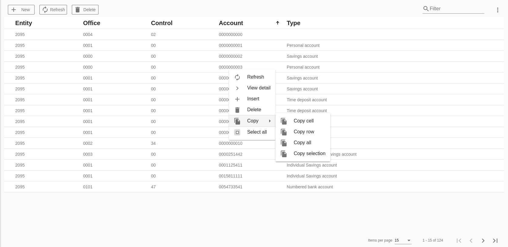
The o-table-context-menu allows to hide these options by setting the attributes insert, edit, view-detail, delete,copy, select-all,refresh,filter to no.
You can also include your own context-menu with the reference to a o-context-menucomponent like in the example below.
Example
<o-table attr="customers" entity="ECustomers" title="CUSTOMERS"
  columns="CUSTOMERID;PHOTO;NAME;STARTDATE;CUSTOMERTYPEID;BOOLEAN;INTEGER;REAL;CURRENCY"
  visible-columns="PHOTO;NAME;STARTDATE;CUSTOMERTYPEID;BOOLEAN;INTEGER;REAL;CURRENCY"
  sort-columns="SURNAME" keys="CUSTOMERID" parent-keys="n:NAME;CUSTOMERTYPEID"
  query-on-init="true" query-rows="6" quick-filter="yes" >

  <o-table-button attr="myButton" label="My button" icon="account_circle"></o-table-button>

  <o-table-column attr="NAME" title="NAME"></o-table-column>

  ...
   <o-table-context-menu [context-menu]="myContextMenu" insert="no" edit="no" view-details="no"></o-table-context-menu>
</o-table>

<o-context-menu #myContextMenu>
  <o-context-menu-item icon="face" label="Item 1" (execute)="onExecute($event)"></o-context-menu-item>
  <o-context-menu-item icon="star_rate" label="Item 2" enabled="no"></o-context-menu-item>
  <o-context-menu-item label="Item 3" [visible]="getVisible" (execute)="onExecute($event)"></o-context-menu-item>
</o-context-menu>
For more information about the o-context-menu component definition, please read the docs.
You can see this and more examples of this component in the OntimizeWeb playground.
Insertable row
The o-table component allow to insert rows adding the o-table-insertable-row component into the o-table definition.
In this component you can define the columns and required columns with columns and required-columns attributes.
Example
In the following example the table has a insertable row where the user may introduce the name, surname or email for inserting a new customer. Name column is required.
<o-table fxFlex attr="customers" title="CUSTOMERS" service="customers" entity="customer" keys="CUSTOMERID" columns="CUSTOMERID;PHOTO;NAME;SURNAME;ADDRESS;STARTDATE;EMAIL"
  visible-columns="NAME;SURNAME;STARTDATE;EMAIL;ADDRESS" sort-columns="SURNAME" query-rows="10" quick-filter="yes"
  pageable="no" row-height="medium" select-all-checkbox="true" pagination-controls="yes">

  <o-table-insertable-row columns="NAME;SURNAME;EMAIL" required-columns="NAME"></o-table-insertable-row>

  <o-table-column attr="NAME" title="NAME" orderable="no"></o-table-column>
  <o-table-column attr="STARTDATE" title="STARTDATE" type="date" format="LL"></o-table-column>
</o-table>
The o-table-insertable-row support 2 differnent positions which can be set via the position input, first and last. By default, it’s last.
To create a custom insertable column, you must define a custom editor for the column following the same steps as in Custom editors and add the column attr column in columns attribute in o-table-insertable-row.
You can see more examples of this component in the OntimizeWeb playground.
Table buttons
The o-table component allows to add extra buttons in the toolbar with the o-table-button component.
You can configure:
- The icon in `icon` property, this name must to be of google icon (see [Google material design icons](https://design.google.com/icons/){:target='_blank'}))
- The label in `label` property
Example
<o-table attr="customers" entity="ECustomers" title="CUSTOMERS"
  columns="CUSTOMERID;PHOTO;NAME;STARTDATE;CUSTOMERTYPEID;BOOLEAN;INTEGER;REAL;CURRENCY"
  visible-columns="PHOTO;NAME;STARTDATE;CUSTOMERTYPEID;BOOLEAN;INTEGER;REAL;CURRENCY"
  sort-columns="SURNAME" keys="CUSTOMERID" parent-keys="n:NAME;CUSTOMERTYPEID"
  query-on-init="true" query-rows="6" quick-filter="yes" >

  <o-table-button attr="myButton" label="My button" icon="account_circle"></o-table-button>

  <o-table-column attr="NAME" title="NAME"></o-table-column>

  ...

</o-table>
Typescript code
  ...
  import { OTableButtonComponent } from 'ontimize-web-ngx';
  ...
  @ViewChild('myButton')
  protected myButton: OTableButtonComponent;
  ...
  ngAfterViewInit() {
    this.myButton.click.subscribe(event => {
      alert('my button click');
    });
  }
Export table data
This section explains how the table data exportation works.
Exportating the table data
The o-table component is able to export its data in Excel, HTML and PDF format by default. Extra formats can be configured using the o-table-export-button component. In order to perform the exportation of the table data, it is necessary to set up the services properly on your rest interface.
The o-table component exports the shown data by default. Using the export-mode attribute, the user can modify this behaviour in order to export all the data the table stores in the browser (export-mode="local") or all the data asociated to the table (export-mode="all").
The exportation process is performed as follows:
Firstly, the table collects all the required information to perform the exportation, the table data, column names, column types...
Then it sends this information to the server in order to generate the file that will contain the exported data.
The rest interface used for this must be like the following by default:
https://{ your-api-endpoint }/{ table-service-path }/{ table-entity }/{ format-selected }
Where format-selected can be: 'xlsx', 'html' or 'pdf' depending on the format selected. You can also export the table data in other format using a o-table-export-button, in this case, the format-selected will be the value configured in the attribute `export-type` of the `o-table-export-button` component.
If you want to customize this end point, please check the Custom exportation end point section.
The service must send a response with an object containing an unique identifier for the file and a key that depends on the format selected for the exportations. You can se en example of each exportation object response in the following table.
You can see an example of the exportation method end point in the following example.
@PostMapping(value = "/{extension}", consumes = MediaType.APPLICATION_JSON_VALUE, produces = MediaType.APPLICATION_JSON_VALUE)
public ResponseEntity<JSONObject> export(@PathVariable("extension") String extension) {

  // Generate xlsx file ...
  int id = generateXLSXFile();

  // Send response
  JSONObject result = new JSONObject();
  result.setInt(extension + "Id", id);
  return new ResponseEntity<>(result, HttpStatus.OK);
}
Finally, the table sends a request to the rest interface with the file identifier provided to perform the download of the file generated on the previous step.
The rest interface used for downloading the file is like the following by default:
https://{ your-api-endpoint }/{ table-service-path }/{ format-selected }/{ file-id }
Where format-selected is the same as in the first request and file-id is the file identifier obtained as response of the first request.
If you want to customize the download end point, please check the Custom exportation end point section.
In the following example you ca see the download api end point method.
@GetMapping(value = "/{extension}/{id}")
public void downloadFile(@PathVariable(name = "extension", required = true) final String fileExtension,
    @PathVariable(name = "id", required = true) final String fileId, HttpServletResponse response) {

  // Get the file usint the file identifier
  File file = getFile(fileId);

  // Send response
  response.setHeader("Content-Type", "application/octet-stream");
  response.setHeader("Content-Disposition", "attachment; filename=\"" + file.getName() + "\"");
  response.setContentLengthLong(file.length());
  fis = new BufferedInputStream(new FileInputStream(file));
  FileCopyUtils.copy(fis, response.getOutputStream());
}
Custom exportation end point
For customizing the exportation end points simply add your end points on the service configuration object of the table with the keys exportPath and downloadPath. Check the following example.
export const SERVICE_CONFIG = {
  users: {
    path: '/users',
    exportPath: '/usersExport',
    downloadPath: '/usersDownload'
  }
}
Using the above configuration the enpoints would be as follows:
https://{ your-api-endpoint }/{ exportPath }/{ table-service-path }/{ table-entity }/{ format-selected }
https://{ your-api-endpoint }/{ downloadPath }/{ table-service-path }/{ format-selected }/{ file-id }
Table export button
The o-table component allows to add extra exportation buttons in the exportation dialog with the o-table-export-button component.
You can configure:
- The icon using the `icon` property, this name must to be of google icon (see [Google material design icons](https://design.google.com/icons/){:target='_blank'}))
- The label with the `label` property
- The exportation type by setting the `export-type` property. The value configured here will be used for making the requests to the backend and also al extension for the downloaded file.
Column titles alignment
The o-table columns title texts are centered by default. Using the o-column component title-align input user can modify that default value.
There also exists the possibility of automatically align the table columns titles depending on the column type, using the auto-align-titles input:
- start: service types and default value when auto-align-titles is active.
- center: image, date, action and boolean types.
- end: currency, integer, real and percentage types.
When the auto-align-titles input is set to true, user can also define a title-align in the columns (its value has precedence over the default type alignment).
Columns multiple sorting
Table allows multiple columns sorting by default. Using the multiple-sort input user can modify that default value.
A column is sorted when user clicks on its header. If the multiple sorting is active the previously sorted columns keeps its state, otherwise the previously sorted column returns to its original state.
Tooltip in columns
The o-table component provides a text that is displayed when the user hovers over an column.
...
  <o-table-column attr="NOTES" title="NOTES" multiline="no" width="300px" tooltip="yes"></o-table-column>
...
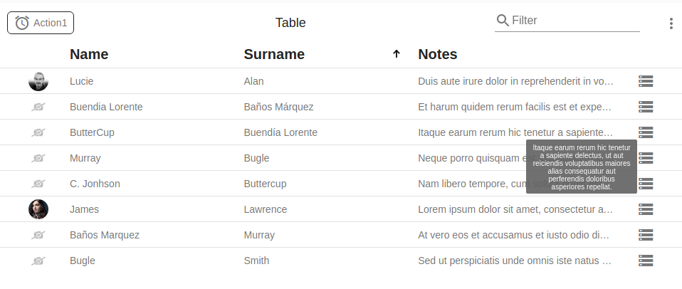
You can configure the value that is displayed with the attribute tooltip-value. Additionally, you can specify default function to be applied when the user over column with tooltip-function attribute.
You can customize the tooltip styles by redefining the class o-table-cell-tooltip.
Note: If you have a custom render in the column and it is not overwritten the getCelldata method will show the internal value of the table.
When you perform an action like update columns, visible columns, filter by columns, service, entity, keys or primary keys of the table, you will want o-table to update the display to reflect these changes. This function is provided for that purpose.For more information see the API.
...
const columnsOfTable= 'PHOTO;ID;NAME;SURNAME;EMAIL;ADDRESS';
const filterColumnsOfTable= 'NAME;EMAIL';

this.table.reinitialize({ columns: columnsOfTable, visibleColumns: columnsOfTable, filterColumns:filterColumnsOfTable});
...
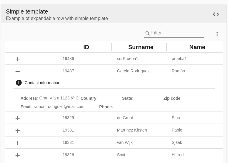
Expandable row
The o-table-row-expandable component enable you to provide additional details about a particular row of table data through expanding or collapsing its content. It’s necessary to wrap the content of your template with the <ng-template let-row></ng-template> tag and add the template definition inside.
Ontimize Web provides two posibilities for attaching child rows to a parent row in the o-table.
- Simple template
- A template with context
Simple template
The example below makes use of simple template, the content of the child row in this example is defined by the ng-template with the let-row attribute so that exposes the variable row in the template to show the information.
 <o-table fxFill #table service-type="DummyService" service="customers" entity="customer" keys="CUSTOMERID" columns="CUSTOMERID;SURNAME;NAME"
      title="CUSTOMERS" insert-button="no" delete-button="no" refresh-button="no" pagination-controls="yes" detail-mode="none" export-button="no"
      query-rows="10" fixed-header="yes">
      <o-table-row-expandable>
        <ng-template let-row>
          <o-column title="CONTACT_DATA" icon="info" class="vertical-margin-10" layout-gap="12px">
            <div fxLayout="row wrap" fxLayoutGap="14px">
              <span fxFlex="30%"><strong>{{'ADDRESS' | oTranslate}}</strong>: {{row.ADDRESS}}</span>
              <span fxFlex="20%"><strong>{{'COUNTRY' | oTranslate}}</strong>: {{row.COUNTRY}}</span>
              <span fxFlex="20%"><strong>{{'STATE' | oTranslate}}</strong>: {{row.STATE}}</span>
              <span fxFlex="20%"><strong>{{'ZIPCODE' | oTranslate}}</strong>: {{row.ZIPCODE}}</span>
            </div>
            <div fxLayout="row wrap" fxLayoutGap="14px">
              <span fxFlex="20%"><strong>{{'EMAIL' | oTranslate}}</strong>: {{row.EMAIL}}</span>
              <span fxFlex="20%"><strong>{{'PHONE' | oTranslate}}</strong>: {{row.PHONE}}</span>
            </div>
          </o-column>
        </ng-template>
      </o-table-row-expandable>

    </o-table>
A template with context
It is possible to define a template with context, so that if the defined template contains a component (such as o-table, o-list, o-chart and o-grid), this context provide functionalities like parent-keys and query the component data automatically when the row is expanded, for example.
NOTE: It is necessary define
targetsinput and[data]="row"to query the data automatically, it will be the references of the components whose query will be launched when expanding the row. The context is established with[data]="row"
<o-table fxFill #table service-type="DummyService" service="customers" entity="customer" keys="CUSTOMERID" columns="CUSTOMERID;SURNAME;NAME"
  title="CUSTOMERS" insert-button="no" delete-button="no" refresh-button="no" pagination-controls="no" detail-mode="none" export-button="no"
  store-state="false" query-rows="10" fixed-header="yes">
  <o-table-row-expandable>
    <ng-template let-row>
      <o-expandable-container [targets]="[accountsTable]" [data]="row">
        <o-table #accountsTable service-type="DummyService" service="customers" entity="customerAccount" parent-keys="CUSTOMERID" keys="ACCOUNTID"
          columns="ACCOUNTID;ENTITYID;OFFICEID;CDID;ANID;ACCOUNT;BALANCE;CUSTOMERID;STARTDATE" visible-columns="ACCOUNT;BALANCE;STARTDATE"
          title="ACCOUNTS" sort-columns="STARTDATE" query-on-init="false" query-rows="6" pageable="no" insert-button="no" delete-button="no"
          detail-mode="none">
          <o-table-column attr="ACCOUNT" title="ACCOUNT" class="o-table-column-centered"></o-table-column>
          <o-table-column attr="STARTDATE" title="STARTDATE" type="date" format="LL"></o-table-column>
          <o-table-column attr="BALANCE" title="BALANCE" type="currency" currency-symbol="€" currency-symbol-position="right"
            thousand-separator="." decimal-separator=",">
          </o-table-column>
        </o-table>
      </o-expandable-container>
    </ng-template>
  </o-table-row-expandable>
</o-table>
Theming
The table headers
You can customize the tables changing the color of the headers. For example with the primary palette by following the steps below.
- Define the style of mat-header-cell in a “theme file”
First, create a Sass mixin that accepts an Angular Material color theme and outputs the color-specific styles for the component.
custom-row-header-theme.scss
// Import library functions for theme creation.
@import '~@angular/material/theming';

@mixin custom-row-header-theme($theme) {
  // Extract the palettes you need from the theme definition.
  $primary: map-get($theme, primary);
  $accent: map-get($theme, accent);

  // Define the styles that affect the table header by the theme
  .o-table .o-table-body .mat-table .mat-header-roww{
      .mat-header-cell {
        background-color: mat-color($primary);
        color: mat-color($primary, default-contrast);
      }
  }
}
Note: using the mat-color function to extract colors from a palette.
- Include the theme mixin in your application
Use the Sass @include keyword to include a component’s theme mixin wherever you’re already including Angular Material’s built-in theme mixins.
app.scss
/***** Importing ontimize-web-ngx-theming prebuilt theme (choose one) *****/
/* @import 'node_modules/ontimize-web-ngx-theming/src/themes/mat-indigo-pink.scss'; */
/* @import 'node_modules/ontimize-web-ngx-theming/src/themes/mat-deeppurple-amber.scss;'*/
/* @import 'node_modules/ontimize-web-ngx-theming/src/themes/mat-pink-bluegrey.scss';*/
/* @import 'node_modules/ontimize-web-ngx-theming/src/themes/mat-purple-green.scss';*/

@import 'node_modules/ontimize-web-ngx-theming/src/themes/ontimize.scss';
/*
* After define theme, it is necessary to transfer color to Ontimize Web framework
*/
@import 'node_modules/ontimize-web-ngx/ontimize/components/theming/all-theme.scss';
@include o-material-theme($theme);

/*
* Propagate theme to custom component definition.
*/
@import '../../app/shared/custom-row-header-theme.scss';
@include custom-row-header-theme($theme);
Demo
You can see this and more examples of this component in the OntimizeWeb playground.