Form data components
Form data components are components that must be placed inside a form and allow for an input of data. The form data components offered by OntimizeWeb are checkbox, combo, currency, date, email, file, hour, html, integer, list picker, NIF, password, percent, radio, real, slider, slide toggle, text, textarea and time.
All input components in OntimizeWeb extend the OFormDataComponent class. This class provides a set of methods and attributes inherited by all the input components. This methods and attributes are explained on the API section of this page.
Data
You can modify value by setting the data attribute or calling the setData method.
 <o-text-input attr="input2" label="{{ 'INPUT.BUTTON.TEXT' | oTranslate }}" [data]="getValue()" read-only="no" required="yes"
    tooltip="This is an awesome tooltip!"></o-text-input>
  getValue() {
    return 'John Doe';
  }
Appearance
You can configure multiple appearance variants changing the appearance and float-label input values.
Appearance
The appearance input indicates which of the different mat-form-field appearance is used. It has the same features that Angular Material appearance input, watch it here.
Global default appearance options can be specified by providing a value for MAT_FORM_FIELD_DEFAULT_OPTIONS in your application’s root module. Like the property, the global setting can be either legacy, standard, fill or outside.
@NgModule({
  providers: [
    { provide: MAT_FORM_FIELD_DEFAULT_OPTIONS, useValue: { appearance: 'fill' } }
  ]
})
Float label
The float-label input indicates which of the different mat-form-field label behaviours is chosen. It has the same features that Angular Material appearance input, watch it here
Global default label options can be specified by providing a value for MAT_LABEL_GLOBAL_OPTIONS in your application’s root module. Like the property, the global setting can be either always, never, or auto.
@NgModule({
  providers: [
    {provide: MAT_LABEL_GLOBAL_OPTIONS, useValue: {float: 'always'}}
  ]
})
Validation
The input shows automatically an error message when the required attribute is set to yes and there is no value on the input.
Input
User can add its own validators to a input component using the validators input.
   <o-text-input attr="input" label="{{ 'INPUT.BUTTON.TEXT' | oTranslate }}"
   [validators]="validatorsArray"></o-text-input>
   ...

  import { ValidatorFn, ValidationErrors, FormControl } from '@angular/forms';

  validatorsArray: ValidatorFn[] = [];

  constructor() {
    this.validatorsArray.push(this.aValidator);
    this.validatorsArray.push(this.bValidator);
  }


  aValidator(control: FormControl): ValidationErrors {
    let result = {};
    if (control.value && control.value.toString().indexOf('a') === -1) {
      result['requiredLowercaseA'] = true;
    }
    if (control.value && control.value.toString().indexOf('A') === -1) {
      result['requiredUppercaseA'] = true;
    }
    return result;
  }

  bValidator(control: FormControl): ValidationErrors {
    if (control.value && control.value.toString().indexOf('b') === -1) {
      return {
        'requiredB': true
      };
    }
    return {};
  }
   ...
Validation component
Using the validators input has the disadvantage that the user cannot define any validation error message for their custom validators. For doing that user has the o-validator and o-error components.
Label visible
Form data components allow you to show or hide label with label-visible attribute. By default, this value is true.
NOTE: This attribute not apply in
o-checkbox,o-radio,o-sliderando-html-input.
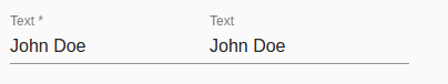
Required
A input can be market with a required attribute, an asterisk will be appendend to the label to indicate it is required field. If unwanted, this can be disabled by setting the hide-required-marker property on form data component.
<o-text-input attr="input3" label="{{ 'INPUT.BUTTON.TEXT' | oTranslate }}" required="yes" [data]="getValue()"></o-text-input>
<o-text-input attr="input4" label="{{ 'INPUT.BUTTON.TEXT' | oTranslate }}" required="yes"
hide-required-marker="yes" [data]="getValue()"></o-text-input>
Enabled
The enabled mode is active by default. You can disable the input by setting enabled='no'.
<o-text-input attr="input3" label="{{ 'INPUT.BUTTON.TEXT' | oTranslate }}" enabled="no" [data]="getValue()"></o-text-input>
Read-only
The readonly mode represents an element that is no longer editable by the user. You can make a component only readable setting read-only="yes".
<o-text-input fxFlex attr="input" label="{{ 'INPUT.BUTTON.TEXT' | oTranslate }}" read-only="yes" [data]="getValue()"></o-text-input>
Tooltip
To create a tooltip, add the tooltip attribute to an element. By default, the tooltip will appear on bottom of the element. Use tooltip-position attribute to set the position of the tooltip on top, bottom, left or the right side of the element.
 <o-text-input attr="input2" label="{{ 'INPUT.BUTTON.TEXT' | oTranslate }}" [data]="getValue()" read-only="no" required="yes"
    tooltip="This is an awesome tooltip!" tooltip-position="left"></o-text-input>
Width
All input conponents have the width atribute. It allows you to can specify the width in pixels (px) or percentage (%) of the input component.