List picker
The o-list-picker component is used in forms for getting or displaying an option between multiple input submitted by the user.
The list picker component is automatically registered on its parent o-form, which provides the value for the list picker programatically. Its value can be also set manually via the data parameter. This and other attributes are explained on the API section of this page.
This component is different than most of other inputs, an array of data must be provided to the component in order to interact with it. This data is used to display the optoins on the list and each element of the data array must be an object with at least one key/value pair.
The data array can be provided in two ways:
- Provide an array of objects to the
static-dataattribute (see the example below). - Configure the component to query the data from a service. Using
serviceandentityattributes.
Once some data has been provided to the component, the user can see the option list by clicking in the search button of the component. Choosing an option, the list will close up and the selected value will be set to the input.
Basic example
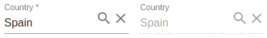
<o-form editable-detail="no" show-header="no">
    <o-list-picker attr="country" label="Country" data="Spain" [static-data]="getStaticData()" value-column="name" columns="id;name" visible-columns="name" read-only="no" required="yes"></o-list-picker>
    <o-list-picker attr="country" label="Country" data="Spain" [static-data]="getStaticData()" value-column="name" columns="id;name" visible-columns="name" enabled="no"></o-list-picker>
</o-form>
You can see this and more examples of this component in the OntimizeWeb playground.
Validation
The o-list-picker shows automatically an error message when the required attribute is set to “yes” and there is no value selected.
Custom renderers
A custom renderer allows you to display the value of a list-picker formatted as you desire. For this, you need to create a new component that extends the custom list-picker renderer class and place it into your o-list-picker component.
The requisites for a custom list-picker renderer component are the following:
-
The component must extend the
OListPickerCustomRendererclass. -
Your renderer template must reference the template container. For this, wrap the content of your component HTML with the
ng-templatetag and define a template variable. Then create an attribute to your component referencing the template container defined previously, add this line to your component:@ViewChild('templateref', { read: TemplateRef }) public templateref: TemplateRef<any>. This will give your component a reference to acces the template container. -
If you want to customize the internal values of the list-picker, you must overwrite the
getListPickerValuemethod.
You have an example of a custom renderer below. It displays a formatted date (the value is a timestamp) as the list-picker value.
import { Component, Injector, TemplateRef ViewChild } from '@angular/core';
import * as moment from 'moment';
import { OBaseTableCellRenderer } from 'ontimize-web-ngx';

@Component({
  selector: 'custom-render',
  templateUrl: './custom-render.component.html'
})

export class CustomRendererComponent extends OListPickerCustomRenderer {

  @ViewChild('templateref', { read: TemplateRef }) public templateref: TemplateRef<any>;

  constructor(protected injector: Injector) {
    super(injector);
  }

 getListPickerValue(value: any) {
    let theDate = moment.unix(value).format("DD/MM/YYYY");
    return theDate;
  }

}
  <ng-template #templateref let-value="value">
    {{ getListPickerValue(value) }}
  </ng-template>
The let keyword declares a template input variable that you reference within the template.
Finally, add the created component to your module for including it in your list-picker.
Locker
OntimizeWeb offers the oLocker directive to the o-list-picker that should to lock the component when you configure the component to query the data from a service.
<o-list-picker attr="CUSTOMERID LOAD" oLocker oLockerMode="load" oLockerDelay="1500"
    read-only="no" service="customers" entity="customer" columns="CUSTOMERID;PHOTO;NAME;SURNAME;ADDRESS;STARTDATE;EMAIL"
    value-column="CUSTOMERID" keys="CUSTOMERID" visible-columns="NAME" width="30%">
</o-list-picker>

<o-list-picker attr="CUSTOMERID DISABLED" oLocker oLockerMode="disable" read-only="no" service="customers"
    entity="customer" columns="CUSTOMERID;PHOTO;NAME;SURNAME;ADDRESS;STARTDATE;EMAIL" value-column="CUSTOMERID"
    keys="CUSTOMERID" visible-columns="NAME" width="30%">
</o-list-picker>

Note you can configure the mode of the locker, there are two modes to block, disable and load mode. The mode by default is load. You can configure delay service start with oLockerDelay attribute, by default this value is the 250ms.
Filtering
You can check how to construct dependant list-pickers here. You will need the attribute parent-keys to achieve this.