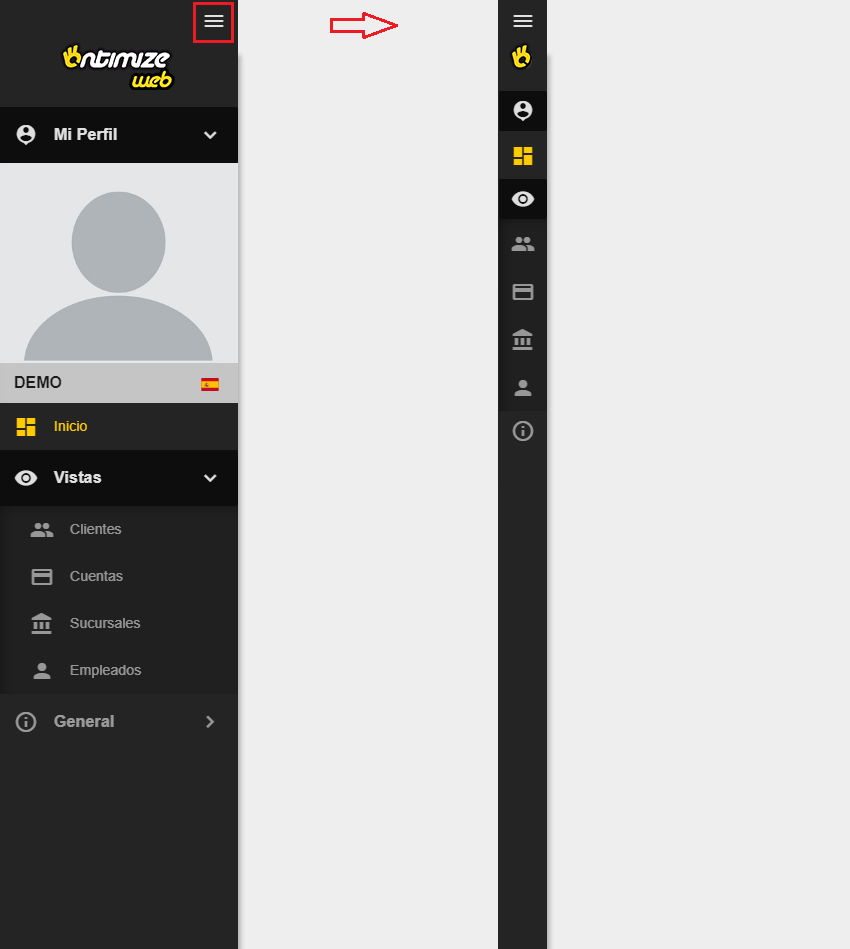
App layout
The o-app-layout components builds a side navigator for application using the application menu configuration. For adding it to the application you just have to wrap the content of the main page with this component like in the example below.
Example
<o-app-layout opened-sidenav-image="assets/images/sidenav-opened.png"
  closed-sidenav-image="assets/images/sidenav-closed.png" mode="desktop">
  <router-outlet></router-outlet>
</o-app-layout>
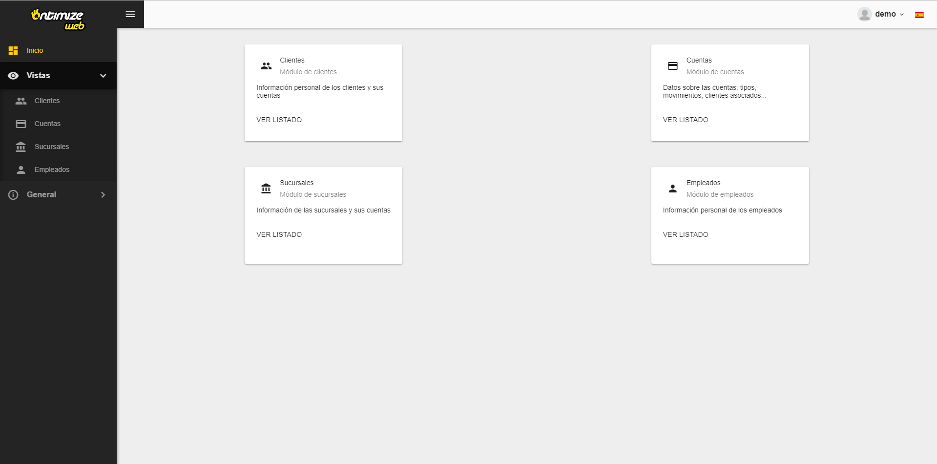
The result of this example is shown below.
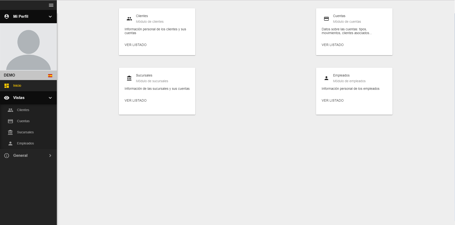
You can see a working example of this in the OntimizeWeb QuickStart or check the code in GitHub.
Custom content
You can attach your own content to the side navigator using the o-app-layout-sidenav component inside the o-app-layout-sidenav of you application.
<o-app-layout opened-sidenav-image="assets/images/sidenav-opened.png" closed-sidenav-image="assets/images/sidenav-closed.png">

  <o-app-layout-sidenav>
    <!-- YOUR CUSTOM CONTENT HERE -->
  </o-app-layout-sidenav>

  <router-outlet></router-outlet>
</o-app-layout>
Modes
The o-app-layout components has two performance modes designed for making this component more usable in desktop and mobile applications. This modes are the following:
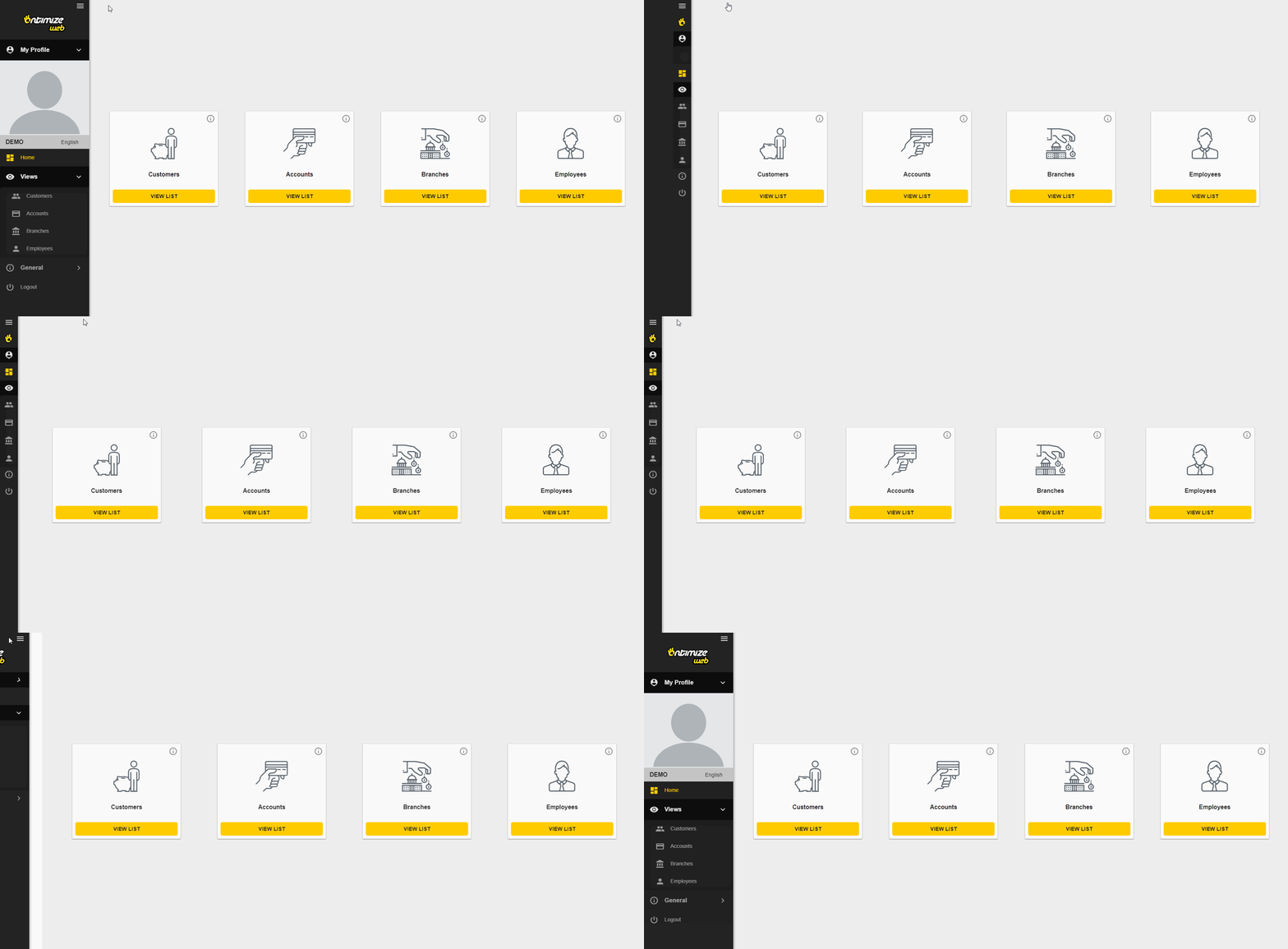
- Desktop
This is the default mode of the
o-app-layoutcomponent. This mode displays the side menu and allows the user to partially hide it.
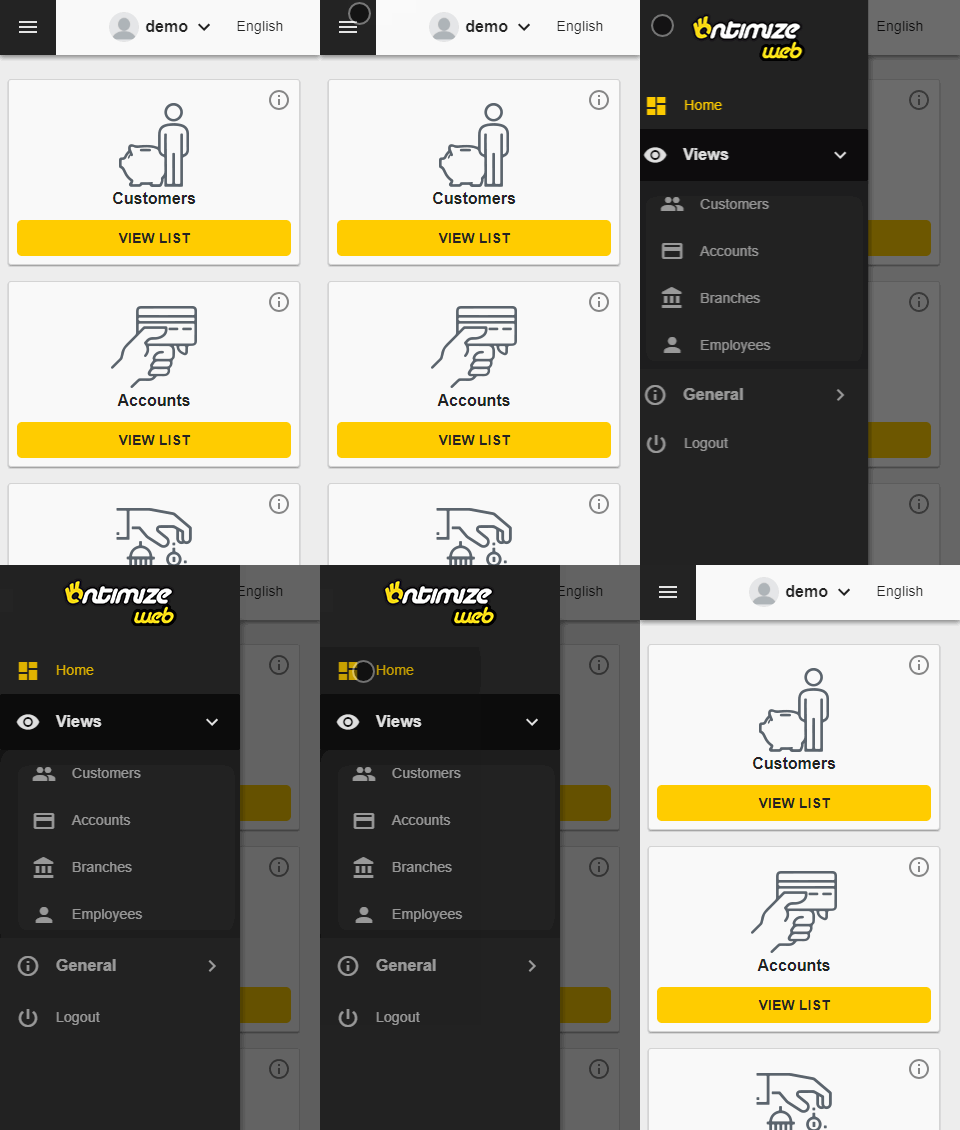
- Mobile
Configure this mode by setting the mobile value in the
modeattribute in theo-app-layoutcomponent. This mode shows the side menu and a toolbar on the top with a button for show/hide the side menu.
Toolbar
The application layout component may show a toolbar at the top of the screen by setting the show-header attribute to yes. Check this and other attributes in the API section of this page.
The o-app-layout component allows you to configure whether or not to show flags on the language selector by setting the attribute use-flag-icons to yes. In order to show the language flags, it is necessary install the dependency flag-icon-css:
$ npm install flag-icon-css
And import the flag icon styles in your application’s angular.json file:
"node_modules/flag-icon-css/css/flag-icons.css"
Adding custom content to the toolbar
If you want to add your own components to the layout toolbar you must use the o-app-layout-header component.
<o-app-layout opened-sidenav-image="assets/images/sidenav-opened.png"
  closed-sidenav-image="assets/images/sidenav-closed.png"
  mode="desktop" show-header="yes">
  <o-app-layout-header>
      <!-- YOUR CUSTOM CONTENT HERE -->
  </o-app-layout-header>

  <router-outlet></router-outlet>
</o-app-layout>
Images
You can set provide images to be shown in the side navigator using the attributes opened-sidenav-image and closed-sidenav-image. Check this and other attributes in the API section of this page.
