Form
Forms are the pillar of management applications. They are used in applications for requesting information from the user or displaying data. OntimizeWeb allows you to add a form and insert form fields on it in a very easy way.
The o-form component allows you to display data from the server and also insert, update and delete records in the database. This can be achived easily by configuring few attributes like service and entity. Check this and other attributes in the API section of this page.
Modes
The o-form component has different modes depending on the operation that is going to be performed. The form modes may suffer little modifications depending on the form configuration, this is explained in the detail form section. The common description of the different form modes is the following:
-
Read only mode: The read only mode is used for displaying data. In this mode the form components are not modifiable and the form toolbar shows the buttons to perform CRUD (Create, Read, Update and Delete) operations.
-
Update mode: The form component adopts the update mode when the data is about to be modified. In this mode the form components are modifiable and the form toolbar shows the buttons to accept or reject changes.
-
Insert mode This is the mode used by the form component to perform creation operations. In this mode, all de form components are empty and modifiable. The form toolbar shows buttons to accept or reject the operation.
There is use cases when it is necessary to perform any action right before or after the form changes from one mode to another. You can achieve this thanks to the events that the o-form emits before and after changing its mode. This events are the following: beforeInsertMode, beforeUpdateMode, beforeInitialMode, onInsertMode, onUpdateMode and onInitialMode.
For example, you can listen to the onInsertMode of the o-form component in your HTML:
<o-form (onInserMode)="performAction()">
And perform an action each time the event is emited:
  performAction() {
    alert("The form has changed to insert mode!")
  }
Detail form
A detail form is an special usage of the form component. A form is called detail form when it is used to manage a piece of data from a collection. The most common use case of a detail form is for displaying the data related to a table record. This use case can be achieved with OntimizeWeb by combining the o-form and the o-table component.
You can read more about this topic in the detail form section.
Form container
In some applications you may want to place a breadcrumb component on top of your form. OntimizeWeb allows this using the o-form-container component. Learn more about this component here.
Form layout manager
A very common feature on management applications is displaying a form with the details related to a row from a data table. As a solution for this, OntimizeWeb offers the o-form-layout-manager component, that allows you managing the transitions between the data table and the form with the row details.
You can read more about this component here.
Extending a form
In some cases you may want to add of modify the form funtionality, OntimizeWeb allows you to extend the form component, for this, you must follow the next steps:
- Define a new component and add the
@OComponentdecorator. - Include the
OFormComponentclass as a provider of your component. - Make your component extend
OFormComponentclass.
Once this steps are done, you can override OFormComponent methods depending on your requirements.
The following example shows how to extend an o-form for creating a classical registration form including a captcha and password verification before submitting the data. The component class would look like the following:
import { forwardRef, Injector } from '@angular/core';
import { Location } from '@angular/common';
import { ActivatedRoute, Router } from '@angular/router';

import { OComponent, dataServiceFactory, LoginService, OFormComponent, OntimizeService  } from 'ontimize-web-ngx';

@OComponent({ // <- Include the `@OComponent` decorator
  selector: 'sign-in-form',
  providers: [
    {
      provide: OntimizeService,
      useFactory: dataServiceFactory
    }, {
      // Include the `OFormComponent` class as a provider of your component
      provide: OFormComponent,
      useExisting: forwardRef(() => SignInFormComponent)
    }
  ]
})
// Make your component extend the `OFormComponent` class
export class SignInFormComponent extends OFormComponent {

  protected recaptchaResponseToken: string;

  constructor(
    _router: Router, _location: Location,
    _actRoute: ActivatedRoute, _loginService: LoginService,
    injector: Injector
  ) {
    super(_router, _location, _actRoute, _loginService, injector);
    this.recaptchaResponseToken = undefined;
  }

  /* Override methods depending on your requirements */

  protected postCorrectInsert(result: any) {
    if (result && result.confirmation_key) {
      this.dialogService.alert('CONFIRM_PENDING', 'CONFIRM_PENDING_MESSAGE')
        .then(res => this._router.navigate(['home']));
    } else {
      this.dialogService.alert('ERROR', 'ERROR_SIGN_IN');
    }
  }

  protected postIncorrectInsert(result: any) {
    let msg = 'ERROR_SIGN_IN';
    if (result && 'json' in result) {
      let res = result.json();
      if (res.message) {
        msg = res.message;
      }
    }
    this.dialogService.alert('ERROR', msg);
  }

  /* Add new methods depending on your requirements */

  protected getCaptcha(response: any) {
    this.recaptchaResponseToken = response;
  }

  public send() {
    if (this.formGroup.controls['password'].value !== this.formGroup.controls['password2'].value) {
      this.dialogService.alert('ERROR', 'ERROR_PASSWORDS_NOT_MATCH');
    } else if (typeof(this.recaptchaResponseToken) === 'undefined') {
      this.dialogService.alert('ERROR', 'ERROR_CAPTCHA');
    } else {
      this._insertAction();
    }
  }

}
Now, you can use the extended form in your template as follows:
<sign-in-form #registryForm service="pharmacy" entity="registerPharmacy" keys="username" columns="username;password;license;name_comercial;locality;province" show-header="no" label-header="REGISTRY" header-actions="I">
  <o-text-input attr="license" required="yes" flex [data]="registryForm.getDataValue('license')"> </o-text-input>
  <o-text-input attr="name_comercial" required="yes" flex [data]="registryForm.getDataValue('name_comercial')"> </o-text-input>
  <o-text-input attr="locality" required="yes" flex [data]="registryForm.getDataValue('locality')"> </o-text-input>
  <o-text-input attr="province" required="yes" flex [data]="registryForm.getDataValue('province')"> </o-text-input>
  <o-email-input attr="username" required="yes" flex [data]="registryForm.getDataValue('username')"> </o-email-input>
  <o-password-input attr="password" required="yes" min-length="6" max-length="30" flex [data]="registryForm.getDataValue('password')"></o-password-input>
  <o-password-input attr="password2" required="yes" min-length="6" max-length="30" flex [data]="registryForm.getDataValue('password2')"></o-password-input>
  <re-captcha siteKey="{{ GOOGLE_RECAPTCHA_KEY }}" (captchaResponse)="registryForm.getCaptcha($event)"></re-captcha>
  <o-row layout-align="end center">
    <o-button label="SEND" (click)="registryForm.send()"></o-button>
  </o-row>
</sign-in-form>
Form to filter table
A common use of a form is using the form data introduced by the user for requesting filtered information from a service and display it on a table. OntimizeWeb offers you two different solutions for filtering a table using the data of a form component. The simplest way of filtering a table is configuring the parent-keys attribute of the table we want to filter, but this will not be enough if we want to apply complex logical filters. In this case, we shoud use the filter builder component.
Parent keys filter
Configuring the parent-keys attribute of the table with the attr of the form fields we want to include on the filtering is the simplest and the fastest way of filtering table data. This aproach is not enough when you want to apply complex filters using logical operations.
In the following example we have a form component with the field for filtering the name, surname and the employee type of a table of employees. Note that the table has configured the attributes parent-keys with the columns involved in the filtering and its corresponding form component attr’s. Remember that when the table column and the form component attr are the same, you only have to include it once.
NOTE Keep in mind that the table will not send any request when the parent keys values are all null. You can configure the
query-with-null-parent-keysas in the example below to avoid this, but it is not always recommended. Check the table documentation page.
<o-form editable-detail="no" show-header="no">
  <o-column title="{{ 'FILTERS' | oTranslate }}">
    <o-row layout-align="space-between center">
      <o-text-input attr="NAME" read-only="no" fxFlex="33"></o-text-input>
      <o-text-input attr="SURNAME" read-only="no" fxFlex="66"></o-text-input>
    </o-row>

    <o-combo attr="EMPLOYEETYPEID" read-only="no" service="employees" entity="employeeType" columns="EMPLOYEETYPEID;EMPLOYEETYPENAME"
      value-column="EMPLOYEETYPEID" keys="EMPLOYEETYPEID" visible-columns="EMPLOYEETYPENAME" width="33%">
    </o-combo>
  </o-column>

  <o-column title="{{ 'EMPLOYEES' | oTranslate }}">
    <o-table attr="employees" service="employees" entity="employee" columns="EMPLOYEEID;EMPLOYEETYPEID;EMPLOYEENAME;EMPLOYEESURNAME;EMPLOYEEADDRESS;EMPLOYEESTARTDATE;EMPLOYEEEMAIL;OFFICEID"
      visible-columns="EMPLOYEENAME;EMPLOYEESURNAME;EMPLOYEEADDRESS;EMPLOYEEEMAIL;EMPLOYEETYPEID;EMPLOYEESTARTDATE" keys="EMPLOYEEID"
      parent-keys="EMPLOYEENAME:NAME;EMPLOYEESURNAME:SURNAME;EMPLOYEETYPEID" query-with-null-parent-keys="yes" sort-columns="EMPLOYEESURNAME"
      detail-mode="none" insert-button="no" pageable="yes">
      <o-table-column attr="EMPLOYEESTARTDATE" title="EMPLOYEESTARTDATE" type="date" format="LL"></o-table-column>
      <o-table-column attr="EMPLOYEETYPEID" title="EMPLOYEETYPEID">
        <o-table-cell-renderer-service service="employees" entity="employeeType" columns="EMPLOYEETYPEID;EMPLOYEETYPENAME" value-column="EMPLOYEETYPENAME"></o-table-cell-renderer-service>
      </o-table-column>
    </o-table>
  </o-column>
</o-form>
Filter builder
The filter builder is a component whose purpose is solving the problem described above. It allows you to build complex filtering expressions using the data introduced in a form component. Read more about the filter builder component on its documentarion page.
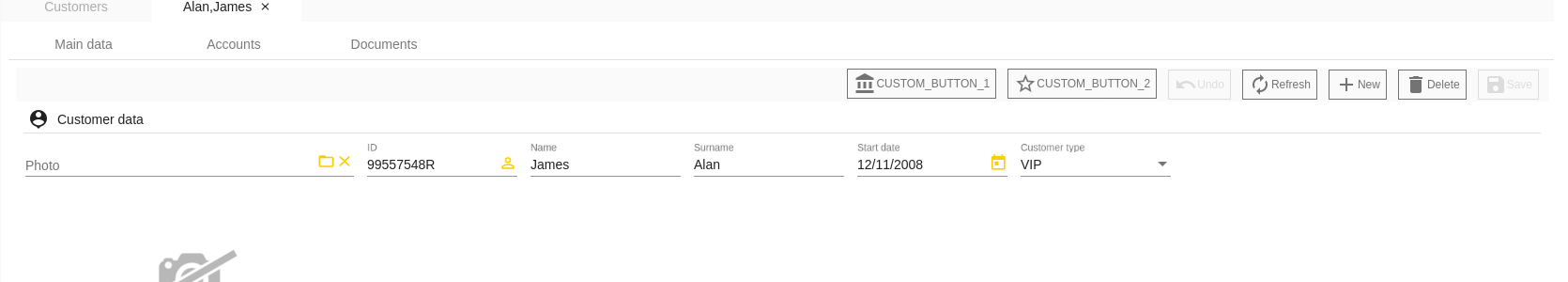
Custom form toolbar buttons
o-form-toolbar-buttons is a directive that allows to add custom buttons in the toolbar form.
<o-form attr="customers_form_edit" service="customers" entity="customer" fxLayout="column" show-header="yes"
  header-actions="R;I;U;D" #oDetailForm keys="CUSTOMERID" keys-sql-types="INTEGER" columns="ID_DMS_DOC"
  show-header-navigation="yes">
  <div o-form-toolbar-buttons>
    <button type="button" class="o-form-toolbar-button" mat-stroked-button (click)="onClickCustomButton1($event)"
      attr="accountBalance">
      <mat-icon>account_balance</mat-icon>
      <span>CUSTOM_BUTTON_1</span>
    </button>

    <button type="button" class="o-form-toolbar-button" mat-stroked-button (click)="onClickCustomButton2($event)"
      attr="addShoppingCart">
      <mat-icon>star_border</mat-icon>
      <span>CUSTOM_BUTTON_2</span>
    </button>
  </div>
  ....