Form layout manager
A very common feature on management applications is displaying a form with the details related to a row from a data table. As a solution for this, OntimizeWeb offers the o-form-layout-manager component, that allows you managing the transitions between the data table and the form with the row details.
Basic example
For including the o-form-layout-manager component in your application you just have to wrap the desired data table with the form layout manager and it will manage the transitions between the table view and the detail forms.
<o-form-layout-manager attr="formLayoutMngr" mode="tab" title="Customers" label-columns="SURNAME;NAME" separator=",">

  <o-table attr="customers" title="Customers" service="customers" entity="customer" keys="CUSTOMERID" columns="CUSTOMERID;NAME;SURNAME"
    visible-columns="NAME;SURNAME">
  </o-table>

</o-form-layout-manager>
This is a summarized example of the customers module of the OntimizeWeb QuickStart.
The o-form-layout-manager component has two available modes: tab and dialog.
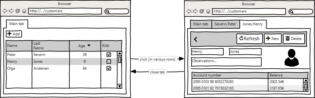
Tab mode
Selection the tab mode the data table and the detail form are displayed in tabs. This allows opening multiple form details at the same time and switch between them quickly.
You can select this mode setting the value tab to the mode attribute. You can see a working example of this mode in the customers module of the OntimizeWeb QuickStart.
Configure tab mode options
It is possible to configure tab mode options with the o-form-layout-tabgroup-options component. This attributes are explained on the API section of this page.
For complex labels, you can add <ng-template let-tabData="tabData">...</ng-template> and inside you can define your template. It’s important than the tabData attributes are including in labe-columns.
Example
<o-form-layout-manager mode="tab" title="CUSTOMERS" label-columns="SURNAME;NAME" separator=","
  attr="o-form-layout-customer-home" title-data-origin="customers_form_edit">
  <o-form-layout-tabgroup-options background-color="primary" color="accent" header-position="below">
    <ng-template let-tabData>
      <mat-icon>person</mat-icon>
      {{tabData?.SURNAME}}, {{tabData?.NAME}}
    </ng-template>
  </o-form-layout-tabgroup-options>
 ................
</o-form-layout-manager>
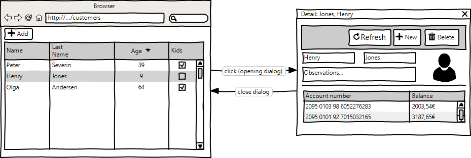
Dialog mode
The dialog mode consists of displaying the form detail in a dialog over the data table.
Select this mode setting the value dialog to the mode attribute. You can see a working example of this mode in the branches module of the OntimizeWeb QuickStart.
Configure dialog mode options
It is possible to configure dialog mode options with the o-form-layout-dialog-options component. This attributes are explained on the API section of this page.
Example
<o-form-layout-manager mode="dialog" title="BRANCHES" label-columns="NAME" separator=""
  attr="o-form-layout-branches-home">

  <o-form-layout-dialog-options width="600px" height="400px"
  disable-close="false" ></o-form-layout-dialog-options>

  ...

</o-form-layout-manager>