List
The o-list component is used to display a series of items. There is different types of predefined list items you can add to the list component.
For adding a list component to your application you must insert the o-list in your page and include a o-list-item component wrapping the desired list item type you want to display. Check the different list items types below.
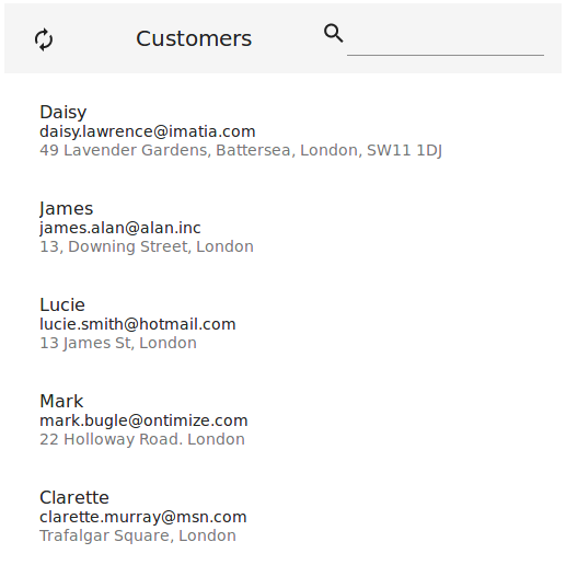
List item
List item: text
The o-list-item-text component is used to display list items with a maximum of two lines of text and a title.
<o-list #list attr="customerlist" title="CUSTOMERS" service="customers" entity="customer"
  keys="CUSTOMERID" columns="CUSTOMERID;PHOTO;NAME;SURNAME;ADDRESS;STARTDATE;EMAIL">
  <o-list-item *ngFor="let row of list.dataArray">
    <o-list-item-text #item title="{{ row.NAME }}" primary-text="{{ row.EMAIL }}"
      secondary-text="{{ row.ADDRESS }}">
    </o-list-item-text>
  </o-list-item>
</o-list>
You can see an example of this component in the OntimizeWeb playground.
List item: avatar
The o-list-item-avatar component is used to display list items with an avatar and a maximum of two lines of text and a title.
<o-list #list attr="customerlist" title="CUSTOMERS" service="customers" entity="customer"
  keys="CUSTOMERID" columns="CUSTOMERID;PHOTO;NAME;SURNAME;ADDRESS;STARTDATE;EMAIL">
  <o-list-item *ngFor="let row of list.dataArray">
    <o-list-item-avatar #item avatar="./assets/images/ontimize.png" title="{{ row.NAME }}"
      primary-text="{{ row.EMAIL }}" secondary-text="{{ row.ADDRESS }}">
    </o-list-item-avatar>
  </o-list-item>
</o-list>
You can see an example of this component in the OntimizeWeb playground.
List item: card
The o-list-item-card component is used to display a card list item with text, image and action buttons.
<o-list #list attr="customerlist" title="CUSTOMERS" service="customers" entity="customer"
  keys="CUSTOMERID" columns="CUSTOMERID;PHOTO;NAME;SURNAME;ADDRESS;STARTDATE;EMAIL">
  <o-list-item *ngFor="let row of list.dataArray">
    <o-list-item-card #item title="{{ row.NAME }}" subtitle="{{ row.EMAIL }}"
      image="./assets/images/ontimize.png" action-1-text="Contact" action-2-text="Share">
    </o-list-item-card>
  </o-list-item>
</o-list>
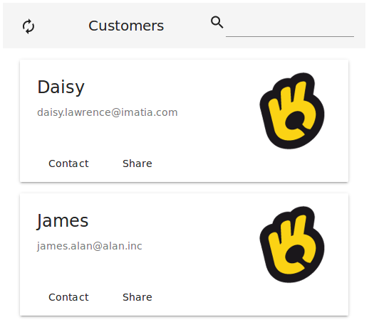
You can see an example of this component in the OntimizeWeb playground.
List item: card image
The o-list-item-card-image component is used to display card list items with a big image.
<o-list #list attr="customerlist" title="CUSTOMERS" service="customers" entity="customer"
  keys="CUSTOMERID" columns="CUSTOMERID;PHOTO;NAME;SURNAME;ADDRESS;STARTDATE;EMAIL">
  <o-list-item *ngFor="let row of list.dataArray">
    <o-list-item-card-image #item title="{{ row.NAME }}" subtitle="{{ row.EMAIL }}"
      content="{{ row.ADDRESS }}" avatar="./assets/images/ontimize.png" image="./assets/images/ontimize.png" action-1-text="Contact" action-2-text="Share" collapsible="yes" collapsed="no">
    </o-list-item-card-image>
  </o-list-item>
</o-list>
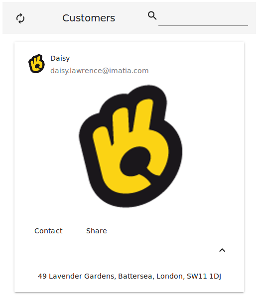
You can see an example of this component in the OntimizeWeb playground.
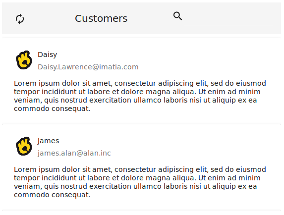
Custom list item
When building an o-list component you can include one of the predefined list items the OntimizeWeb offers or you can include your own list item. For including a custom list item, OntimizeWeb offers the o-list-item directive that can be attached to an angular material list item (mat-list-item) or an angular material card (mat-card).
<o-list #list attr="customerlist" title="CUSTOMERS" service="customers" entity="customer"
  keys="CUSTOMERID" columns="CUSTOMERID;PHOTO;NAME;SURNAME;ADDRESS;STARTDATE;EMAIL">
  <mat-card *ngFor="let rowData of list.dataArray" [o-list-item]="rowData">
    <mat-card-header>
      <div mat-card-avatar>
        <img matListAvatar fxFill src="./assets/images/ontimize.png">
      </div>
      <mat-card-title></mat-card-title>
      <mat-card-subtitle></mat-card-subtitle>
    </mat-card-header>
    <mat-card-content>
      <p>Lorem ipsum dolor sit amet, consectetur adipiscing elit, sed do eiusmod tempor incididunt ut labore et dolore magna
        aliqua. Ut enim ad minim veniam, quis nostrud exercitation ullamco laboris nisi ut aliquip ex ea commodo consequat.</p>
    </mat-card-content>
  </mat-card>
</o-list>
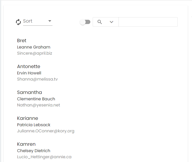
Custom content in toolbar
The o-list component allows to add content in the toolbar with the selector o-list-toolbar at start position by default but you can configure the position with position='start' at the start or at the end with the position='end'.
If the selector o-list-toolbar is used together with position='start' the content will always be placed to the right of the New/Refresh/Delete buttons and if used together with position='end' the content will always be placed to the left of the quickfilter
<o-list #list attr="list" ... refresh-button="yes" quick-filter="yes"...>
  <!-- Custom content toolbar in position start -->
  <o-combo o-grid-toolbar position="start" label="Sort" width="100px"...></o-combo>
  <!-- Custom content toolbar in position end -->
  <o-slide-toggle o-grid-toolbar position="end"....></o-slide-toggle>
</o-list>
Pagination
By default, the list is not paginating the data, but if you want that behaviour you must set pagination-controls= "yes" in the o-list component.
The paginator displays a dropdown of page sizes for you to choose from. The options for this dropdown can be set via page-size-options. For more information see the API.
You can also configure the number of records initially displayed with query-rows attribute.
Support JDBC UUID
Ontimize web now supports the JDBC UUID sql type. To indicate that a key column is of type UUID, all you have to do is to set to set the UUID via input keys-sql-types in the o-list as indicated in the following example.
  <o-list  #list service="..." entity="..." keys="ID" keys-sql-types="UUID">
      <o-list-item *ngFor="let list of list.dataArray">
       ....
      </o-list-item>
    </o-list>