Button toggle
The o-button-toggle component is an on/off toggle with the appearance of a button. They can be standalone or grouped with the mat-button-toggle-group component.
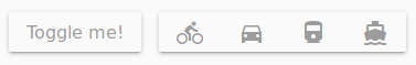
Example
<o-button-toggle attr="singleToggle" label="Toggle me!" layout-padding></o-button-toggle>

<o-button-toggle-group attr="toggleGroup" layout="row" multiple="no" value="car" layout-padding>
    <o-button-toggle attr="toggle1" value="bike" icon="directions_bike"></o-button-toggle>
    <o-button-toggle attr="toggle2" value="car" icon="directions_car"></o-button-toggle>
    <o-button-toggle attr="toggle3" value="train" icon="directions_railway"></o-button-toggle>
    <o-button-toggle attr="toggle4" value="boat" icon="directions_boat"></o-button-toggle>
</o-button-toggle-group>
You can see this live example in the OntimizeWeb playground.
Button toggle
Directive: o-button-toggle
Inputs
| Name | Since | Description | Default |
|---|---|---|---|
|
attr string |
|
Field identifier. Registry property if component is inside a form. |
|
|
checked boolean |
|
Indicates whether the button toggle is checked or not |
no |
|
enabled no | false | yes | true |
|
Indicates whether or not the field is enabled |
yes |
|
icon string |
|
Name of google icon (see Google material design icons) |
|
|
icon-position before | after |
|
Icon position |
before |
|
label string |
|
Field label |
|
|
name string |
|
The name for the button toggle, this attribute is used when the toggle button is inside a button toggle group |
|
|
value any |
|
The value for the button toggle, this attribute is used when the toggle button is inside a button toggle group |
|
Outputs
| Name | Since | Description |
|---|---|---|
|
onChange |
Event triggered when the status of the button toggle changes |
Button toggle
Directive: o-button-toggle-group
Inputs
| Name | Since | Description | Default |
|---|---|---|---|
|
attr string |
|
Field identifier. Registry property if component is inside a form. |
|
|
enabled no | false | yes | true |
|
Indicates whether or not the button toggle group is enabled |
yes |
|
layout row | column |
|
Indicates the disposition of the toggle buttons inside the group |
row |
|
multiple no | false | yes | true |
|
Whether multiple button toggles can be selected |
no |
|
name string |
|
The name tha identifies the button toggle group and its toggle buttons |
|
|
value any |
|
The default value of the button toggle group |
|
Outputs
| Name | Since | Description |
|---|---|---|
|
onChange |
Event triggered when the value of the toggle button group changes |
Methods
| getValue |
|---|
| Return the value of the component |
| Returns |
| any |
| setValue |
|---|
| Sets the value of the component |
| Parameters |
| val: any | any[] |