Card menu item
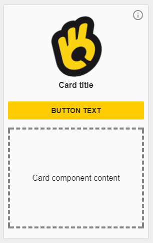
The o-card-menu-item component is a leaf component used inside the o-card-menu-layout component to display the menu options. As it was said, an instance of this component is built automatically by the card menu layout component for each children of the menu item provided.
Example
  <o-card-menu-item button-text="button text" title="Card title" tooltip="Tooltip information"
    image="assets/images/ontimize.png"></o-card-menu-item>
  <o-card-menu-item button-text="button text" title="Card title" tooltip="Tooltip information" image="assets/images/ontimize.png"
    [detail-component]="cardContent" [detail-component-inputs]="cardContentAttributes">
  </o-card-menu-item>
import { Component, Injector } from '@angular/core';

import { CardContentComponent } from '../../shared/card-content/card-content.component';

@Component({
  selector: 'home',
  templateUrl: './home.component.html',
  styleUrls: ['./home.component.scss']
})

export class HomeComponent {

  cardContent = CardContentComponent;
  cardContentAttributes: Object = {
    color: 'gray'
  };

}
Card menu item
Directive: o-card-menu-item
Inputs
| Name | Since | Description | Default |
|---|---|---|---|
|
action function |
|
A function defined in your component called when the card button is clicked and the route attribute is not configured |
|
|
button-text string |
|
Card button text. If it has no value, the card will have no button |
|
|
detail-component Component reference |
|
Component displayed on the lower side of the card menu item |
|
|
detail-component-inputs Object |
|
Object containing the attributes for the component provided to the |
{} |
|
disabled-button no | false | yes | true |
|
Indicates whether or not to the card button is enabled |
no |
|
icon string |
|
Card icon. Card image have preference over it |
|
|
image string |
|
Card image |
|
|
main-container-layout string |
|
Card upper container layout direction |
column |
|
route string |
|
App navigation route when the menu card is selected (clicking on button, if exists, or in the card) |
|
|
secondary-container-layout string |
|
Card lower container layout direction |
column |
|
title string |
|
Card title |
|
|
tooltip string |
|
Card tooltip |
|
