List
The o-list component is used to display a series of items. There is different types of predefined list items you can add to the list component.
For adding a list component to your application you must insert the o-list in your page and include a o-list-item component wrapping the desired list item type you want to display. Check the different list items types below.
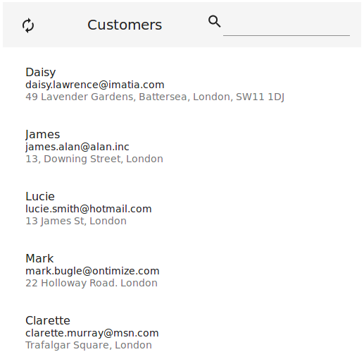
List item: text
The o-list-item-text component is used to display list items with a maximum of two lines of text and a title.
<o-list #list attr="customerlist" title="CUSTOMERS" service="customers" entity="customer"
  keys="CUSTOMERID" columns="CUSTOMERID;PHOTO;NAME;SURNAME;ADDRESS;STARTDATE;EMAIL">
  <o-list-item *ngFor="let row of list.dataArray">
    <o-list-item-text #item title="{{ row.NAME }}" primary-text="{{ row.EMAIL }}"
      secondary-text="{{ row.ADDRESS }}">
    </o-list-item-text>
  </o-list-item>
</o-list>
You can see an example of this component in the OntimizeWeb playground.
List item: avatar
The o-list-item-avatar component is used to display list items with an avatar and a maximum of two lines of text and a title.
<o-list #list attr="customerlist" title="CUSTOMERS" service="customers" entity="customer"
  keys="CUSTOMERID" columns="CUSTOMERID;PHOTO;NAME;SURNAME;ADDRESS;STARTDATE;EMAIL">
  <o-list-item *ngFor="let row of list.dataArray">
    <o-list-item-avatar #item avatar="./assets/images/ontimize.png" title="{{ row.NAME }}"
      primary-text="{{ row.EMAIL }}" secondary-text="{{ row.ADDRESS }}">
    </o-list-item-avatar>
  </o-list-item>
</o-list>
You can see an example of this component in the OntimizeWeb playground.
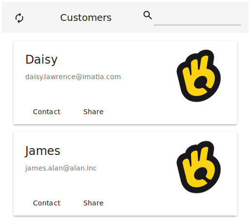
List item: card
The o-list-item-card component is used to display a card list item with text, image and action buttons.
<o-list #list attr="customerlist" title="CUSTOMERS" service="customers" entity="customer"
  keys="CUSTOMERID" columns="CUSTOMERID;PHOTO;NAME;SURNAME;ADDRESS;STARTDATE;EMAIL">
  <o-list-item *ngFor="let row of list.dataArray">
    <o-list-item-card #item title="{{ row.NAME }}" subtitle="{{ row.EMAIL }}"
      image="./assets/images/ontimize.png" action-1-text="Contact" action-2-text="Share">
    </o-list-item-card>
  </o-list-item>
</o-list>
You can see an example of this component in the OntimizeWeb playground.
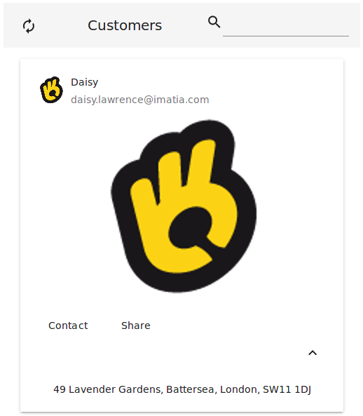
List item: card image
The o-list-item-card-image component is used to display card list items with a big image.
<o-list #list attr="customerlist" title="CUSTOMERS" service="customers" entity="customer"
  keys="CUSTOMERID" columns="CUSTOMERID;PHOTO;NAME;SURNAME;ADDRESS;STARTDATE;EMAIL">
  <o-list-item *ngFor="let row of list.dataArray">
    <o-list-item-card-image #item title="{{ row.NAME }}" subtitle="{{ row.EMAIL }}"
      content="{{ row.ADDRESS }}" avatar="./assets/images/ontimize.png" image="./assets/images/ontimize.png" action-1-text="Contact" action-2-text="Share" collapsible="yes" collapsed="no">
    </o-list-item-card-image>
  </o-list-item>
</o-list>
You can see an example of this component in the OntimizeWeb playground.
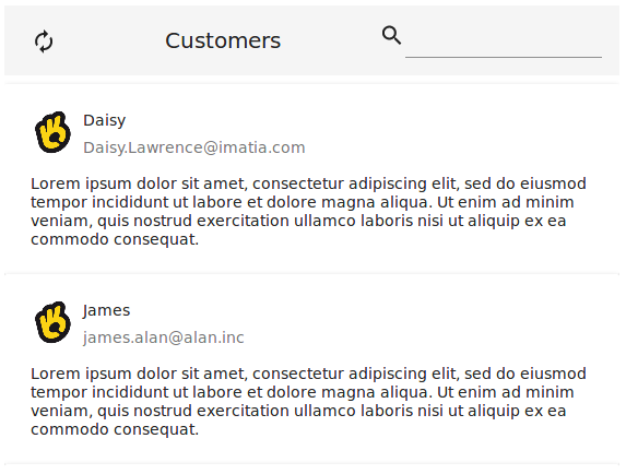
Custom list item
When building an o-list component you can include one of the predefined list items the OntimizeWeb offers or you can include your own list item. For including a custom list item, OntimizeWeb offers the o-list-item directive that can be attached to an angular material list item (mat-list-item) or an angular material card (mat-card).
<o-list #list attr="customerlist" title="CUSTOMERS" service="customers" entity="customer"
  keys="CUSTOMERID" columns="CUSTOMERID;PHOTO;NAME;SURNAME;ADDRESS;STARTDATE;EMAIL">
  <mat-card *ngFor="let rowData of list.dataArray" [o-list-item]="rowData">
    <mat-card-header>
      <div mat-card-avatar>
        <img matListAvatar fxFill src="./assets/images/ontimize.png">
      </div>
      <mat-card-title></mat-card-title>
      <mat-card-subtitle></mat-card-subtitle>
    </mat-card-header>
    <mat-card-content>
      <p>Lorem ipsum dolor sit amet, consectetur adipiscing elit, sed do eiusmod tempor incididunt ut labore et dolore magna
        aliqua. Ut enim ad minim veniam, quis nostrud exercitation ullamco laboris nisi ut aliquip ex ea commodo consequat.</p>
    </mat-card-content>
  </mat-card>
</o-list>
Directive: o-list
Inherited inputs
-
from OServiceBaseComponent:
- attr
- columns
- delete-method
- entity
- insert-method
- keys
- pageable
- paginated-query-method
- parent-keys
- query-method
- query-on-bind
- query-on-init
- query-rows
- query-with-null-parent-keys
- service
- service-type
- static-data
- store-state
- update-method
-
from OServiceComponent:
- controls
- detail-button-in-row
- detail-button-in-row-icon
- detail-form-route
- detail-mode
- edit-button-in-row
- edit-button-in-row-icon
- edit-form-route
- enabled
- insert-button
- insert-form-route
- recursive-detail
- recursive-edit
- recursive-insert
- row-height
- title
- visible
Inputs
| Name | Description | Default |
|---|---|---|
|
delete-button no | false | yes | true |
Indicates whether or not to show a delete button. The delete button is shown only when some list item is selected |
yes |
|
dense no | false | yes | true |
Indicates whether or not to display the table in dense mode |
no |
|
quick-filter no | false | yes | true |
Indicates whether or not to show a input for filtering data |
yes |
|
quick-filter-columns string |
Columns used by the quick filter. Separated by ‘;’ |
|
|
refresh-button no | false | yes | true |
Indicates whether or not to show a button for refreshing data |
yes |
|
selectable no | false | yes | true |
Indicates whether or not to show selection check boxes on the list items |
no |
Outputs
| Name | Description |
|---|---|
|
beforeGoEditMode |
Event triggered befoe going to form edition mode |
|
onDataLoaded |
Event triggered when the data is loaded |
|
onFormModeChange |
Event triggered when form mode changes |
|
onPaginatedDataLoaded |
Event triggered when the paginated data is loaded |
List item
Directive: o-list-item
List item directive
Directive: o-list-item
Inputs
| Name | Description | Default |
|---|---|---|
|
o-list-item Object |
The list item model data |
|
|
selectable no | false | yes | true |
Indicates whether the list item is selectable or not |
false |
Outputs
| Name | Description |
|---|---|
|
click |
Event triggered when the list item is clicked |
|
dblclick |
Event triggered when the list item is double clicked |
List item: text
Directive: o-list-item-text
Inputs
| Name | Description | Default |
|---|---|---|
|
icon string |
Name of google icon (see Google material design icons) |
|
|
icon-position left | right |
The icon position |
|
|
primary-text string |
The primary of the list item |
|
|
secondary-text string |
The secondary of the list item |
|
|
title string |
The title of the list item |
|
Outputs
| Name | Description |
|---|---|
|
icon-action |
Event triggered when the list item icon is clicked |
List item: avatar
Directive: o-list-item-avatar
Inherited inputs
-
from List item text:
- icon
- primary-text
- secondary-text
- title
Inherited outputs
-
from List item text:
- icon-action
List item: card
Directive: o-list-item-card
Inputs
| Name | Description |
|---|---|
|
action-1-text string |
The text of the first button |
|
action-2-text string |
The text of the second button |
|
image string |
The image of the list item |
|
subtitle string |
The subtitle of the list item |
|
title string |
The title of the list item |
Outputs
| Name | Description |
|---|---|
|
action-1 |
Event triggered when first button is clicked |
|
action-2 |
Event triggered when second button is clicked |
List item: card image
Directive: o-list-item-card-image
Inherited inputs
-
from List item card:
- action-1-text
- action-2-text
- image
- subtitle
- title
Inputs
| Name | Description |
|---|---|
|
avatar string |
The avatar of the list item |
Inherited outputs
-
from List item card:
- action-1
- action-2