Time
The o-time-input component is used in forms for getting or displaying a date and hour input submitted by the user.
The time input is automatically registered on its parent o-form, which provides the value for the input programatically. Its value can be also set manually via the data parameter. This and other attributes are explained on the API section of this page.
Basic example
<o-form editable-detail="no" show-header="no">
<div fxLayout="column" layout-padding>
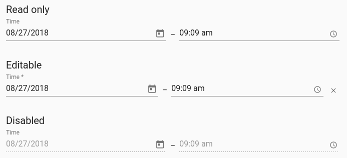
<label class="input-comp-title">{{ 'INPUTS.READ_ONLY' | oTranslate }}</label>
<o-time-input fxFlex attr="input" label="{{ 'INPUT.BUTTON.TIME' | oTranslate }}" [data]="getValue()"></o-time-input>
</div>
<div fxLayout="column" layout-padding>
<label class="input-comp-title">{{ 'INPUTS.EDITABLE' | oTranslate }}</label>
<o-time-input attr="input2" label="{{ 'INPUT.BUTTON.TIME' | oTranslate }}" [data]="getValue()" read-only="no" required="yes"
tooltip="This is an awesome tooltip!" clear-button="yes" format="24"></o-time-input>
</div>
<div fxLayout="column" layout-padding>
<label class="input-comp-title">{{ 'INPUTS.DISABLED' | oTranslate }}</label>
<o-time-input attr="input3" label="{{ 'INPUT.BUTTON.TIME' | oTranslate }}" enabled="no" [data]="getValue()"></o-time-input>
</o-form>
You can see this and more examples of this component in the OntimizeWeb playground.
Directive: o-time-input
Inherited inputs
-
from FormDataComponent:
- attr
- automatic-binding
- automatic-registering
- clear-button
- data
- enabled
- label
- read-only
- required
- sql-type
- tooltip
- tooltip-position
- tooltip-show-delay
- validators
- width
Inputs
| Name | Description | Default |
|---|---|---|
|
date-filter-date (date: Date) => boolean |
Function for filtering datepicker possible values |
|
|
date-format string |
Date format. See MomentJS format |
MomentJS localized format L (see Localized formats in MomentJS format) |
|
date-locale string. Values like es, en, ... |
Configured language locale |
Application configured locale |
|
date-max string |
Maximum selectable date |
|
|
date-min string |
Minimum selectable date |
|
|
date-start-at string |
Start date |
|
|
date-start-view month | year |
|
month |
|
date-text-input-enabled no | false | yes | true |
Indicates whether or not to allow the user to edit the date input manually |
yes |
|
date-touch-ui no | false | yes | true |
Indicates wheter to use the datepicker ‘touch-ui’ mode |
false |
|
hour-format 12 | 24 |
Hour format. 12 hours format with AM PM |
24 |
|
hour-text-input-enabled no | false | yes | true |
Indicates whether or not to allow the user to edit the hour input manually |
yes |
Inherited outputs
-
from FormDataComponent:
- onChange
- onValueChange
Outputs
| Name | Description |
|---|---|
|
onBlur |
Event triggered when component loses the focus |
|
onFocus |
Event triggered when component gains the focus |