Slider
The o-slider component is used in forms for selecting or displaying a value from a range via mouse, touch or keyboard.
The slider component is automatically registered on its parent o-form, which provides the value for the slide programatically. Its value can be also set manually via the data parameter. This and other attributes are explained on the API section of this page.
Basic example

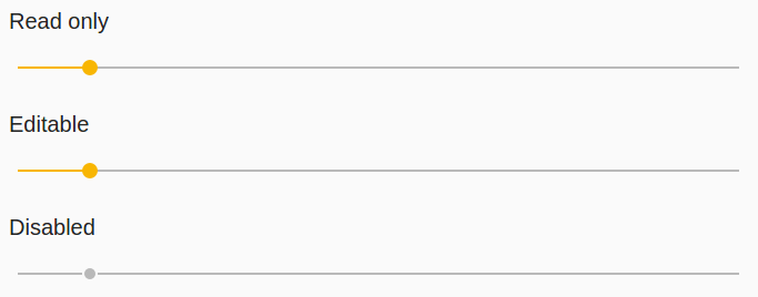
<o-form editable-detail="false" show-header="no">
    <div fxLayout="column" layout-padding>
        <label class="input-comp-title">INPUTS.READ_ONLY</label>
        <o-slider attr="slider" [data]="getValue()"></o-slider>
    </div>
    <div fxLayout="column" layout-padding>
        <label class="input-comp-title">INPUTS.EDITABLE</label>
        <o-slider #slider attr="slider-editable" [data]="getValue()"
        read-only="no" tooltip="This is an awesome tooltip!" read-only="no"></o-slider>
    </div>
    <div fxLayout="column" layout-padding>
        <label class="input-comp-title">INPUTS.DISABLED</label>
        <o-slider attr="slider-disabled" [data]="getValue()" enabled="no" ></o-slider>
    </div>
</o-form>
 getValue() {
    return 10;
  }
Selection a value
By default the minimum value of the slider is 0, the maximum value is 100, and the thumb moves in increments of 1. These values can be changed by setting the min, max, and step attributes respectively. The initial value is set to the minimum value unless otherwise specified.
Orientation
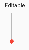
By default sliders are horizontal with the minimum value on the left and the maximum value on the right. The vertical attribute can be added to a slider to make it vertical with the minimum value on bottom and the maximum value on top.

<o-form editable-detail="false" show-header="no" layout-direction="row">
    <div fxLayout="column" layout-padding fxFlex="30">
      <label class="input-comp-title">INPUTS.EDITABLE</label>
      <o-slider attr="slider-editable" [data]="getValue()" read-only="no" tooltip="This is an awesome tooltip!" vertical="true" color="warn"  max="100" min="0" thumb-label="true" step="1" tick-interval="auto"></o-slider>
    </div>
  </o-form>
An invert attribute is also available which can be specified to flip the axis that the thumb moves along. An inverted horizontal slider will have the minimum value on the right and the maximum value on the left, while an inverted vertical slider will have the minimum value on top and the maximum value on bottom.
<o-form editable-detail="false" show-header="no" layout-direction="row">
    <div fxLayout="column" layout-padding fxFlex="30">
      <label class="input-comp-title">INPUTS.EDITABLE</label>
      <o-slider attr="slider-editable" [data]="getValue()" read-only="no" tooltip="This is an awesome tooltip!" vertical="true" color="warn"  max="100" min="0" thumb-label="true" step="1" tick-interval="auto" invert="yes"></o-slider>
    </div>
  </o-form>
Thumb label
By default, the exact selected value of a slider is not visible to the user. However, this value can be added to the thumb by adding the thumb-label attribute.
Tick marks
By default, sliders do not show tick marks along the thumb track. This can be enabled using the tick-interval attribute. The value of tick-interval should be a number representing the number of steps between between ticks. For example a tick-interval of 3 with a step of 4 will draw tick marks at every 3 steps, which is the same as every 12 values.
<o-slider attr="slider-editable" read-only="no" thumb-label="true" step="4" tickInterval="3"></o-slider>
The tick-interval can also be set to auto which will automatically choose the number of steps such that there is at least 30px of space between ticks.
<o-slider attr="slider-editable" read-only="no" thumb-label="true" tick-interval="auto"></o-slider>

You can see this and more examples of this component in the OntimizeWeb playground.
Directive: o-slider
Inherited inputs
-
from FormDataComponent:
- attr
- automatic-binding
- automatic-registering
- data
- enabled
- label
- read-only
- tooltip
- tooltip-position
- tooltip-show-delay
- validators
Inputs
| Name | Description | Default |
|---|---|---|
|
color ThemePalette |
Theme color palette for the component. |
|
|
invert boolean |
Whether the slider is inverted. |
false |
|
max number |
The maximum value that the slider can have. |
100 |
|
min number |
The minimum value that the slider can have. |
0 |
|
step number |
The values at which the thumb will snap. |
1 |
|
thumb-label boolean |
Whether or not to show the thumb label. |
false |
|
tick-interval 'auto' | number |
How often to show ticks. |
0 |
|
vertical boolean |
Whether the slider is vertical. |
false |
Inherited outputs
-
from FormDataComponent:
- onChange
- onValueChange