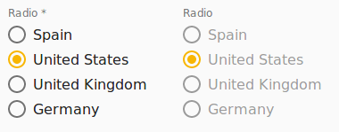
Radio
The o-radio component is used in forms for getting or displaying an option between multiple input submitted by the user.
The radio component is automatically registered on its parent o-form, which provides the value for the radio programatically. Its value can be also set manually via the data parameter. This and other attributes are explained on the API section of this page.
This component is different than most of other inputs, an array of data must be provided to the component in order to interact with it. This data is used to display the optoins of the radio group and each element of the data array must be an object with at least one key/value pair.
The data array can be provided in two ways:
- Provide an array of objects to the
static-dataattribute (see the example below). - Configure the component to query the data from a service. Using
serviceandentityattributes.
Basic example

<o-form editable-detail="false" show-header="no">
    <o-radio attr="radio-editable" label="INPUT.BUTTON.RADIO" [static-data]="getDataArray()"
        [data]="getValue()" value-column="key" columns="key;value" visible-columns="value" read-only="no" required="yes"
        tooltip="This is an awesome tooltip!" tooltip-position="below"></o-radio>
    <o-radio attr="radio-disabled" label="INPUT.BUTTON.RADIO" [static-data]="getDataArray()"
        [data]="getValue()" value-column="key" columns="key;value" visible-columns="value" enabled="no"></o-radio>
</o-form>
Validation
The o-radio shows automatically an error message when the required attribute is set to “yes” and there is no value selected.
You can see this and more examples of this component in the OntimizeWeb playground.
Directive: o-radio
Inherited inputs
-
from FormDataComponent:
- attr
- automatic-binding
- automatic-registering
- data
- enabled
- label
- read-only
- required
- sql-type
- tooltip
- tooltip-position
- tooltip-show-delay
- validators
- width
-
from OFormServiceComponent:
- columns
- entity
- parent-keys
- query-method
- query-on-bind
- query-on-event
- query-on-init
- query-with-null-parent-keys
- separator
- service
- service-type
- set-value-on-value-change
- static-data
- value-column
- value-column-type
- visible-columns
Inputs
| Name | Description | Default |
|---|---|---|
|
label-position before | after |
Indicates whether the labels should appear after or before the radio buttons |
after |
|
layout row | column |
Indicates the disposition of the radio buttons |
column |
|
translate no | false | yes | true |
Indicates whether or not to translate the labels displayed in the radio buttons |
false |
Inherited outputs
-
from FormDataComponent:
- onChange
- onValueChange
-
from OFormServiceComponent:
- onSetValueOnValueChange
Methods
| getDescriptionValue() |
|---|
| Returns the displayed text for the selected radio group element |
| Returns |
| string |
| getOptionDescriptionValue(element) |
|---|
| Returns the displayed text for the provided radio group element |
| Returns |
| string |