HTML input
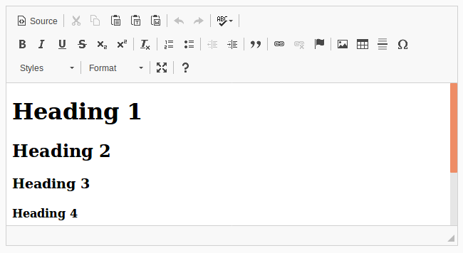
The o-html-input component is used in forms for getting or displaying html text submitted by the user.
This component wraps the CKEditor 4 component into an OntimizeWeb component. For using it you need to download the CKEditor library and include it in your application.
- Download the CKEditor 4.
- Include it in your application:
- Copy the CKEditor library to your assets folder.
- Import the CKEditor library in the index.html file of your application.
<script type="text/javascript" src="./assets/js/ckeditor/ckeditor.js"></script>- For production you have the take two more steps:
- Include the CKEditor library in the aot-config/index.ejs file, like in the previous example.
- Include the CKEditor in the webpack copy files plugin, for this, include the ckeditor folder in the
GlobCopyWebpackPluginpatterns in the aot-config/webpack-aot.config.js file.
      plugins: [
          new GlobCopyWebpackPlugin({
              "patterns": [
              ...
              "assets/js/ckeditor"
          ],
          ...
- Now you can include the
o-html-inputin your application templates.
The HTML input is automatically registered on its parent o-form, which provides the value for the input programatically. Its value can be also set manually via the data parameter. This and other attributes are explained on the API section of this page.
Basic example

<o-form editable-detail="no" show-header="no">
    <o-html-input attr="html" [data]="getHTMLData()" read-only="no" required="yes"></o-html-input>
</o-form>
You can see this and more examples of this component in the OntimizeWeb playground.
Validation
The o-html-input shows automatically an error message when the required attribute is set to “yes” and there is no value on the input.
Directive: o-html-input
Inherited inputs
-
from FormDataComponent:
- attr
- automatic-binding
- automatic-registering
- data
- read-only
- required
- sql-type
-
from o-text-input:
- max-length
- min-length
Inherited outputs
-
from FormDataComponent:
- onChange
- onValueChange
Outputs
| Name | Description |
|---|---|
|
onBlur |
Event triggered when component loses the focus |
|
onFocus |
Event triggered when component gains the focus |