Combo
The o-combo component is used in forms for getting or displaying an option between multiple input submitted by the user.
The combo component is automatically registered on its parent o-form, which provides the value for the combo programatically. Its value can be also set manually via the data parameter. This and other attributes are explained on the API section of this page.
This component is different than most of other inputs, an array of data must be provided to the component in order to interact with it. This data is used to display the optoins on the drop down and each element of the data array must be an object with at least one key/value pair.
The data array can be provided in two ways:
- Provide an array of objects to the
static-dataattribute (see the example below). - Configure the component to query the data from a service. Using
serviceandentityattributes.
Basic example

<o-form editable-detail="no" show-header="no">
    <o-combo attr="country" label="Country" data="Spain" [static-data]="getStaticData()" value-column="name" columns="id;name" visible-columns="name" read-only="no" required="yes"></o-combo>
    <o-combo attr="country" label="Country" data="Spain" [static-data]="getStaticData()" value-column="name" columns="id;name" visible-columns="name" enabled="no"></o-combo>
</o-form>
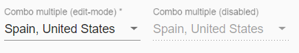
Multiple selection
The o-combo doesn’t allow multiple selection by default, you can configure the multiple selection by setting the value yes to the multiple attribute. This will allow the user to select multiple values at once.
<o-form editable-detail="no" show-header="no">
  <o-combo #combo attr="combo-multiple" label="Country" [static-data]="getDataArray()" [data]="getValueMultiple()" value-column="key" columns="key;value" visible-columns="value" required="yes" read-only="false" layout-padding multiple="yes"></o-combo>

  <o-combo #combo attr="combo-multiple-disabled" enabled="no" label="Country" [static-data]="getDataArray()" [data]="getValueMultiple()" value-column="key" columns="key;value" visible-columns="value" required="yes" read-only="false" layout-padding multiple="yes"></o-combo>
</o-form>
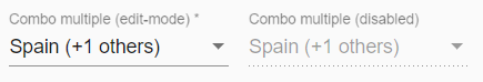
Customize the trigger label
You can customize the combo label configuring the multiple-trigger-label attribute as in the example below.
  <o-form editable-detail="no" show-header="no">
    <o-combo #combo attr="combo-multiple2" label="Country" [static-data]="getDataArray()"
     [data]="getValueMultiple()" value-column="key" columns="key;value" visible-columns="value"
     required="yes" read-only="false" layout-padding multiple="yes" multiple-trigger-label="yes"></o-combo>

    <o-combo #combo attr="combo-multiple-disabled" enabled="no" label="Country" [static-data]="getDataArray()"
     [data]="getValueMultiple()" value-column="key" columns="key;value" visible-columns="value"
     required="yes" read-only="false" layout-padding multiple="yes" multiple-trigger-label="yes"></o-combo>
  </o-form>
If you want to override the default trigger label, add the entry INPUT.COMBO.MESSAGE_TRIGGER in your bundle with the desired text.
'INPUT.COMBO.MESSAGE_TRIGGER':' (+{0} others)'
Validation
The o-combo shows automatically an error message when the required attribute is set to “yes” and there is no value selected.
You can see this and more examples of this component in the OntimizeWeb playground.
Locker
OntimizeWeb offers the oLocker directive to the o-combo that should to lock the component when you configure the component to query the data from a service
<o-combo attr="EMPLOYEETYPEID LOAD" oLocker read-only="no" service="employees" entity="employeeType" columns="EMPLOYEETYPEID;EMPLOYEETYPENAME"
  value-column="EMPLOYEETYPEID" keys="EMPLOYEETYPEID" visible-columns="EMPLOYEETYPENAME" width="33%">
</o-combo>

<o-combo attr="EMPLOYEETYPEID DISABLE" oLocker oLockerMode="disable" read-only="no" service="employees" entity="employeeType" columns="EMPLOYEETYPEID;EMPLOYEETYPENAME"
  value-column="EMPLOYEETYPEID" keys="EMPLOYEETYPEID" visible-columns="EMPLOYEETYPENAME" width="33%">
</o-combo>

Note you can configure the mode of the locker, there are two modes to block, disable and load mode. The mode by default is load. You can configure delay service start with oLockerDelay attribute, by default this value is the 250ms.
Directive: o-combo
Inherited inputs
-
from FormDataComponent:
- attr
- automatic-binding
- automatic-registering
- clear-button
- data
- enabled
- label
- read-only
- required
- sql-type
- tooltip
- tooltip-position
- tooltip-show-delay
- validators
- width
-
from OFormServiceComponent:
- columns
- description-columns
- entity
- parent-keys
- query-method
- query-on-bind
- query-on-event
- query-on-init
- query-with-null-parent-keys
- separator
- service
- service-type
- static-data
- value-column
- value-column-type
Inputs
| Name | Description | Default |
|---|---|---|
|
multiple no | false | yes | true |
Indicates whether or not to allow the user to select multiple options |
false |
|
multiple-trigger-label no | false | yes | true |
Indicates whether or not the component label shows a summary of the selected items |
false |
|
null-selection no | false | yes | true |
Indicates whether or not to have a selectable null value |
yes |
|
translate no | false | yes | true |
Indicates whether or not to translate the values shown on the drop down |
false |
Inherited outputs
-
from FormDataComponent:
- onChange
- onValueChange
-
from OFormServiceComponent:
- onSetValueOnValueChange
Methods
| getSelectedItems() |
|---|
| Return the selected items of the component. |
| Returns |
| any[] |
| setSelectedItems() |
|---|
| Set the selected items of the component. |
| Parameters |
| any[] |
Directive: oLocker
Inputs
| Name | Description | Default |
|---|---|---|
|
oLockerDelay number |
Time the oLocker will be shown |
250 |
|
oLockerMode 'load' | 'disable' |
Indicates the component performance mode |
false |