Image
The o-image component to display different types of images, including network images, base64 images or images from the local disk.
This component can also be used within the form allowing the management of this data (add, modify or delete an image of the form).
Basic example
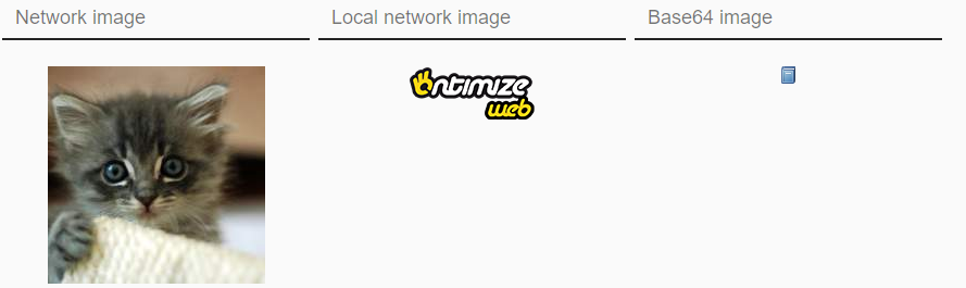
This example shows the obtaining and visualization of an image from the network, from relative url and even in base64 in the data propertie.
<!-- network images -->
 <o-image attr="image1" data="http://placekitten.com/200/200"></o-image>
 <!-- local network image -->
 <o-image attr="image2" data="assets/images/sidenav-opened.png"></o-image>
 <!-- base64 images-->
 <o-image attr="image3" [data]="dataBase64"></o-image>
public dataBase64= "data:image/png;base64,iV BORw0KGgoAAAANSUhEUgAAABAAAAAQCAYAAAAf8/9hAAAABGdBTUEAAK/INwWK6QAAABl0RVh0U29mdHd hcmUAQWRvYmUgSW1hZ2VSZWFkeXHJZTwAAAHjSURBVDjLdZO/alVBEMZ/5+TemxAbFUUskqAoSOJNp4KC 4AsoPoGFIHY+gA+jiJXaKIiChbETtBYLUbSMRf6Aydndmfks9kRjvHdhGVh2fvN9uzONJK7fe7Ai6algA 3FZCAmQqEF/dnihpK1v7x7dPw0woF64Izg3Xl5s1n9uIe0lQYUFCtjc+sVuEqHBKfpVAXB1vLzQXFtdYP HkGFUCoahVo1Y/fnie+bkBV27c5R8A0pHxyhKvPn5hY2MHRQAQeyokFGJze4cuZfav3gLNYDTg7Pklzpw 4ijtIQYRwFx6BhdjtCk+erU0CCPfg+/o2o3ZI13WUlLGo58YMg+GIY4dmCWkCAAgPzAspJW5ePFPlV3VI 4uHbz5S5IQfy/yooHngxzFser30iFcNcuAVGw3A0Ilt91IkAsyCXQg5QO0szHEIrogkiguwN2acCoJhjn ZGKYx4Ujz5WOA2YD1BMU+BBSYVUvNpxkXuIuWgbsOxTHrG3UHIFWIhsgXtQQpTizNBS5jXZQkhkcywZqQ QlAjdRwiml7wU5xWLaL1AvZa8WIjALzIRZ7YVWDW5CiIj48Z8F2pYLl1ZR0+AuzEX0UX035mxIkLq0dhD w5vXL97fr5O3rfwQHJhPx4uuH57f2AL8BfPrVlrs6xwsAAAAASUVORK5CYII=";
Empty image
The o-image component allow add an empty image when the data is empty.
For example:
<o-image attr="PHOTO" class="customer-picture" empty-image="./assets/images/no-image.png" ></o-image>

Show controls
The o-image component show controls by default, you can configure hide the controls by setting the value no to show-controls attribute.
Configure size
The o-image component adjust size the image by default, you can disable this functionality setting the value no to auto-fit attribute.
You can also add the height and the width to an o-image component with height and width attribute in px or in %.
You can see this and more examples of this component in the OntimizeWeb playground
Validation
The o-image shows automatically an error message inside of the form when the required attribute is set to ‘yes’ and there is no value on the input.
Directive: o-image
Inputs
| Name | Description | Default |
|---|---|---|
|
attr string |
Field identifier. Registry property if component is inside a form. |
|
|
auto-fit no | false | yes | true |
Indicates whether or not the image size is automatically adjusted |
yes |
|
automatic-binding no | false | yes | true |
Indicates whether or not the component will bind its value to its |
yes |
|
automatic-registering no | false | yes | true |
Indicates whether or not the component will register itself (using its |
yes |
|
data |
Manually setted component value |
|
|
empty-icon string |
Name of google icon (see Google material design icons) displayed when the component has no value |
|
|
empty-image string |
Image displayed when the component has no value. It has preference over the |
|
|
enabled no | false | yes | true |
Indicates whether or not the field is enabled |
yes |
|
full-screen-button no | false | yes | true |
Indicates whether or not to show the maximize button |
no |
|
height number |
Indicates the height of image component in pixels (px) or percentage (%) |
|
|
label string |
Field label (placeholder when field is empty and floating label when field has data) |
|
|
required no | false | yes | true |
Indicates whether or not the field is required |
no |
|
show-controls no | false | yes | true |
Indicates whether or not to show the selection controls |
yes |
|
tooltip string |
Field tooltip text |
|
|
tooltip-position before | after | above | below | left | right |
Field tooltip position |
below |
|
tooltip-show-delay number |
Field tooltip display time |
500 |
Outputs
| Name | Description |
|---|---|
|
onChange |
Event triggered when the component value changes |