Grid
This component is available since version 3.1.0.
Introduction
The o-grid component is used to display a two-dimensional list view that arranges cells into grid-based layout.
For adding a grid component to your application you must insert the o-grid in your page and include a o-grid-item component wrapping the desired grid item type you want to display.
Define title
The o-grid component allows you to specify a title by configuring the title attribute, this value will appear in the toolbar.
Show controls
The o-grid component shows controls by default, you can show/hide them by configuring the show-controls attribute.
Columns per row
You can specify the number of columns shown on each row by configuring the cols attribute. By default, the number of columns will be automatically determined based on mediaQuery of Flex Layout. See more here.
The following table shows the default columns that will appear in the grid according to the size of the screen.
| Breakpoint | Number columns |
|---|---|
| xs, sm | 1 |
| md | 2 |
| lg,xl | 4 |
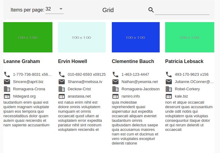
Items per page
The o-grid component allows you to configure the number of items displayed on each page by configuring the page-size attribute. By default this value is 32.
You can also configure the page size options by configuring the show-page-size and the page-size-options attributes.
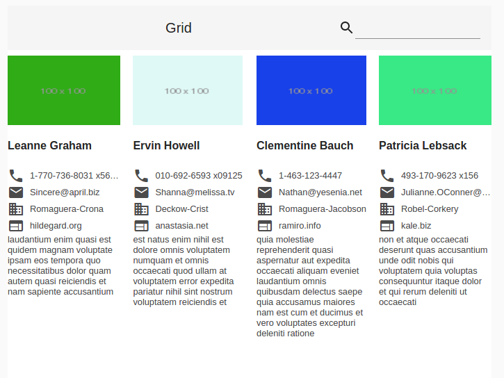
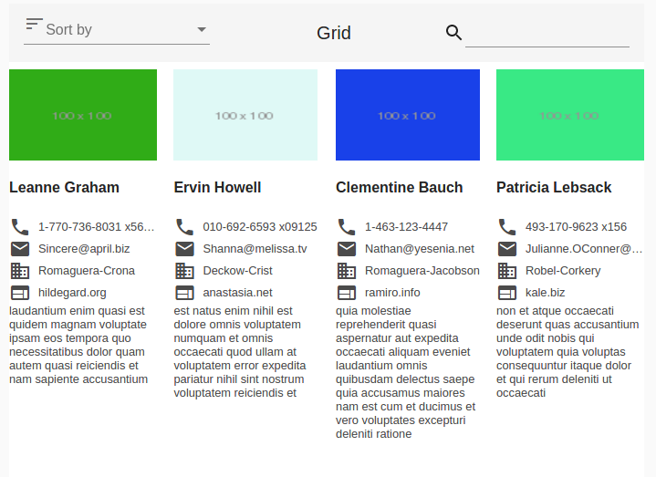
<o-grid #grid columns="id;name;username;email;companyname" keys="id" [static-data]="getStaticData()"
  show-page-size="yes" page-size-options="24;32;64">
  <o-grid-item *ngFor="let list of grid.dataArray">
    <o-column layout-padding class="container-item">
      <img [src]="list.thumbnailUrl" style="margin-top:8px">
      <h4> {{list.name}} </h4>
      <div class="phone">
        <mat-icon>phone</mat-icon><span>{{ list.phone }} </span></div>
      <div class="email">
        <mat-icon>email</mat-icon><span>{{ list.email }}</span></div>
      <div class="domain">
        <mat-icon>domain</mat-icon><span>{{ list.companyname }}</span></div>
      <div class="website">
        <mat-icon>website</mat-icon><span>{{ list.website }}</span></div>
      <div class="body">
        {{ list.body }}
      </div>
    </o-column>
  </o-grid-item>
</o-grid>
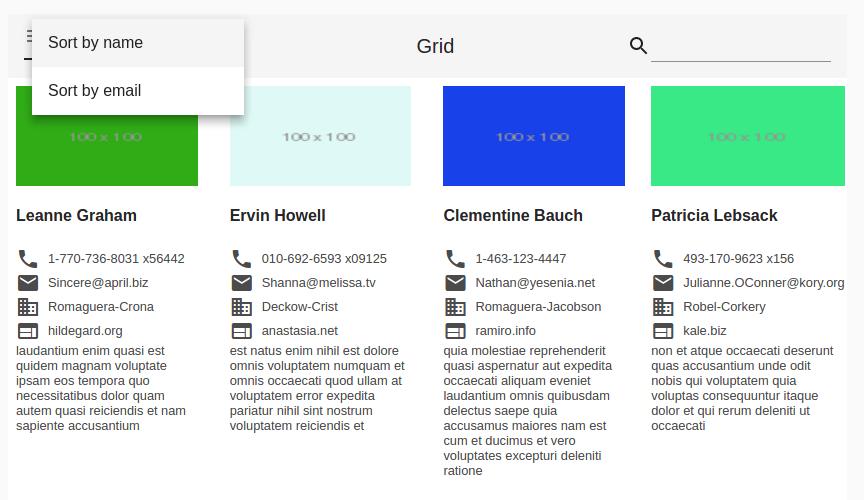
Sorting
The o-grid component allows you to sort the grid items by configuring the orderable attribute. You must also configure the sortable-columns attribute in order to indicate which columns would be sortable.
You also can specify the default sorting column by configuring the sort-column attribute.
<o-grid #grid  columns="id;name;username;email;companyname" keys="id" [static-data]="getStaticData()"
  orderable="yes" quick-filter="yes" sortable-columns="name;email" sort-column="name" grid-item-height="1:2">
  <o-grid-item *ngFor="let list of grid.dataArray">
    <o-column layout-padding  class="container-item">
      <img [src]="list.thumbnailUrl" style="margin-top:8px">
      <h4></h4>
      <div class="phone"><mat-icon>phone</mat-icon><span></span></div>
      <div class="email"><mat-icon>email</mat-icon><span></span></div>
      <div class="domain"><mat-icon>domain</mat-icon><span></span></div>
      <div class="website"><mat-icon>website</mat-icon><span></span></div>
      <div class="body">

      </div>
    </o-column>
  </o-grid-item>
</o-grid>
Grid item height
The height of the rows in a grid list can be set via the grid-item-height attribute. By default this value is 1:1.
- Fixed height: The height can be in px, em, or rem. If no units are specified, px units are assumed (e.g. 100px, 5em, 250).
- Ratio: This ratio is column-width:row-height, and must be passed in with a colon, not a decimal (e.g. 4:3).
- Fit: Setting
grid-item-heightto fit automatically divides the available height by the number of rows. Please note the height of the o-grid or its container must be set.
Gutter size
The gutter size can be set to any px, em, or rem value with the gutter-size property. If no units are specified, px units are assumed. By default the gutter size is 1px.
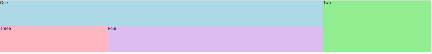
Multiple rows or columns
It is possible to set the rowspan and colspan of each o-grid-item individually, using the rowspan and colspan properties. By default its values are 1. The colspan must not exceed the number of cols in the o-grid. There is no such restriction on the rowspan however, more rows will simply be added for it the tile to fill.
 <o-grid #grid attr="grid" [static-data]="getStaticData())" columns="text;cols;rows;color" cols="4"
grid-item-height="100px" controls="no" gutter-size="0">
  <o-grid-item *ngFor="let list of grid.dataArray" [colspan]="list.cols" [rowspan]="list.rows">
    <div [style.background]="list.color" fxFill>
       {{list.text}}
    </div>
  </o-grid-item>
</o-grid>
QuickFilter
By default this option is enabled, the filter is visible in the top right. It can be disabled by configuring the quick-filter attribute.
Fixed header and footer
The o-grid component supports fixed header and footer setting fixed-header="yes" when its content is greater than its own height. For that, you must set the height of the grid, using, for example [ngStyle]="{height: 400px;}". By default, it’s disabled.
<o-grid #grid attr="grid" [static-data]="getStaticData()" columns="id;name;username;email;companyname"
  keys="id" fixed-header="yes" [ngStyle]="{height:400px}" pagination-controls="yes" query-rows="8">
  <o-grid-item *ngFor="let list of grid.dataArray">
    <o-column layout-padding class="container-item">
      <img [src]="list.thumbnailUrl" style="margin-top:8px">
      <div class="name"><b> {{ list.name }}</b></div>
      <div class="phone">
        <mat-icon>phone</mat-icon> <span>  {{ list.phone }} </span>
      </div>
      <div class="email">
        <mat-icon>email</mat-icon> <span> {{ list.email }} </span>
      </div>
      <div class="domain">
        <mat-icon>domain</mat-icon> <span>  {{ list.companyname }} </span>
      </div>
      <div class="website">
        <mat-icon>website</mat-icon> <span>  {{ list.website }} </span>
      </div>
    </o-column>
  </o-grid-item>
</o-grid>
Custom grid item
When building an o-grid component you can define your own grid item. For including a custom grid item, OntimizeWeb offers the o-grid-item directive that can be attached to an angular material grid tile (mat-grid-tile) .
<o-grid #grid columns="id;name;username;email;companyname" keys="id" [static-data]="getStaticData()"
  orderable="yes" quick-filter="yes" grid-item-height="1:2" sortable-columns="name;email">
  <o-grid-item *ngFor="let list of grid.dataArray">
    <o-column layout-padding  class="container-item">
      <img [src]="list.thumbnailUrl" style="margin-top:8px">
      <h4> {{ list.name }} </h4>
      <div class="phone"><mat-icon>phone</mat-icon><span> {{ list.phone }} </span></div>
      <div class="email"><mat-icon>email</mat-icon><span> {{ list.email }}</span></div>
      <div class="domain"><mat-icon>domain</mat-icon><span>{% raw %} {{ list.companyname }} </span></div>
      <div class="website"><mat-icon>website</mat-icon><span>  {{ list.website }}</span></div>
      <div class="body">
         {{ list.body }}
      </div>
    </o-column>
  </o-grid-item>
</o-grid>
Demo
You can see this and more examples of this component in the OntimizeWeb playground.
Directive: o-grid
Inherited inputs
-
from OServiceBaseComponent:
- attr
- columns
- entity
- keys
- pageable
- paginated-query-method
- parent-keys
- query-method
- query-on-bind
- query-on-init
- query-rows
- query-with-null-parent-keys
- service
- service-type
- static-data
- store-state
-
from OServiceComponent:
- controls
- detail-form-route
- detail-mode
- enabled
- recursive-detail
- title
- visible
Inputs
| Name | Description | Default |
|---|---|---|
|
cols number |
Number of items to display on a page. By default set to 32. |
By default, the number of columns will be automatically determined based mediaQuery of Flex Layout. See more here. |
|
fixed-header string" |
Size of the grid list’s gutter in pixels |
no |
|
grid-item-height string | number |
Set internal representation of row height from the user-provided value (see attribute |
1:1 |
|
gutter-size no | false | yes | true |
The amount of space between o-grid-items. This will be something like ‘10px’ or ‘1em’. |
1px |
|
orderable no | false | yes | true |
Whether or not the sort select is shown in the toolbar. |
false |
|
page-size-options array |
Page size options separated by ‘;’. |
8;16;24;32;64] |
|
pagination-controls no | false | yes | true |
Indicates whether or not to show the pagination controls |
no |
|
quick-filter no | false | yes | true |
Indicates whether or not to show a input for filtering data |
yes |
|
quick-filter-columns string |
Columns used by the quick filter. Separated by ‘;’ |
|
|
refresh-button no | false | yes | true |
Indicates whether or not to show a button for refreshing data |
yes |
|
show-page-size no | false | yes | true |
Whether or not to hide the page size selector. |
no |
|
sort-column string |
Sorting default column. |
|
|
sortable-columns string |
Sorting columns separated by ‘;’. |
|
Outputs
| Name | Description |
|---|---|
|
onClick |
Event triggered when a row is clicked |
|
onDataLoaded |
Event triggered when the data is updated |
|
onDoubleClick |
Event triggered when a row is double clicked |
|
onPaginatedDataLoaded |
Event triggered when the paginated data is updated |
Grid item
Directive: o-grid-item
Inputs
| Name | Description |
|---|---|
|
colspan number |
Amount of columns that the grid tile takes up. |
|
rowspan number |
Amount of rows that the grid tile takes up. |