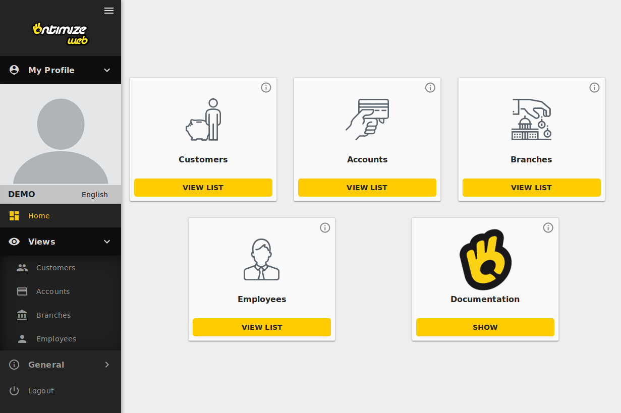
Card menu layout
The o-card-menu-layout component builds automatically a dashboard page based on the application menu configuration (read more about how to configure the application menu here). It displays a o-card-menu-item component for each menu item provided on the parent-menu-id attribute. When this attribute is not configured, the component builds a o-card-menu-item for each root menu item. You can also include your own card menu items like in the example below.
Example
<o-card-menu-layout parent-menu-id="views">
  <o-card-menu-item button-text="Show" title="Documentation" tooltip="Check the OntimizeWeb documentation" image="assets/images/ontimize.png"></o-card-menu-item>
</o-card-menu-layout>

You can see an example of this component working in the OntimizeWeb QuickStart.
Card menu item
The o-card-menu-item component is the child component for the o-card-menu-layout component. You can read more about this component here.
Directive: o-card-menu-layout
Inputs
| Name | Description |
|---|---|
|
parent-menu-id string |
The menu item identifier whose children are rendered. When this attribute is not configured, the component builds a card for the root elements of the menu |