Button
The o-button component is a wrapper for Angular Material buttons. It allows add buttons to your application and configure them easily.
Example
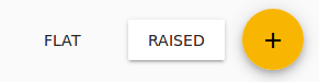
  <o-button attr="flat" type="FLAT" label="FLAT" (click)="onClick($event)"></o-button>

  <o-button attr="raised" type="RAISED" label="RAISED" (click)="onClick($event)"></o-button>

  <o-button attr="floating" type="FLOATING" icon="add" (click)="onClick($event)"></o-button>
You can see this live example in the OntimizeWeb playground.
Directive: o-button
Inputs
| Name | Description | Default |
|---|---|---|
|
attr string |
Field identifier. Registry property if component is inside a form. |
|
|
icon string |
Name of google icon (see Google material design icons) |
|
|
icon-position left | right | top | bottom |
Icon position |
left |
|
image |
Icon image |
|
|
label string |
Field label (placeholder when field is empty and floating label when field has data) |
|
|
type FLAT | RAISED | FLOATING |
Type of button |
FLAT |
* required inputs.